Jul 08, 2015 | Posted in Inspirations, Trends |



artwork courtesy Blisstree.com
Continuing our series inspired by our love of Mad Men, interior decor and summer cocktails, pairing design and drinks! Following on the heels of our last post on pairing Melon Madness with décor, this edition is a playful and colorful interior that makes entertaining fun and easy.
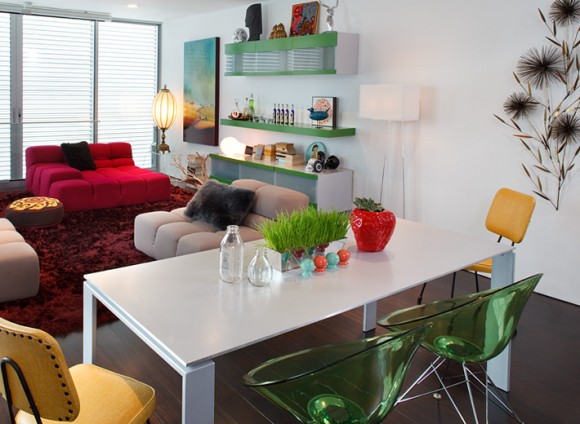
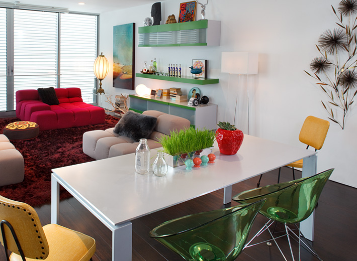
San Francisco condo living/dining area by Kimball Starr Interior Design / photo by Eric Rorer
Above in this San Francisco condo, custom chartreuse-and-silver custom cabinetry opens to reveal a cocktail bar, perfect for offering guests a drink while they enjoy a movie on the hidden projector or snack at the dining room table flanked by bright seating.
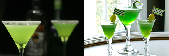
Left: Green iguana courtesy drinksmixer.com / Right: St. Patrick-tini courtesy Anders Ruff
To enjoy this bachelor pad with friends or dates, we recommend the Green Iguana!
- 1/2 part tequila
- 1 part Midori melon liqueur
- 2 parts sweet & sour mix
- ice
Mix tequila, midori melon liqueur and sweet and sour mix in a blender. Add ice. Serve in a margarita glass.
Get other pairing ideas by visiting our Pinterest Drinks & Décor Pairings! For a non-alcoholic version, we love St. Patrick-tinis! Mix green Jell-o with vanilla ice cream, and refrigerate overnight or until set and garnish with a lime twist – view the full receipe via our Pinterest.
If you need help designing a space for entertaining, we at Kimball Starr Interior Design are residential design experts! We can help you discover the possibilities of your own property!
Kimball Starr Interior Design is an award-winning San Francisco interior design firm specializing in contemporary interiors for the San Francisco, Peninsula, Marin, and San Jose area. Kimball Starr “changes lives one room at a time” by creating interiors tailored specially for you.
Labels: custom furniture, dining room, drinks & decor, living room
Jul 02, 2015 | Posted in Inspirations, Trends |
artwork courtesy Blisstree.com
Inspired by our love of Mad Men, interior decor and summer cocktails, introducing a fun series of posts pairing design and drinks! Throughout the summer months we will share with you new pairings to inspire your own entertaining and interior design style combinations.
To kick off this 4th of July holiday weekend, a kicky bungalow patio is paired with melon-infused goodness to celebrate summer breezes and fresh fruit season.
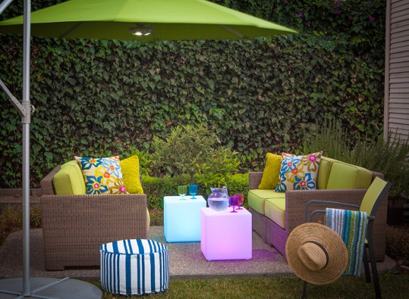
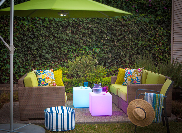
Kimball Starr Interior Design / Photo by Marija Vidal
Above in the Palo Alto backyard, Kimball Starr designed the patio with outdoor furniture made of a contemporary resin material with the look of wicker but much more durable. The patio’s outdoor umbrella has a built-in light, so you can read the paper well after sunset. You’ll never have trouble finding your cocktail with these playful illuminating cube tables that double as additional seating. And the outdoor fabric on these loveseats is designed to last through years of rain, wind and sunlight without fading or becoming frayed – it dries quickly and covers a comfortable marine-grade cushion.
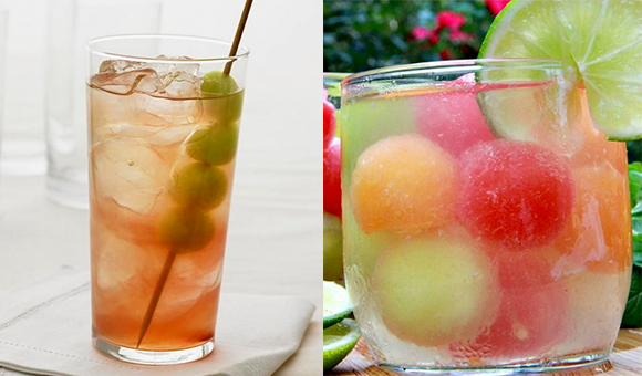
Left: Honey Deuce Cocktail courtesy Grey Goose / Right: Melon Ball Punch courtesy iFood.tv
To enjoy this outdoor space on a warm summer night, we recommend the Honey Deuce, a lovely light cocktail created by Nick Mautone, Master Mixologist for Grey Goose, for the US Open Tennis Championship in 2009. It includes vodka, raspberry liqueur, lemonade and honeydew melon balls for a taste that beats the heat.
- 1 1/4 parts Grey Goose Vodka
- Fresh-squeezed lemonade
- 1/2 part Chambord or premium raspberry liqueur
- Crushed ice
- Honeydew melon balls for garnish
Get other pairing ideas by visiting our Pinterest Drinks & Décor Pairings! For a non-alcoholic version, we love Melon Ball Punch! Mix watermelon, cantaloupe, honeydew, and limes with lemon-lime soda, lemonade and another secret ingredient you can find by visiting our Pinterest.
If you need help designing an indoor-outdoor space for entertaining, or you just want to live outdoors, we at Kimball Starr Interior Design are outdoor living design experts! Have us help you discover the possibilities of your own backyard!
Kimball Starr Interior Design is an award-winning San Francisco interior design firm specializing in contemporary interiors and outdoor living for the San Francisco, Peninsula, Marin, and San Jose area. Kimball Starr “changes lives one room at a time” by creating interiors tailored specially for you.
Labels: cocktails, contemporary, drinks & decor, outdoor, residential design
Jun 30, 2015 | Posted in Before & After |
Our first post on redesigning bay windows was a breath of fresh air, so we decided to share more “before & after” ideas from Kimball Starr Interior Design’s portfolio, and how bay windows can be beautiful spaces for relaxing with a little help from your neighborhood designer!
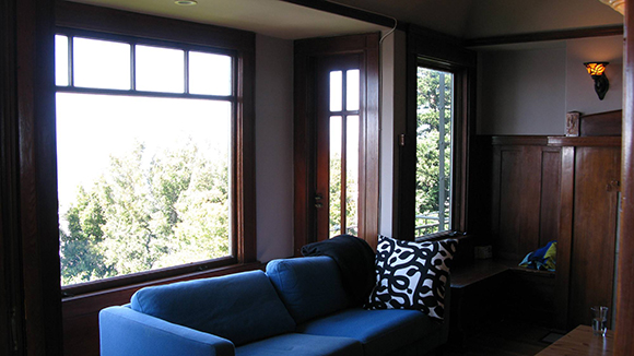
BEFORE: Russian Hill bay window
In San Francisco’s Russian Hill district, this bay window has a fantastic view that feels ignored with the sofa facing away from the window, and the darker sofa combined with the wood paneling makes the sunlit window area feel heavy.
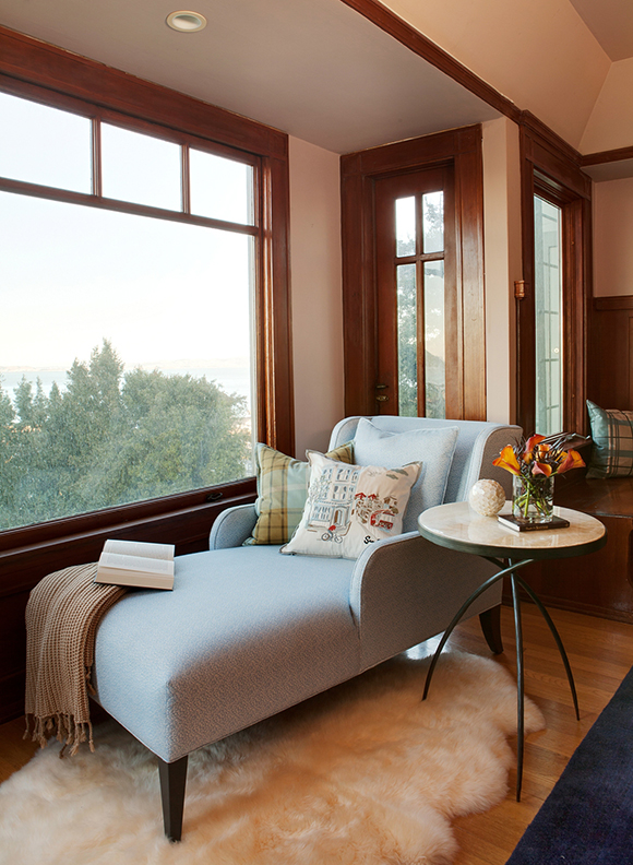
AFTER: Russian Hill Bay Window seating by Kimball Starr Interior Design / photo by Marija Vidal
Kimball Starr’s expert design makeover utilizes this space by replacing the sofa with a custom-designed chaise upholstered in a pale watery-blue. Now the chaise faces the view, and a side table is added for your book and a soft white area rug to bury your feet in.
With a lighter color palette to balance the wood paneling, and a reorientation of the furniture, you’re now encouraged to enjoy the bay window and admire the iconic view of Alcatraz and the Golden Gate bridge.
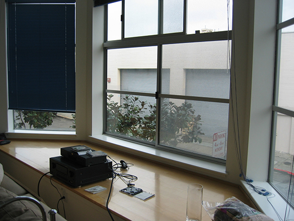
BEFORE: A wide view of the San Francisco loft bay window
A contemporary San Francisco loft located in SOMA has clean lines and modern style but the bay window space was underutilized and not inviting to use.
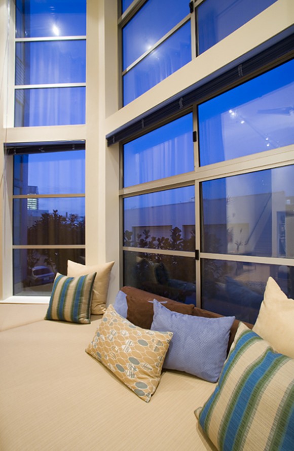
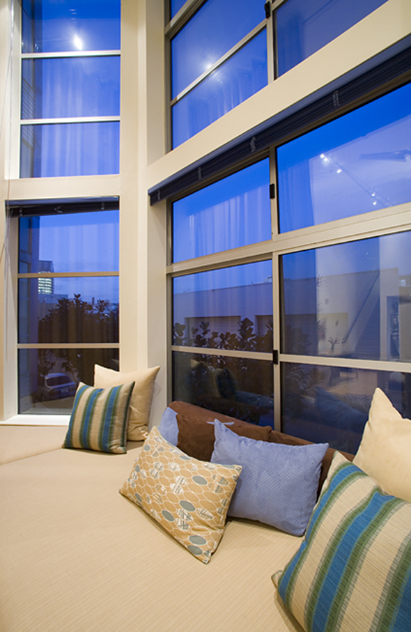
AFTER: Zen loft bay window as comfortable seating by Kimball Starr Interior Design / photo by Eric Rorer
Expert decorator Kimball Starr knew precisely how to address the dark and empty bay window space! Soften the hard surface with a custom-built window seat in cream upholstery and add colorful throw pillows. Now you can curl up in the window for a midday nap and enjoy the sunshine. And the fabrics are outdoor rated, so they won’t fade from the sun!
Do you have windows that you’re embarrassed to show? Kimball Starr can design a space you’ll love! Contact the award-winning design firm today to transform your home!
Kimball Starr Interior Design is an award-winning San Francisco interior design firm providing home design throughout the SF Bay Area.
Labels: window treatments
Jun 22, 2015 | Posted in Before & After |
Bay windows are a popular feature of many San Francisco homes – and with good reason. They allow in more natural light, provide a bit of extra space, and give an appealing view. But what if your bay windows are an eyesore? Kimball Starr Interior Design to the rescue!
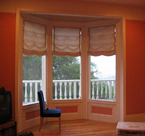
BEFORE: Pacific Heights Bay Window
Above is a Pacific Heights home with a bay window that has tired and dated window treatments. The wall color wasn’t doing it any favors either. It feels a bit dark and old-fashioned, doesn’t it?
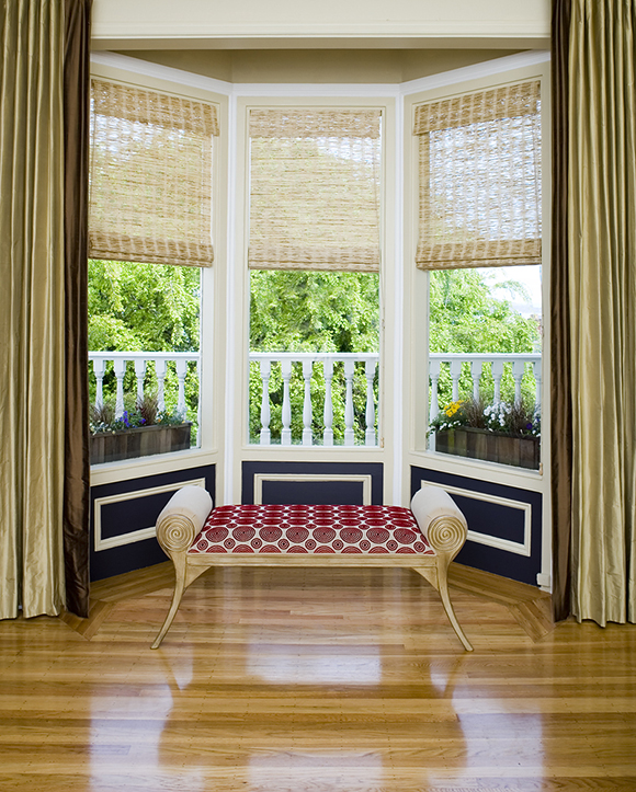
AFTER: Kimball Starr Interior Design / Photo by Eric Rorer
Solution! Replace the old window treatments with silk draperies, change out the rotting linens for natural grass woven shades, and paint the architectural wood paneling so it’s highlighted, a real feature of this home. Add some planters outside the windows, freshen up the white railings and you now have a gorgeous frame for an attractive view!
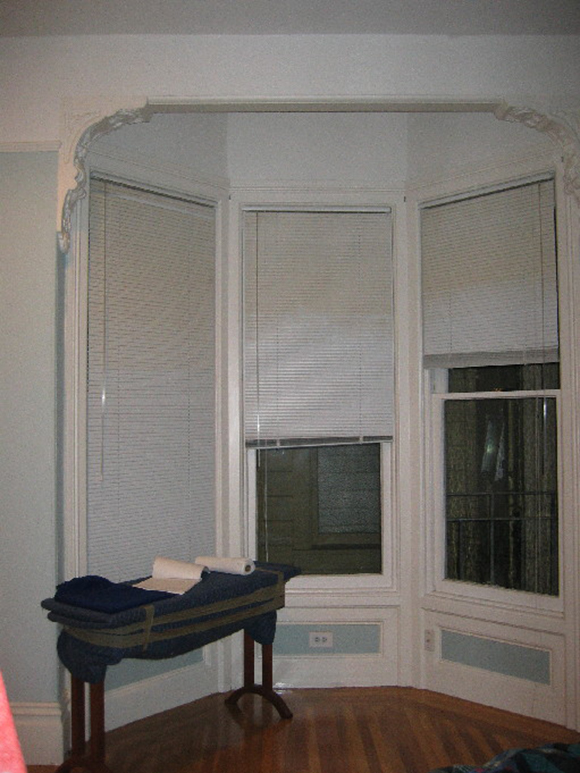
BEFORE: Bedroom Bay Window
In this same home, a matching bay window in the bedroom also needed a lift. Baby blue with white made the window space feel dull and lifeless, and the window shades were outdated.
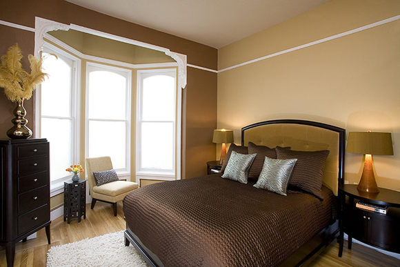
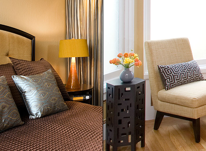
AFTER Bedroom and Window: Kimball Starr Interior Design / Photo by Eric Rorer
We selected colors of chocolate and caramel to evoke a sensual nature and richness in color for the bedroom. Outdated window shades were removed and the windows were frosted for privacy but still allow in light. The picture rail in contrasting white brought the ceiling down visually and adding a comfortable chair for reading completed the makeover of this beautiful bay window.
Do you have windows that you’d rather keep covered? Kimball Starr Interior Design can help you show them off to their best advantage! Contact this SF designer today to transform your home interior!
Kimball Starr Interior Design is an award-winning San Francisco interior design firm providing home design throughout the SF Bay Area.
Labels: bay windows
May 26, 2015 | Posted in How To & Decorating Tips |
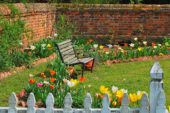
Spring Garden photo courtesy Pxleyes.com
Spring has sprung! You can smell it in the air, so fresh and exciting, when the plants starts to grow and bloom, birds and butterflies are busy and the spring rain is just around the corner (we hope!) The change of season always brings with it an intention to do – what else? – Spring Cleaning! Here are 3 simple tips to make yours swiftly effective and fun.
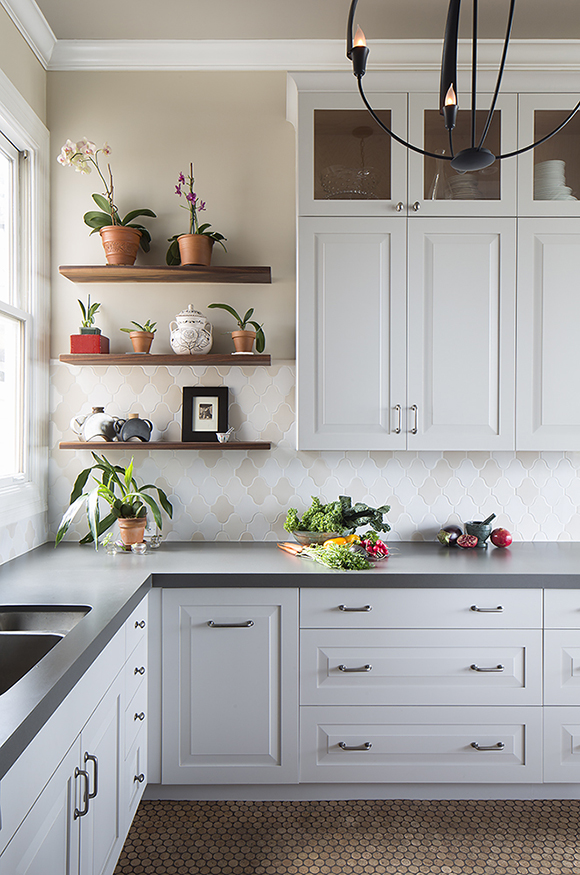
Uncluttered kitchen design by Kimball Starr / photo by Eric Rorer
1) Clean from the top down
Don’t fight gravity! Start by dusting ceiling fans, shaking out curtains, wiping blinds, and definitely do the tops of your cabinets and fridge before you get to the countertops and later the floors.
Use a microfiber cleaning tool to grab dust instead of pushing it around – Rubbermaid, Lowe’s and Walgreens all have low-cost, flexible tools. Choose something washable instead of disposable.
Freshen fabrics – launder sofa and pillow covers. Wash matching items at the same time so they always have the same wear and color. Wash your mattress pad and flip your mattress while hanging your sheets outside for that extra-fresh smell.
Sanitize high-traffic surfaces – doorknobs, drawer handles and light switches deserve extra attention. But skip the antibacterial products – plain dish soap and water or citrus-based products are the best natural antibacterial and don’t contribute to our environmental chemical load. Use bleach sparingly.
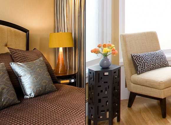
Wash and refresh fabrics when spring cleaning. Pacific Heights apartment by Kimball Starr Interior Design / photos by Eric Rorer
2) Clear the clutter
Visual clutter is disruptive to an effective work life and home life. Banish belongings to hidden storage or eliminate them altogether with these quick steps.
Remove anything that hasn’t been used within the last 7 days – either put it back into its storage location, donate it to a friend or charity, or recycle it. Landfill is the least desirable option so try to find a new home for it first.
Develop and regularly use a storage system – whether that is cardboard boxes labeled with sharpie pen, or clear plastic bins with label maker stickers, or glass jars with canning labels, keeping items separated and clearly labeled makes it easier to find and maintain them over the entire year without a huge investment in time. If it can be done in 2 minutes or less, you’re more likely to keep it up.
Group related objects together in storage – hats, gloves & scarves can go in the hall closet or up in the attic until next winter. Rotating your items seasonally means you have less to wade through in your most-used areas.
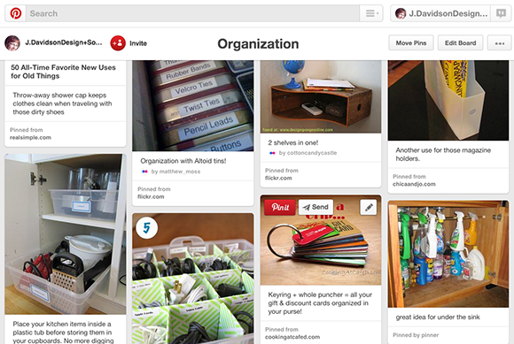
Pinterest Organization Board via J. Davidson Design + Social Media
3) Clip ideas from social media
Don’t be afraid to go someplace unexpected for cleaning advice and inspiration. Social media is full of people thinking about and doing spring cleaning at this time of year, just like you!
Create a scrapbook of ideas – you’ll need a new Pinterest spring cleaning board or a Houzz spring cleaning ideabook for all the great ideas you’ll come across.
Find inspiration – Follow a friend whose organizational smarts you admire. Look up a celebrity. Or go with a brand you trust that is natural and organic.
Celebrate your accomplishments – After you’ve sweated, take some photos to show off your sparkly-clean results! Post them to your social media of choice with a relevant hash tag such as #springcleaning, relax with a glass of wine and wait for the kudos to roll in!
Kimball Starr Interior Design is an award-winning San Francisco interior design firm providing clutter-free interior design for both residential and commercial spaces.
Labels: cleaning, storage, tips
May 17, 2015 | Posted in Trends |
Don’t you just love Spring, with its feeling of renewed energy, trees and plants blooming everywhere and summer just around the corner? Do you wish Spring could last forever? Now it can, if you use the color “Spring Forever” in your home or office!
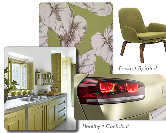
Color Marketing Group, an international association for color design professionals and authority on color in the marketplace, puts it this way:
Celebrate the confident side of nature with “Spring Forever.” This green, with a strong yellow influence, is a hue reminiscent of a cool morning in the garden, as well as a fresh take on your local produce aisle. This is not a fragile green. This spirited color denies any mention of the doldrums, instead appearing self-assured and bold whether appearing in fashion or adapted for home décor. It makes a statement of authority that says, “The difficulty of winter is over! Long live Spring!” Already energizing women’s and men’s wardrobes with a crisp burst of color, “Spring Forever” is arriving in homes and auto showrooms with the power to invigorate a space as well as the highway. From glowing silk, to timeless matte wool to glistening metallic, this green will be with you now and forever.
If you want to use Spring Forever in your interiors but don’t know how to go about it, we can help!
You can also learn about selecting paint colors from Kimball Starr’s television appearances seen in How To Choose Paint Colors: Video 1 and How To Choose Paint Colors: Video 2.
If you’re looking to choose paint colors but don’t know how to make them look their best, contact us, the San Francisco paint color experts for a personal color consultation.
Kimball Starr Interior Design is an award-winning San Francisco interior design firm providing paint color consulting services for both residential and commercial spaces.
Labels: color, residential design