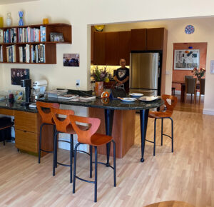
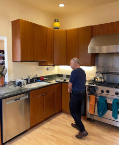
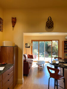
In January I shared photos of a recently-renovated kitchen belonging to my San Francisco clients. Now I’m here to share the glowing review they left me, and show a few before-and-after photos. Enjoy the transformation!
BEFORE – Photo by Kimball StarrAFTER – Design by Kimball Starr / Photo by Gao’s Cabinets
The kitchen is so much more light, open, and functional now.
BEFORE – Photo by Kimball StarrAFTER – Design by Kimball Starr / Photo by Gao’s Cabinetry
We opened up the wall in front of the new prep sink, creating a more unified space.
BEFORE – Photo by Kimball StarrAFTER – Design by Kimball Starr / Photo by Goa’s Cabinetry
The view into the backyard is now a feature, with the kitchen and living areas feeling harmonious with each other and nature. Great result and happy client! Read for the review below or on Google.
Despite being a residential real estate broker with decades of experience, I knew my wife and I would need help redesigning the kitchen of our Noe Valley home, which had seen us through 25 years of hard use.
Our primary interest was in getting help on the interior design and layout aspects of our new kitchen, and here Kimball really excelled. She was meticulous in her measurements and had a great eye for the practical necessities of a busy kitchen (my wife and I both like to cook).
One small detail as an example: Making sure there’d be enough room between the open door of the dishwasher and the end of our peninsula countertop to allow easy access.
She also helped us think through the specific uses of our custom cabinets and drawers so that we’d know we had room for all of our “stuff.”
Though our primary focus was on help with layout, Kimball also helped us select finishes. My wife’s and my design aesthetics are often not the same, and Kimball was very careful to be respectful of both of us. In fact, at a certain point we asked her to be more assertive of her own opinions and she responded accordingly.
As others have said, Kimball is not interested in pushing her own views; rather, she listens to what you want and helps to execute it. We really appreciated that.
The proof of the pudding is that we absolutely love our new kitchen! It “works” in all the ways we wanted it to. Besides this, Kimball was available, organized, always pleasant, easy to deal with, and very affordable. Easy 5 stars!
~ Google Review from user Misha W.
Kimball Starr designs contemporary homes throughout the San Francisco Bay Area and Lake Tahoe. Contact her today for a remote or in-person consultation.
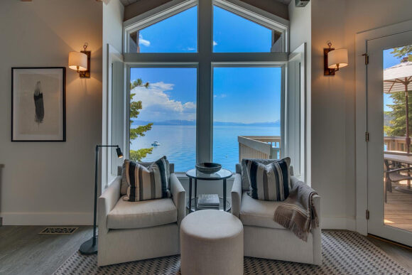
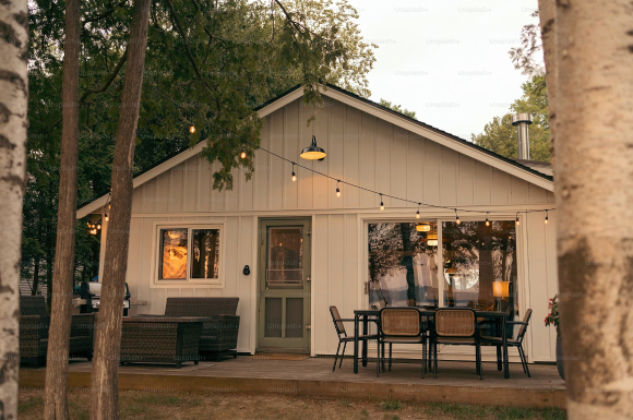
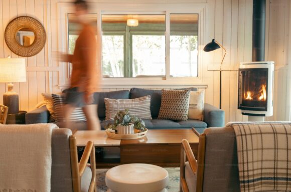
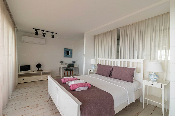
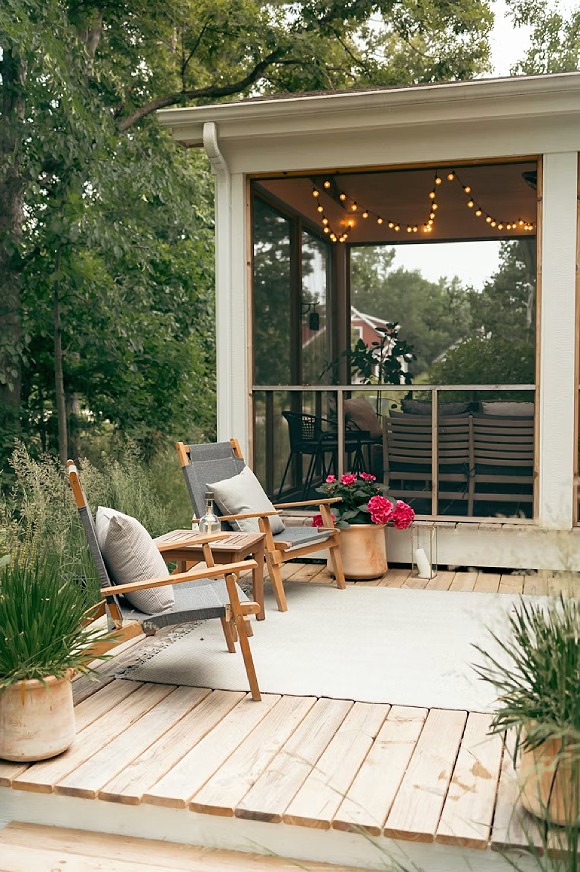
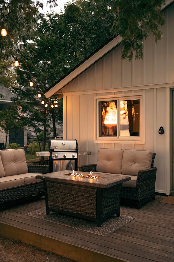
Want a vacation escape at your home, with no traveling required? Even better, a space you can rent out when you need extra income. Here are some ideas.
This isn’t a full rental, so you don’t need to provide a kitchen. People don’t want to cook on vacation! Just give them a cozy spot to relax, and a table for take-out.
Amenities like a dry bar, fire pit, or BBQ will attract vacationers, and be fun for you, too!
Kimball Starr designs beautiful homes with backyard buildings / ADUs throughout the San Francisco Bay Area and Lake Tahoe. Contact her today for a remote or in-person consultation!
I’m frequently asked how to transform dark, cramped bathrooms into light and airy spaces. Oh, and also to make the space look high-end, luxury, or upscale as well, without breaking the bank. A request that might seem impossible, but I’ve done it here!
Design by Kimball Starr / Photo by David Duncan Livingston
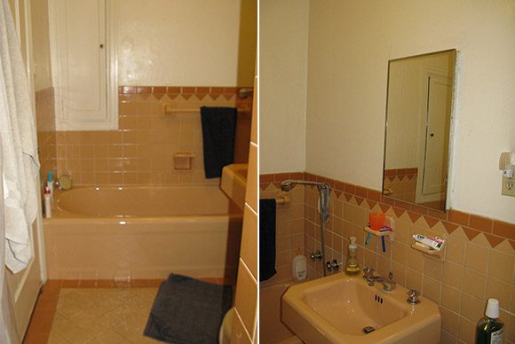
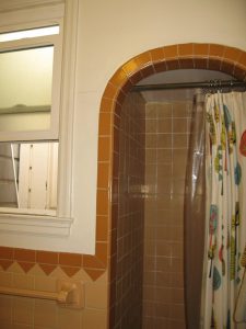
This San Francisco bathroom was drowning in dark, outdated tiling with the toilet, tub, and sink all in tan. While I appreciate the effort from the original installer to color-coordinate everything, it unfortunately hasn’t stood the test of time, as you can see below in these “before” photos I took on-site.
BEFORE photo by Kimball Starr
The lonely mirror looked unfinished above a motel-style tiled edge, and the lighting was severely lacking. Those triangle tiles remind me of broken teeth!
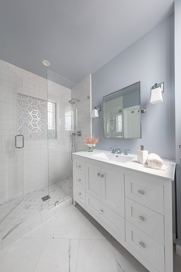
Design by Kimball Starr / Photo by David Duncan Livingston
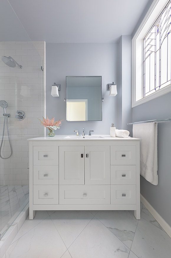
What a change in the AFTER! To make the room feel bigger, I turned the floor tiles at a 45-degree angle, which visually widens the space and feels more welcoming, and kept the color palette to pale light tones. The angled flooring is repeated in the shower pan in a smaller-scale pattern, the repetition of materials visually elongating the entire bathroom. All the flooring is durable, stain-proof, and maintenance-free porcelain that replicates the look of Calacatta marble.
Design by Kimball Starr / Photo by David Duncan Livingston
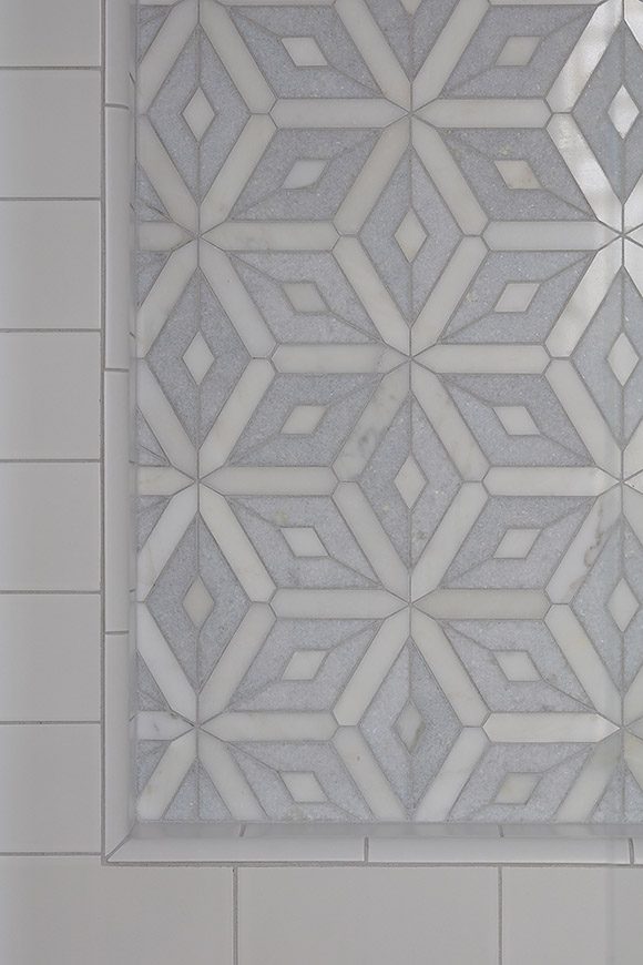
To create a high-end look, we added a custom detail for the shower niche. We splurged on real Calacatta and blue Celeste marble, and had our custom pattern fabricated just for us. The added bonus of having the marble recessed inside the niche and on a vertical surface means there will be minimal issues with staining.
BEFORE photo by Kimball Starr
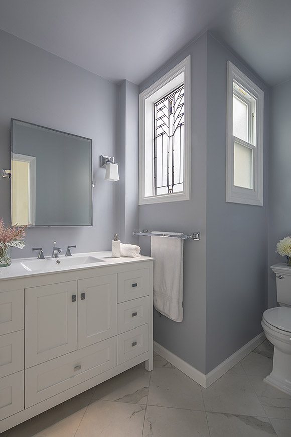
Another way I opened up and lightened the space was by relocating the toilet where the shower enclosure was previously located. That allowed us to remove all the old shower tile, add a second window for more light, and brighten up the walls with a soft shade of blue.
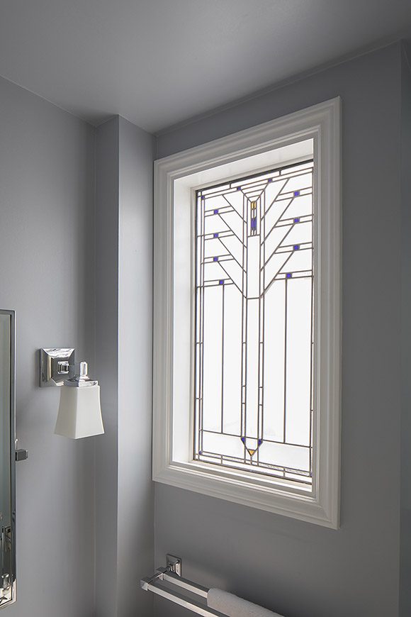
Design by Kimball Starr / Photo by David Duncan Livingston
A favorite custom detail is the stained glass window. The homeowner found a pattern she loved, and we had the stained glass window fabricated for us, installed to the right of the vanity. Custom elements like this and the marble shower niche elevate a simple utilitarian area into a higher-end space that’s unique and sophisticated.
Design by Kimball Starr / Photo by David Duncan Livingston
Completing the bathroom with paint in a soft powdery blue color gives enough contrast to the white fixtures and finishes to make the space interesting, while maintaining the serene and airy look.
If you’re due for a bathroom update, and are excited to bring in custom design elements for a luxurious space, contact Kimball Starr today!
Kimball Starr Interior Design works with homeowners all across Northern California to create beautiful “afters” of bathrooms, kitchens, and interior spaces throughout your home. Message her for a remote or in-person consultation.
I’m so proud to announce that we’ve been awarded Best of Houzz for the 14th time, as winners of the Houzz Design category this year!
There are new projects in our Houzz profile featuring fully renovated properties and smaller projects such as custom kitchens, bathrooms, and bedrooms, so please go enjoy yourself.
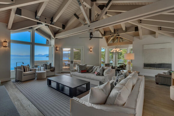
Design by Kimball Starr / Photo by Client
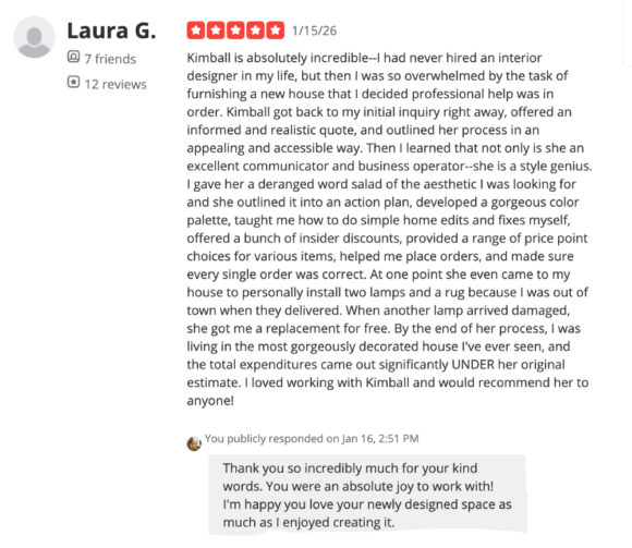
It’s also my pleasure to share that one of my clients wrote a glowing Yelp review of our project together. I’m thrilled that she loves it so much.
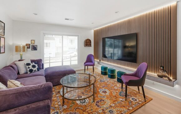
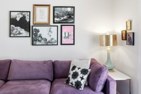
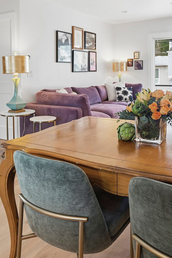
Design by Kimball Starr / Photo by Client
What a fabulous use of color – AND she’s one of my favorite clients of all time BECAUSE of her desire for color and texture!
Design by Kimball Starr / Photo by Client
You have to experience the space as a whole, because the colors draw you in further as you see how the dining room tones with the kitchen, and the living room contrasts with the dining area.
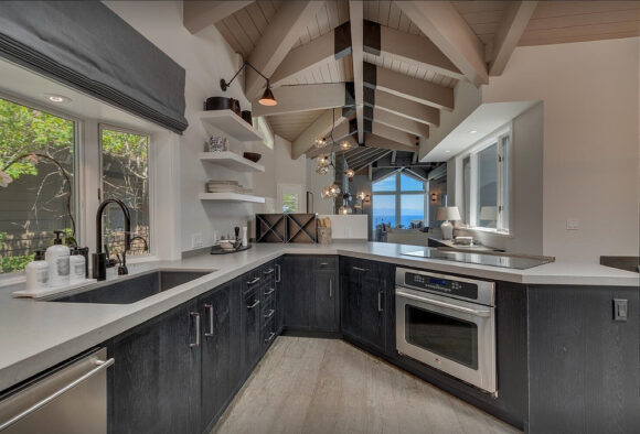
Design by Kimball Starr / Photo by Client
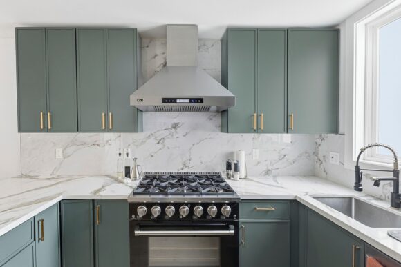
Green is still a popular kitchen color, especially when mixed with gold hardware, black accessories, and white marble surfaces.
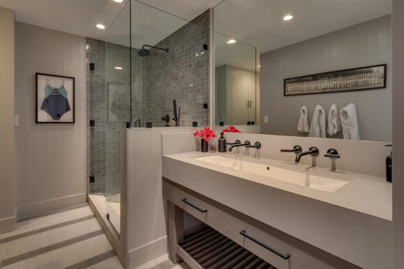
Design by Kimball Starr / Photo by Client
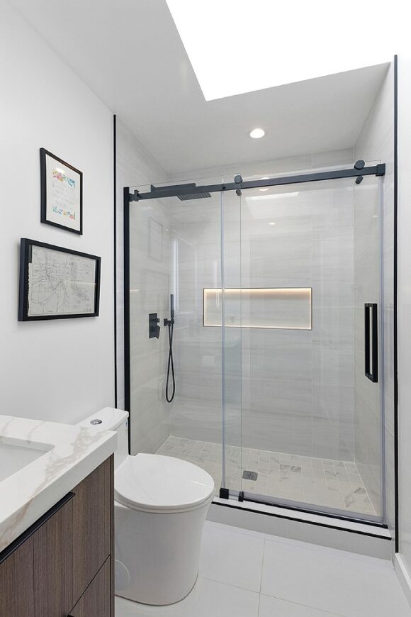
In the bathroom, black hardware counterpoints the oversize white floor tiles, and a modern lighted shower niche inset is beautiful and useful.
Client review courtesy Laura G. and Yelp
If you have questions about materials, colors, methods, or furniture, I’m happy to answer.
Kimball Starr designs beautiful homes throughout the San Francisco Bay Area and Lake Tahoe. Contact her today for an in-person or remote consultation.
Do you have a shed in the backyard, or want to get one? Here are some inspiring ideas what to use it for — I’d LOVE to help convert or install for you!
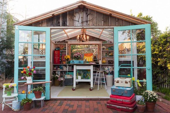
Cottage Glam
Photo courtesy OneKindDesign
Combine cottage style with chic chandeliers for a glam chillout space.
Skip the kitchen and bathroom to make an ADU-less area under 120 sq. ft. that’s comfortable for friends and family, and can be easily uninstalled when you move.
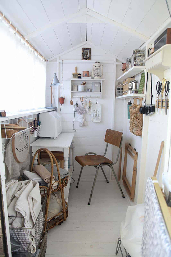
Sewing Shed
Photo courtesy OneKindDesign
Corral the mess from sewing supplies, allowing you to spread out. A sheer blind hides everything from view while allowing in sunlight.
Craft Studio
Photo courtesy OneKindDesign
All your crafting and artwork supplies neatly at hand, while working in natural sunlight.
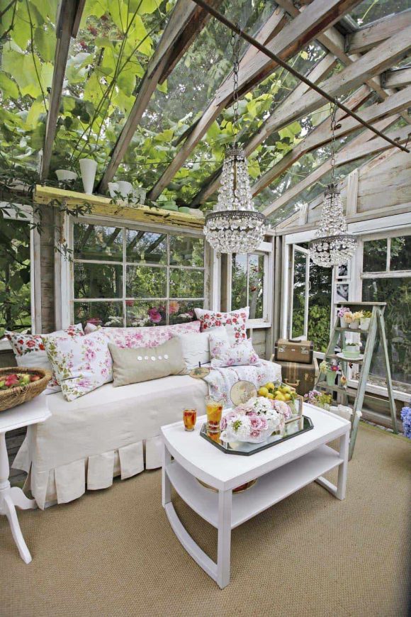
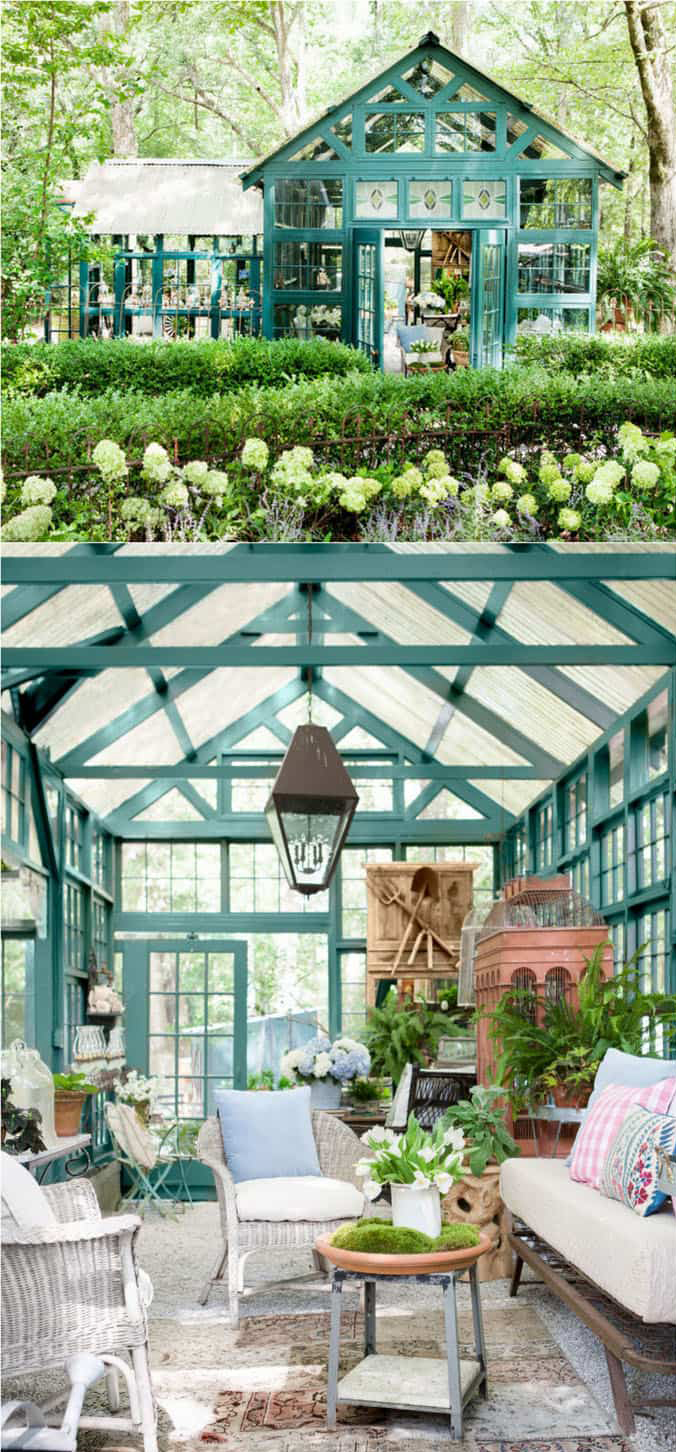
Greenhouse Glass
Photo courtesy apieceofrainbow.com
An old-fashioned greenhouse becomes a beautiful seating area, with a few choice furniture selections.
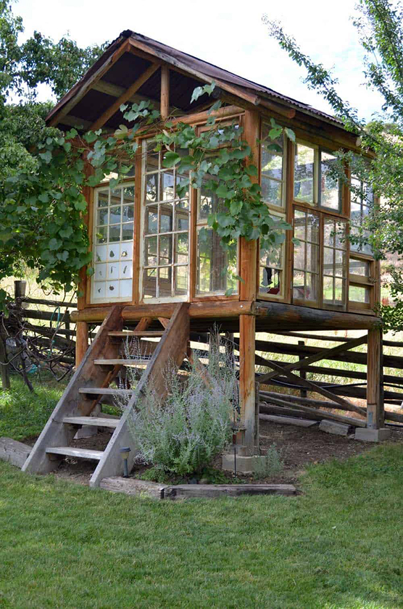
Potting House with a View
Photo courtesy OneKindDesign
Made entirely out of reused windows, this potting house shed loves the sun!
Create a gorgeous, functional space with Kimball Starr Interior Design! She designs homes throughout the San Francisco Bay Area and Lake Tahoe. Contact her today for an in-person or remote consultation.