Combine Color Creatively
![A tangering and orange colored bedroom, with multiple patterns, textures, and several layers of pillows on the bed, plus tan blanket, white sheets, and orange comforter on a dark brown wood bed.](https://kimballstarr.com/wp-content/uploads/2020/03/Kimball-Starr-Interior-Design_Blog-Wellness-Color-Bedroom-Tangerine-580x387.jpg)
When you look through my interior design portfolio, one thing that new clients often mention attracted them is my use of color combinations. I’m confident in using color boldly to transform interior spaces, and I can help you gain color confidence, too. Here’s a peek into my process.
Monochromatic Color Scheme
![A color wheel, showing multiple shades of each color, starting with reds at the 5-minutes-after-the-hour-on-a-clock position, oranges at 10 minutes, yellows at the 15-minute position, green yellows at 20 mins, greens at 25 mins, blue greens at 30 mins, blues at 35 mins, blue violets at 40 mins, violets at 45 mins, mauves at 50 mins, mauve pinks at 55 mins, and pinks at 12 o'clock. The blue violet pie-shaped slice at the 40 min mark is pulled slightly out from the circle.](https://kimballstarr.com/wp-content/uploads/2020/10/Kimball-Starr-Interior-Design_Blog-Combine-Colors_Monochromatic-Color-Wheel-via-Deposit-Photos-580x409.jpg)
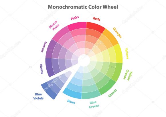
One of the simplest ways to be assured your colors will go together is by using variations of the same color, just in different values or tints, called a monochrome. Monochromatic designs often use neutrals such as grey or tan, but could just as easily be made with blue.
![A bedroom designed in multiple shades and hues of blue, from floor tiles, to striped bedside rug, to wooden headboard with lamp, and blue pillows and sheets. A small white bunch of flowers sits on the bedside table nearly center of the image.](https://kimballstarr.com/wp-content/uploads/2020/10/Kimball-Starr-Interior-Design_Blog-Combine-Colors_Monochromatic-Blue-via-Architectural-Digest-580x773.jpg)
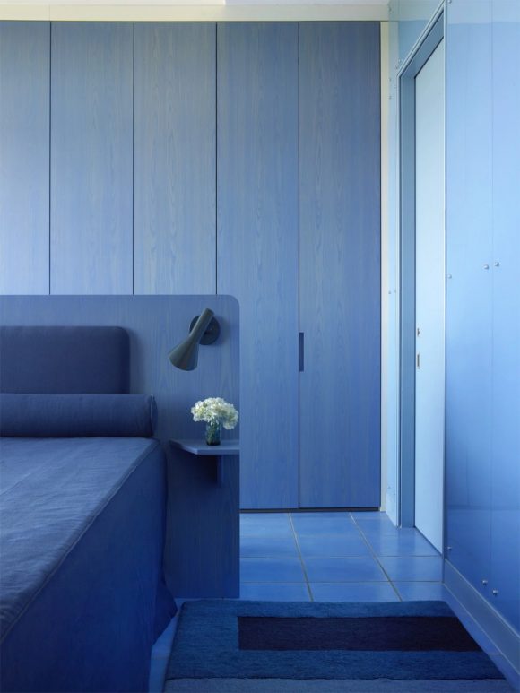
The key to this type of color combination is to create a balance by using several variations of your main color, then just a pop of a contrasting color to give it life, such as shades of light and dark grays accented with a touch of lime green.
![](https://kimballstarr.com/wp-content/uploads/2020/10/06A0903-580x870.jpg)
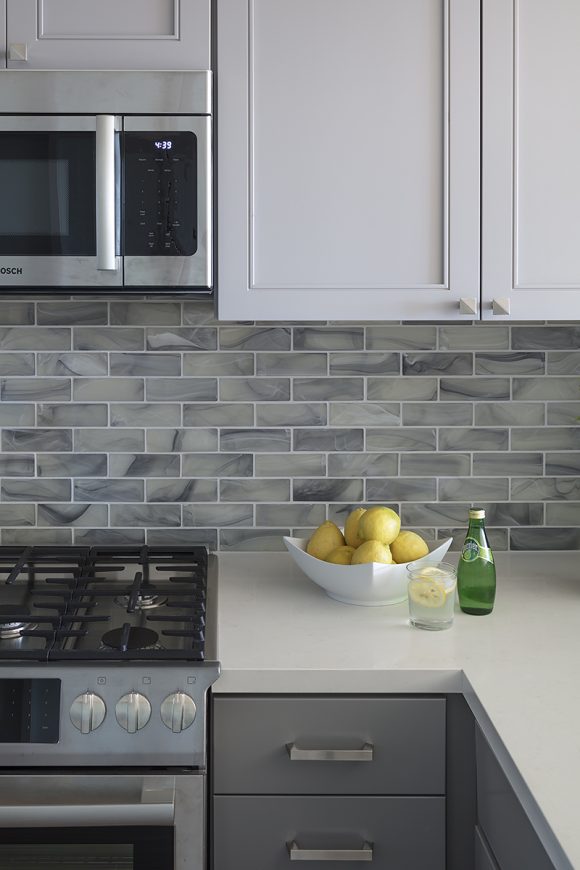
In the kitchen above, designed for a San Francisco bachelor who wanted something timeless and chic, variations of grey upper and lower cabinetry with silver drawer pulls, stainless steel appliances, and sleek subway tiles work together to provide a soothing backdrop, so the fruit and green glass bottle on the counter really stand out, as would any fresh food you’re preparing and serving.
Complementary Colors
![A color wheel, showing yellow at the 12 o'clock position, orange at the 10 mins after position, red at 20 mins, purple at 30 mins, blue at 40 mins, green at 50 mins. Three crossed arrows lead between yellow as primary and purple as complementary, blue as primary and orange as complementary, red as primary and green as complementary.](https://kimballstarr.com/wp-content/uploads/2020/10/Kimball-Starr-Interior-Design_Blog-Combine-Colors-Color-Wheel-Complementary-Primary-via-Craftsy.jpg)
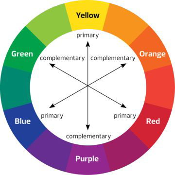
Another easy combination is complementary colors. Primary colors, which are yellow, red, and blue, are the building blocks for creating all other colors. Specific paint mixture combinations of two primary colors will create the secondary colors of either green, orange, or purple. A complementary color scheme is defined as a primary color matched with its secondary color shown directly across from it on the color wheel.
![Photo of the end of a mustard yellow sofa with tufted back pillows and rounded arms on dark wooden round leg, in front of a mauve-pink wall color. The pink is echoed in a plant cutting in a large green glass vase on a brass and glass table in front.](https://kimballstarr.com/wp-content/uploads/2020/10/Kimball-Starr-Interior-Design_Blog-Combine-Colors-Complementary-Yellow-Purple-via-One-Kings-Lane.jpg)
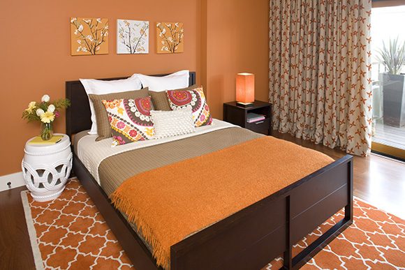
Pairing a primary with its complementary color creates a harmonious balance. For example, red and green, which we use often for Christmas and holiday traditions. Yellow and purple is bright and energetic, seen in sports teams and also as a trending interior design combination this year. Blue and orange is so popular in graphic design and color correction for film and television that there are whole YouTube essays about this combination, and why we’re attracted to it.
![A contemporary kitchen with warm orangey wood doors and slatted wall around the sliding window. White countertops, drawers and cabinets have black handle pulls. Dark blue bottom cabinets on the kitchen island have matching handles. A silver oven and cooktop under a silver hood is surrounded by blue and white wavy backsplash tiles.](https://kimballstarr.com/wp-content/uploads/2020/10/Kimball-Starr-Interior-Design_Blog-Combine-Colors_Complementary-Color-Scheme-Blue-Orange-Kitchen-580x407.jpg)
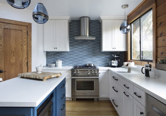
The Bay Area farmhouse kitchen above is a good example of blue and orange, where the orangey color of the wood stands in a for a true orange. It’s important to work with the dominant color and features in your home, to enhance the beauty instead of fighting it. This home has a very cabin-y feel with all the exposed knotty wood, but the blue color complements the wood comfortably, making it feel both homey and modern.
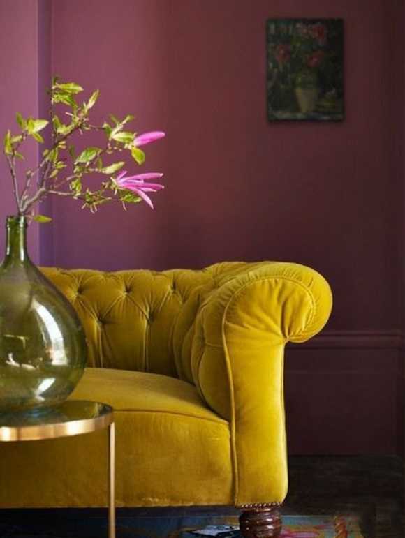
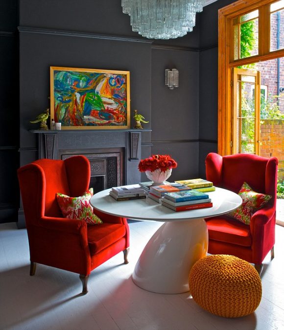
Split Complementary
![A main color wheel on the right is offset by smaller multiple examples of types of color pairings in circles to the right. The one we want to focus on is split complementary, which shows yellow at the 12 o'clock position, and two shades of purple and mauve at the 25 mins and 35 mins positions.](https://kimballstarr.com/wp-content/uploads/2020/10/Kimball-Starr-Interior-Design_Blog-Combine-Colors_Split-Complementary-Color-Wheel-via-Getty-Images-580x371.jpg)
A more advanced combination is that of split complementary, where you select two colors that are one color apart from each other on the wheel, and then one directly across from those.
![A living room with teal walls is complemented by a bright yellow chair seated to allow discussion with a white sofa filled with pink, teal, and yellow throw pillows. On the wall are matching framed art. There is a sideboard dressed with tall vases and two hot pink candles in brass candleholders. A multicolored horizontally striped lampshade matches the color scheme. Long drapes that start as white at the top and become darker shades of teal as they descend to the floor flanks a large picture window with plants outside. A round pendant light peeks from above.](https://kimballstarr.com/wp-content/uploads/2020/10/Modern-green-living-room-with-painterly-effects-920x920-1-580x580.jpg)
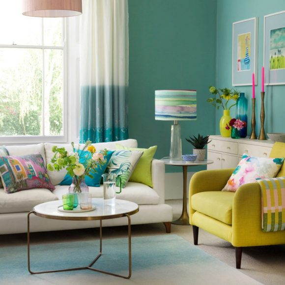
In the design above, chartreuse, teal, and pink combine beautifully to exude both calm and energy simultaneously. Below is an example of a split complementary scheme of red, orange, and pale turquoise, found in the chandelier, which also picks up the bluish undertones of the wall color.
![A split complementary colored living room with red wingback chairs, a white table dressed with colorful books, an orange pouf as a footrest, orange window frame, a dark grey back wall with a fireplace and a colorful framed piece of art sitting on the mantle, with a glass chandelier hanging overhead.](https://kimballstarr.com/wp-content/uploads/2020/10/47-Park-Avenues-home-FrenchyFancy-25-580x674.jpg)
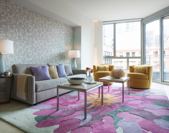
In my own design below, lilac and fuchsia with a splash of yellow liven up foggy San Francisco days. Don’t forget that color has a strong effect on mood, so pick something you love to fill your home with joy.
![A San Francisco condo living room with grey patterned wallpaper to the left, and large floor to ceiling windows to the right. In front of the windows sit a pair of mustard-yellow tub chairs, and two square coffee tables dressed with bowls and vases. To the right, a long grey sofa dressed with purple and yellow pillows, and a yellow blanket is hung over one arm. A pair of white lampshades with blue glass lamps flank the sofa. The rug is the centerpiece of the room, being shaped and colored like a huge lilac, purple and fuschia flower with a yellow center.](https://kimballstarr.com/wp-content/uploads/2020/10/Kimball-Starr-Interior-Design_Blog-Combine-Colors_Split-Complementary-Color-Scheme-Pink-Fuschia-Yellow-Living-Room-580x457.jpg)
If you want to use color boldly, work with Kimball Starr Interior Design! She creates beautiful homes in the San Francisco Bay Area and Lake Tahoe. Contact her today for a socially-distanced in-person or remote consultation.