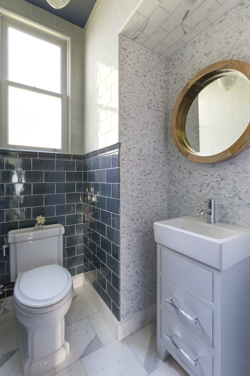
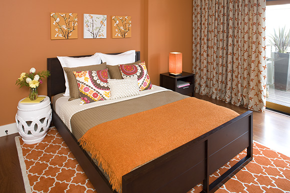
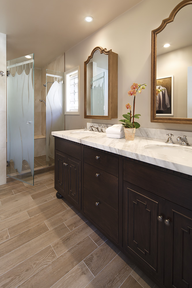
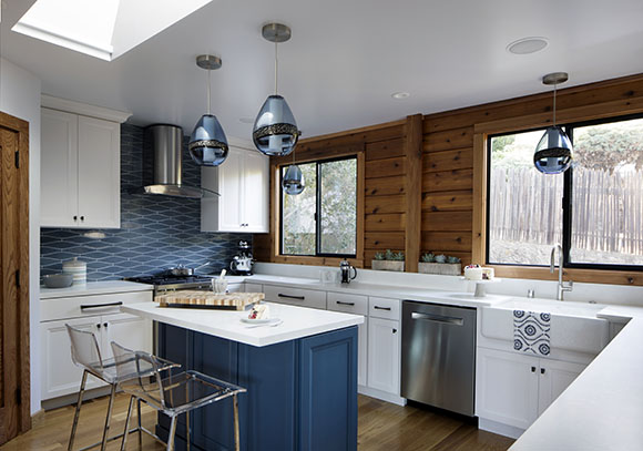
Drop a pin on a map anywhere in Northern California and you’re already close to water – an important element in luxury home design. Today I’m sharing a few aspects of California coastal style that will make your spirit soar!
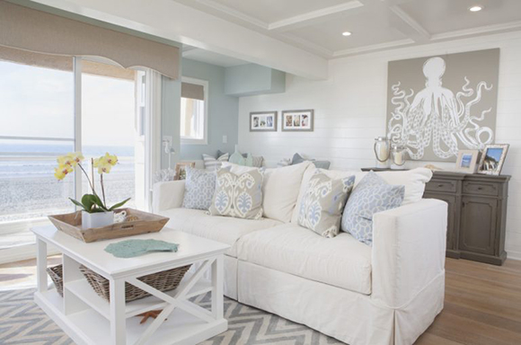
Image courtesy Coastal Farmhouse.com
Neutral Color & Texture Palette
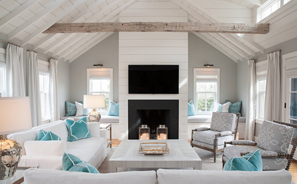
The coastal color palette is simple, light and breezy. Create a foundation with neutrals, then layer in some pops of color, such as the traditional navy blue and white, or a fun turquoise. Texture is also considered a key neutral element here, with use of wood, bamboo, rattan and other natural materials adding to the textural feeling.
Image courtesy CoastalLiving.com
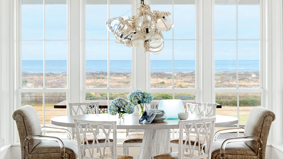
Sun, Sand, Surf, and Outdoor Dining
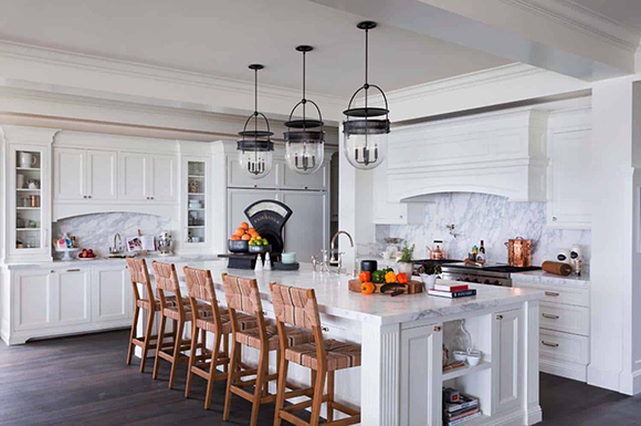
Use all your senses to recall those magic moments, by bringing in the basics of water, sand, wind, and sun to your design. Indoor-outdoor dining is a key element here, year-round. If you don’t always have the best weather, pull that breezy feeling indoors, as in this Cape Cod-inspired kitchen.
Photo courtesy OneKindDesign.com
Let Light In
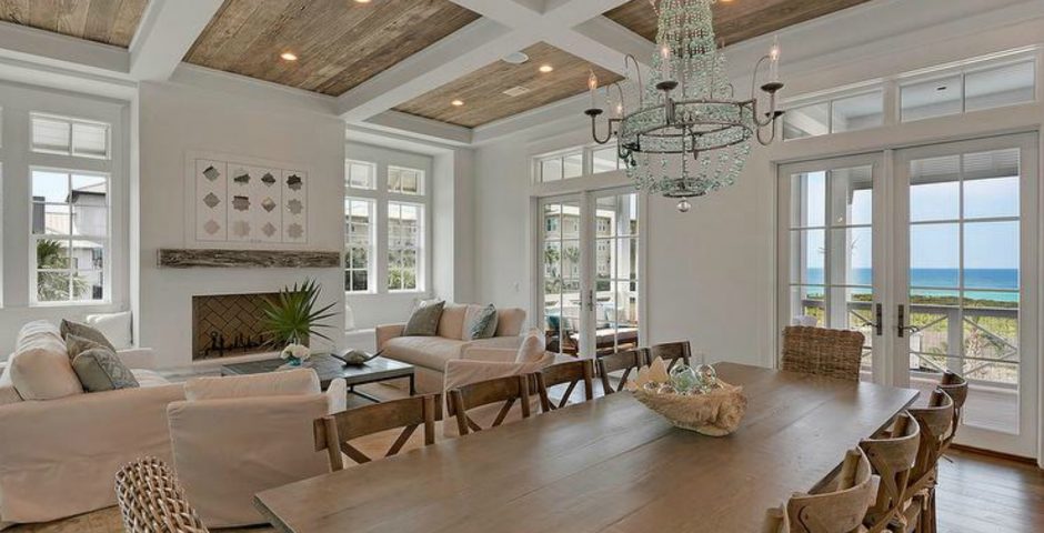
Coastal designs blur the line between indoors and out – plenty of windows, glass doors and skylights, all essential elements that allow light and the sunshine to flood in. To fake it, add lamps and sconces, place a glass-topped table in a sunny breakfast nook or mount a mirror opposite a window. Trade in heavy draperies for light fabrics, or take down the curtains altogether and replace with simple shades. The hallmark color of a coastal home is white, because it allows light to bounce and dazzle.
Image courtesy CoastalFarmhouse.com
If YOU want to refresh your home in the coastal style, contact Kimball Starr to make your ocean retreat a reality.
Now that the summer months are here, my thoughts turn to travel, especially to those countries near water. One of my personal favorite interior design styles was popularized overseas, and is just as relevant along the Northern California coastline: The Mediterranean style originated in countries north of the Mediterranean Sea, such as Spain, Italy, and Greece. Let’s take a look at what makes this style so enduring.
Image courtesy DiscoverGreece.com
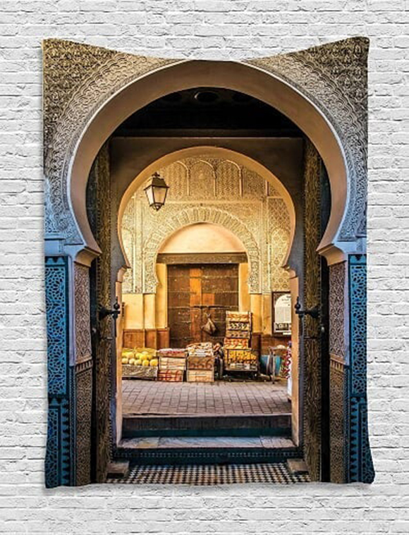
When we talk about Mediterranean style, you may think of whitewashed buildings high atop steep cliffs above Santorini, the city lights of Monaco, or fields of Tuscan wineries. I imagine white sand beaches and bright blue waters along the Turkish coast, and colorful tapestries hung in a Moroccan market.
Image courtesy Mercari.com
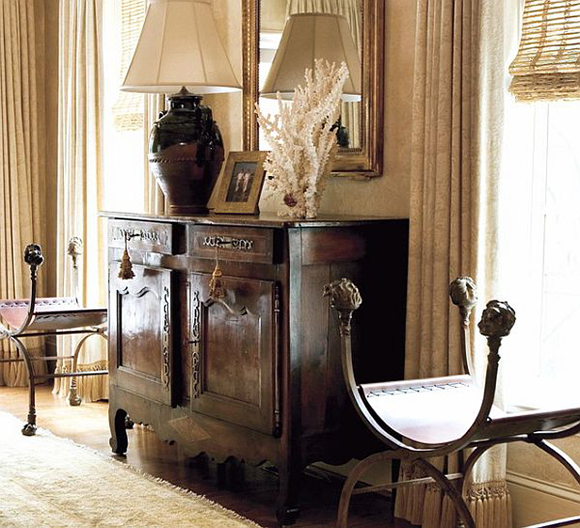
Furniture in the Mediterranean style ranges from formal to functional, with ornately turned legs and feet. Furniture hardware can often be heavy and include burnished metal details.
Image courtesy Decoist.com via Pinterest
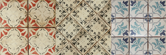
Mediterranean colors echo those of the sea and sky, and, depending on the region, can also include terra cotta, lavender and yellow. Mosaic tile designs embody the colors of the Med, and blend easily with many design styles. Bring tiling designs into your home on flooring, a kitchen backsplash, or on something you can take with you if you move, like a mirror frame or a tabletop.
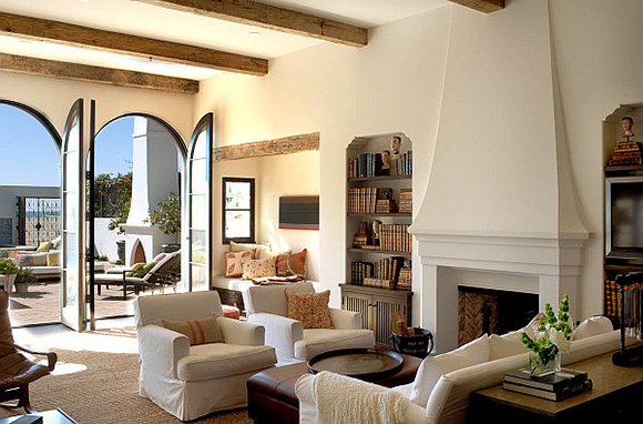
Another popular Mediterranean style accent is exposed wood beams, often paired with gleaming white marble floors or white walls.
Image courtesy Decoist.com via Pinterest
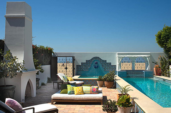
People of the Med adore their outdoor spaces, so make sure your interiors flow easily into an exterior dining area or patio, and you can’t go wrong. Arranging your outdoor seating around a water feature is also a popular approach.
Image courtesy Decoist.com
The outdoor lifestyle of the Med often includes a veranda or an open interior courtyard, to optimize for the warm, sunny weather. This is another place you’ll see colorful geometric tiling, or sometimes even pure white, and plenty of healthy plantings, so that’s an easy way to get the look, by layering in plants and tiling.
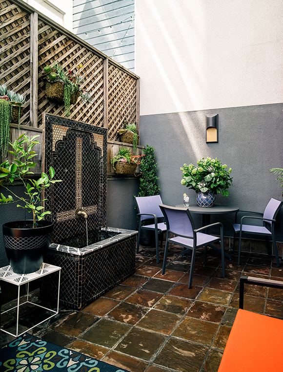
Design by Kimball Starr / Photo by Eric Rorer
Here’s a Med-inspired courtyard deck I designed for a San Francisco SOMA loft. The stunning water fountain imported from Morocco features an uplight for dramatic nighttime scenes. It’s surrounded by large-scale textural floor tiles in multiple colorations, and a stylized patterned outdoor polypropylene rug that resists fading, which can be hosed off for easy maintenance. The entire space is dotted with easy-care live plants, including the succulent wall hangings on the trellis behind the water feature. An LED sconce will light the space for 50,000 hours before it needs changing. Durable outdoor furniture withstands the weather and remains welcoming, making this truly an outdoor living room.
Do YOU have a Mediterranean-style project that wants to be realized? Kimball Starr Interior Design can help with a consultation. Contact her today!
If you plan to re-do your home for the winter holidays, NOW is the time to start planning! I know it seems like winter is a long way off, but July is the perfect time to consider your options for a bathroom renovation or just replacing your furniture for a fresh look. Here are some valuable tips to ensure your project finishes on schedule.
Design by Kimball Starr / photo by David Duncan Livingston
Scope of the Project
Think about the scale of what you want to accomplish. If you want to re-do your kitchen, bathroom or living room, is this a complete remodel, or is it only new furniture? Does this involve a contractor and structural changes? Are we changing windows, tile and other finishes, or are we just replacing furniture? If it’s furniture, is this a full-house refurnish or just a couple of rooms?
A lot of folks think the project with the contractor will take longer, but you’d be surprised to learn that a whole house of furniture can often take far longer than a small remodel, due to furniture ordering, production, and delivery lead times.
If you’re replacing furniture without major construction for holiday hosting, plan for 3 months minimum from when you order to when you get it in house, so this is important to start early. 10-12 weeks for furniture is a good rule of thumb: 8-10 weeks to order plus 2 weeks to ship. But not if you’re doing an entire house!
If you’re doing living, dining and master or guest bedroom, plan for 3 months to receive the furniture, plus another 2-4 months for furniture plan, meetings, review and the order process, depending on scope and how quickly the decisions are made.
Design by Kimball Starr / photo by Eric Rorer
Steps of a Renovation
What if you want to fully renovate your powder room? Here are the steps:
1. Hire a contractor, who leads the
timeline and drives the schedule.
2. Come up with a design plan – permit
drawings will be required.
3. Execute the plan, managing deliveries
and services from professional installers.
4. With construction, you need time to fix
errors, which is called a “punch list”, and complete the final details. This
part often takes longer than expected.
In our furniture example, finishing details such as art and mirrors come last but do take time, so don’t forget to plan for what I think is the best part!
Design by Kimball Starr / photo by David Duncan Livingston
Account for Delays
Definitely account for potential delays in your plan. If any of the furniture or finishes you’re ordering is European, everyone goes on vacation in August, so that’s an entire month you can’t get anything done if you’re buying from anywhere in Europe. Same thing with Thanksgiving and Christmas here in the United States: Warehouses, production facilities and even showrooms may close for two weeks or more, so plan for these delays.
Then there’s delivery. Should things become damaged in shipping, you’ll need some extra time to either repair or replace. Shipping companies are often understaffed and people get a little careless when they’re rushed, so mistakes can happen. Aim for November BEFORE Thanksgiving, rather than December. Then if there are unexpected delays, you’ve bought yourself some time to work with.
Design by Kimball Starr / photo by Paul Dyer
Renovation Timelines
In my experience, a bathroom remodel will take about 2-3 months from demolition to conclusion. This is realistic to finish before the holiday season, especially if it’s a small bathroom, and client decisions can be made quickly. I suggest 1-3 months for the design planning process, including designing the floor plan and selecting finishes. This can vary based on the scope and level of detail, plus how quickly decisions are made.
Now, a full kitchen renovation will take at least 3-5 months, from demolition to completion of all details. For the design process, again, it can take anywhere from 2-4 months for planning, layout, selection of fixtures and finishes, and final decisions. Plus, then you might decide you need to change recessed lighting, or re-do the attached/related areas of the space, so it feels complete. If you start now, you could potentially finish your kitchen in time to be cooking Thanksgiving or Christmas dinner for your guests.
Design by Kimball Starr / photo by Eric Rorer
Hiring Professionals
While some people do manage renovation projects themselves, it’s good to hire professionals, especially if you have a very tight schedule. Drawing up a floor plan seems like it should be quick, but if you don’t know about things like clearances or required circulation space for fire codes, you could find yourself in hot water quickly. That’s why hiring a designer is a great idea.Plus, a designer can help you select a trustworthy local contractor, a very important decision in any home renovation project. The designer can communicate with and manage the contractor and installation professionals, which can keep your project on schedule and on budget. This is a must for a project that needs to finish in time for your holiday guests to arrive!
Design by Kimball Starr / photo by Eric Rorer
If YOU want to renovate your bathroom, kitchen or bedroom in time for the winter holidays, call or email now! Kimball Starr offers complimentary consultations to explore your ideas.
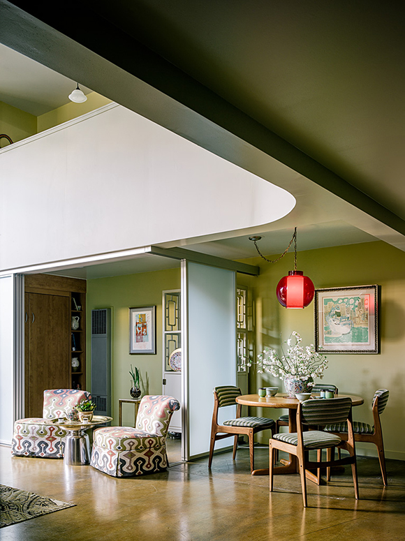
AFTER Design by Kimball Starr / photo by Joe Fletcher
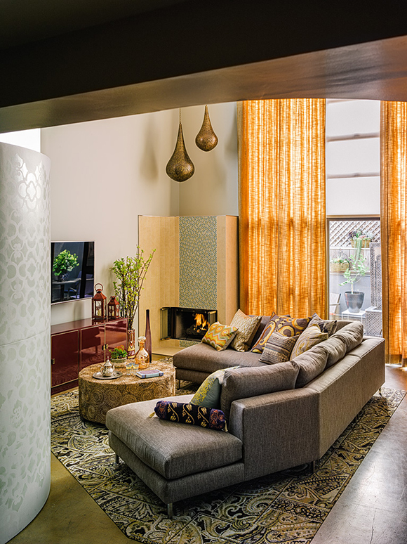
Ever been to a mid-century Moroccan bazaar? That’s the feeling we created for an underutilized San Francisco loft. To see how we transformed an empty space into a sumptuous home by mixing global style with midcentury modern flair, read on!
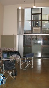
BEFORE – living room and doorway to patio
When you compare the after at top with this before photo, the change is quite dramatic. We removed the clunky metal vertical blinds and replaced them with light-filtering soft draperies, and got rid of the loud air conditioner, unnecessary in San Francisco’s temperate climate.
AFTER Design by Kimball Starr / photo by Joe Fletcher
After our redesign, we lightened the space by replacing a solid wall with retracting opaque ones. You can just see a convertible bed closed on the left wall, allowing for more living space. In front, a Moroccan metal table and a pair of patterned slipper chairs provide additional seating. The guest bedroom wall now separates the open-plan dining space, featuring midcentury modern dining table and chairs in coordinating colors. Combining the Moroccan influence with midcentury style creates a fun atmosphere!
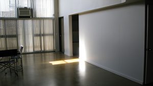
BEFORE – living room and guest bedroom wall
In this before image, you’re seeing a temporary wall used to create a storage area tucked underneath the loft’s upstairs master bedroom, which we opened up by replacing them with the opaque retracting walls, and creating an open plan dining space. The entire area was veiled in shadow, before that change.
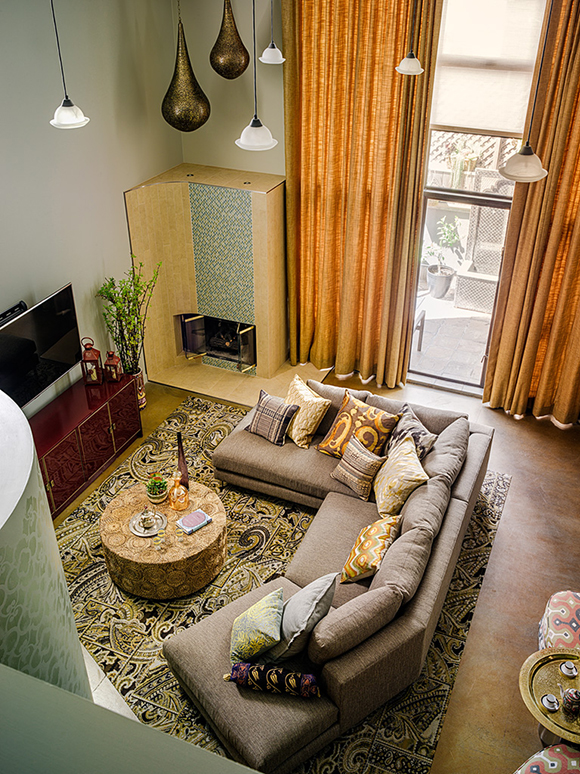
AFTER Design by Kimball Starr / photo by Joe Fletcher
In this after
view from above, authentic Moroccan brass teardrop pendants fill the high space
above the custom-designed curved fireplace, and dramatic 18-foot-high golden
draperies emphasize the room height and capture sunlight with a backlit glow.
Hanging the hand-pierced brass pendants down to the top of the fireplace lowers
the visual focus and adds a stunning design element.
To create a more intimate space in the
living area, long white glass pendants visually lower the ceiling directly over
the seating. The global-patterned living room rug was custom-cut at an angle to
echo the lines of the sofa, creating room for the adjacent pivoting bookcase on
floor casters. By customizing the shape and size of the rug, we’ve defined the
living area zone and created an inviting and intimate space. We juxtaposed the midcentury
elements with stylish global pieces like the Chinese-inspired red lacquer
sideboard, used as a media unit below the TV.
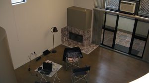
BEFORE – overlooking the living area from the loft
Before, overlooking the living area from the loft, showing the fireplace and bare bones of the space. You can really see what a difference zoning makes!
AFTER Design by Kimball Starr / photo by Joe Fletcher
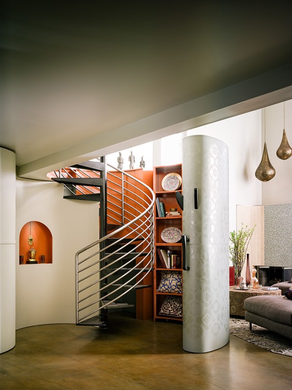
With a change in color for the modern staircase rails and a high-gloss shelving interior, the addition of global textures and patterns, and coordination with a pop of color in the nearby wall niche, now the stairs are a fascinating journey to a higher plane of relaxation. The authentic teardrop pendant lamps display our Moroccan influence, while the modern lines and finishes neatly tie in with midcentury style.
BEFORE – loft bedroom circular staircase
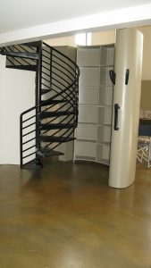
To get up to the loft’s master bedroom, you navigate a circular staircase. It already had this cool pivoting bookcase wall that curls neatly around the stairs, but it was stark and office-y looking.
AFTER Design by Kimball Starr / photo by Joe Fletcher
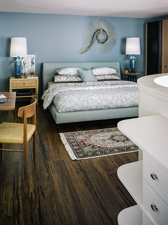
After, built-in storage leads you toward a sumptuous, relaxing bedroom. The lines of the built-in follow the stranded bamboo flooring into the sleeping area, featuring a beloved vintage rug I can picture arriving on the back of a camel. Pairing a vintage rug with midcentury modern tables and lamps gives this bedroom a cool aesthetic.
BEFORE – loft bedroom red shag carpet
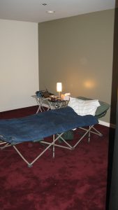
In this before photo of the loft master bedroom, you’ll agree the wall colors and red shag carpet weren’t doing it any favors.
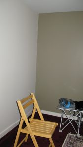
BEFORE – loft bedroom wall color
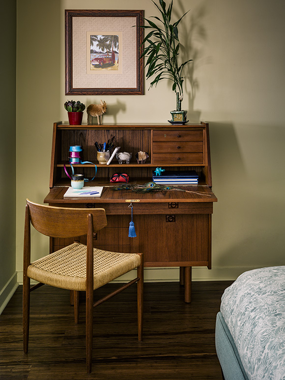
Here’s the corner that became a lovely secretaire and home office desk, as you can see in the After photo below. What a difference the right shade of paint makes, along with a beautiful piece of furniture, paired with a vintage chair in coordinating color. I love it, and the owner loves it too!
AFTER Design by Kimball Starr / photo by Joe Fletcher
If YOU want to transform your living space, get in touch! Kimball Starr offers complimentary consultations to explore your horizons.
AFTER: Design by Kimball Starr, photo by Eric Rorer
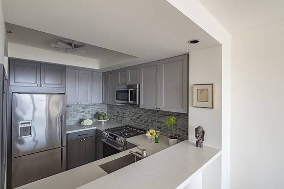
You just cannot beat the WOW of a great before-and-after story. My client wanted a modern kitchen with a cool masculine aesthetic for his San Francisco condo that would remain in style for years to come. Looking at the photo above, do you agree we delivered the “wow”?
BEFORE
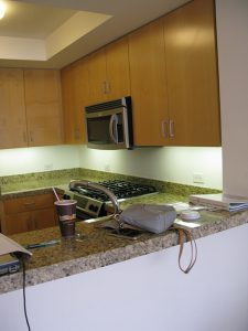
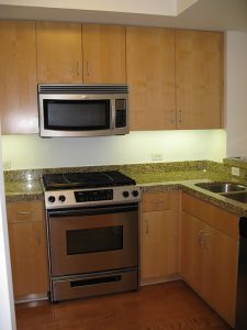
Here’s what the space looked like before: Almost office-y with its basic cabinetry, standard handles, plenty of electrical outlets but nothing dressing the counters.
AFTER: Design by Kimball Starr, photo by Eric Rorer
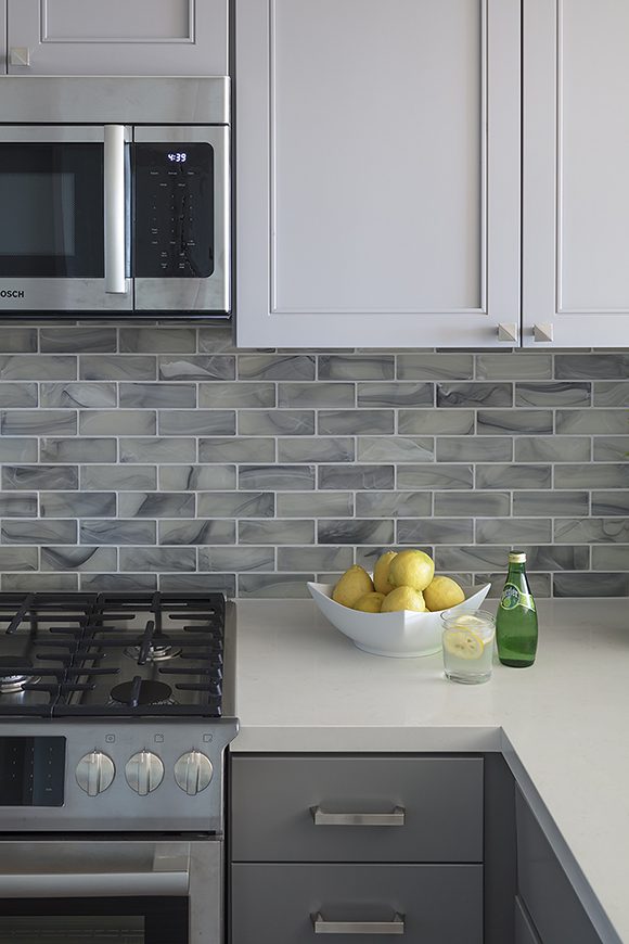
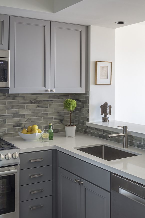
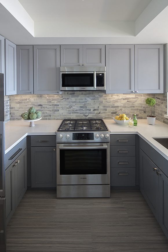
After, what a difference! I brought in off-white quartz countertops to brighten up the space, two-toned gray cabinetry for some color dimension, and handmade stained glass subway tiles in soft, watered-down tones of grays, blues, and greens. Now it’s contemporary, smart, and welcoming, and will be a kitchen that feels timeless, the heart of the home.
BEFORE
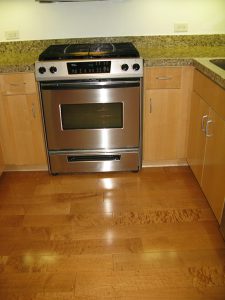
Previously, the old finishes were dated and discolored, and the lighting gave off this eerie cast.
AFTER: Design by Kimball Starr, photo by Eric Rorer
After our makeover, you’d actually want to spend time doing the washing up in this lovely, calming kitchen! I love that the owner’s artwork and sculpture are given space to breathe, and natural light pours in from the dining area.
BEFOREAFTER: Design by Kimball Starr, photo by Eric Rorer
Now the kitchen is light, fresh, and ready to welcome chefs and guests alike!
Need a kitchen that sizzles while looking cool? Kimball Starr Interior specializes in contemporary residential kitchens loved by cooks! Contact us today for a complimentary consultation.
We’re entering the summer travel season, with Memorial Day coming up quickly. For fun, here are five interior design images and ideas inspired by wanderlust!
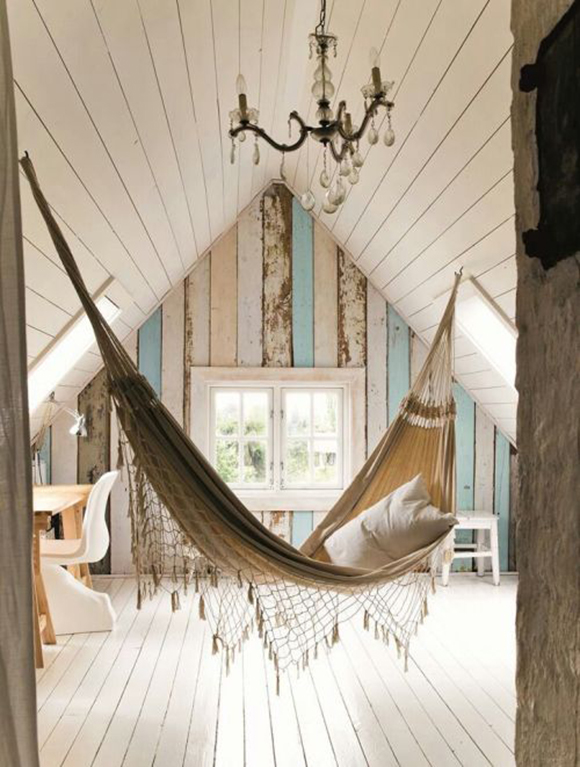
Image courtesy Heart Home via Pinterest
There’s nothing quite like swinging lazily, napping in a hammock. Bring that peaceful feeling to your home, in an attic, basement, or guest bedroom for a delightful surprise.
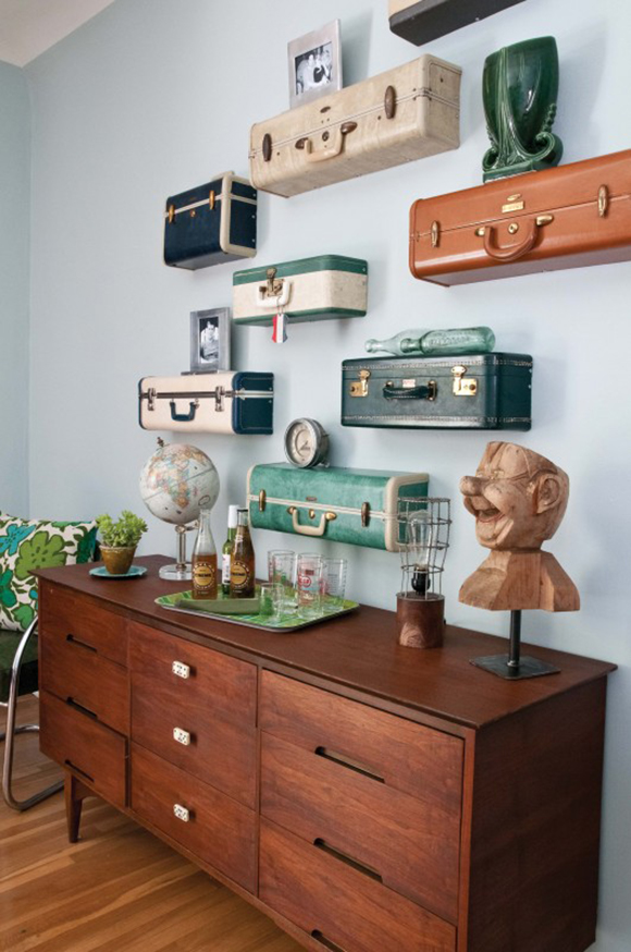
Image courtesy Flea Market Style Magazine via Vagabondish.com
An ingenious way to recall family vacations, by using the ends of vintage suitcases as open shelving. Inexpensive to create – find suitcases at yard sales and simply saw them off, then mount on the wall for instant conversation starters.
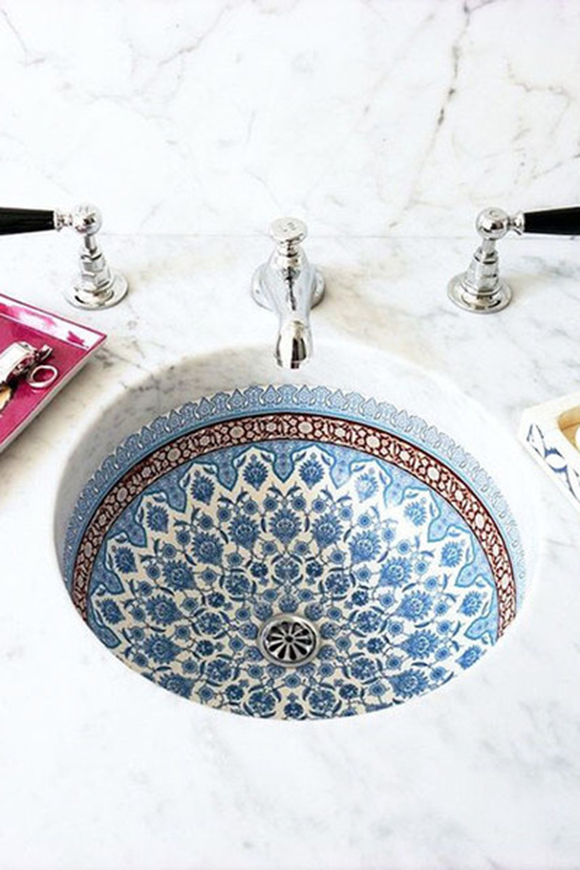
Image courtesy Lonny.com via Pinterest
Does this tiled sink make you long for Morocco? Washing your hands becomes trés cool.
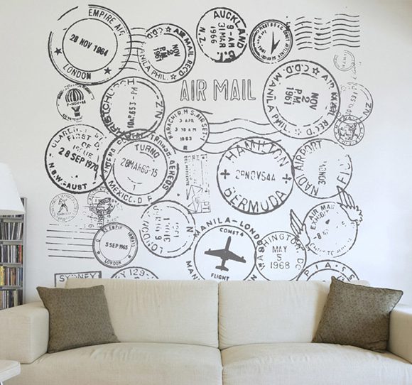
Image courtesy Tenstickers.com
Passport stamps applied via wall decals make a great feature wall and inspiration for destinations!
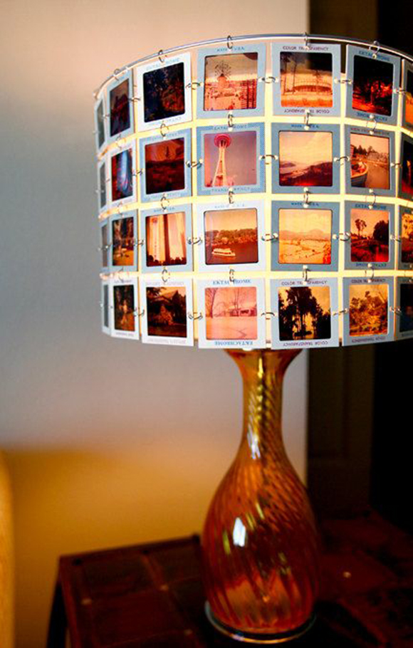
Image courtesy Rachel Reynolds Design via Etsy
My Dad has the wanderlust bug, and also thousands of these slides from his many journeys. Finally! The perfect way to display his old slides and holiday snaps – or yours!
Want a unique home that shows YOUR personality? Kimball Starr Interior Design specializes in contemporary residential spaces presented with style! Contact us today for a complimentary consultation.