Pantone Color of the Year 2022
What does is look like when a color in the real world and a color in the digital space come together?
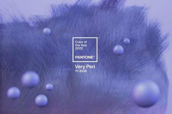
Pantone’s Color of the Year 2022 is Very Peri, a combination of red and blue that might appear familiar to Microsoft users.

Matching to this completely made-up brand-new color is going to be interesting. You read that right, a brand-new color: The first time in global color authority Pantone’s history they’ve done such a thing.

Dubbed Very Peri (Pantone 17-3938), the dynamic periwinkle blue boasts a warm violet-red undertone and signals novelty in these continuing unprecedented times.

“As we emerge from an intense period of isolation, our notions and standards are changing, and our physical and digital lives have merged in new ways,” the company shared in their press release. “Very Peri illustrates the fusion of modern life and how color trends in the digital world are being manifested in the physical world and vice versa.”
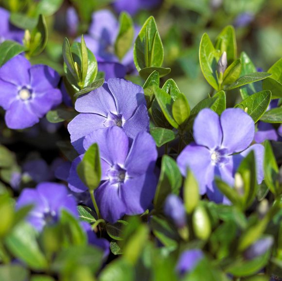
Periwinkle blue (or violet, if you prefer), is a color that takes its name from the periwinkle plant’s flowers, or myrtle. This particular blue has a violet-red undertone, which conveys “a spritely, joyous attitude and dynamic presence that encourages courageous creativity and imaginative expression,” said color guru Leatrice Eiseman, executive director of the Pantone Color Institute.
We’re looking forward to seeing all the ways that people utilize this color in their world. I look forward to finishing my periwinkle blue kitchen cabinetry project once the hardware arrives!
Custom color is Kimball‘s specialty! She designs colorful homes throughout the San Francisco Bay Area and Lake Tahoe. Contact her today for a remote or socially-distant in-person consultation.


