Colors of the Rainbow
Thank you to Cat Aflord of Design Shuffle for featuring me in her article about designing with The Colors of the Rainbow. Here’s an excerpt from Cat Alford’s article.
“While it’s easy to stick to a classic, neutral color scheme throughout your house, it’s equally as exciting to choose a bold color for your favorite room. The inspiration pictures below feature designers who aren’t afraid to use color and incorporate the colors of the rainbow from deep saturated red to bright orange to muted violet. While these colors can easily be too bright or too bold in a room, these designers chose the perfect furniture, accessories, and art to balance their choices and make a truly great space. Still not convinced that these colors are for you? Bring a few small paint samples home and see how you feel looking at them on the wall during various times of the day.”
Kimball Starr Interior Design
“Use a variety of colors from the rainbow to brighten up your space. From pillows to ottomans like these, you can mix and match a few colors to brighten up an otherwise neutral room.”
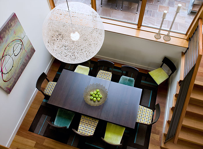
Kimball Starr Interior Design
“Bright colors can absolutely be featured together, especially in places perfect for accent colors like chair cushions, artwork, rugs, and pillows. This dining room design is a great example of that technique. The colors aren’t overpowering because they are grounded by the large, dark wood dining table.”
Thanks Cat for the compliments. Yes, I do like color. Whether it’s tiny splashes of color, or full-tilt color, they all bring a smile the faces of my clients. To read the full article, see The Colors of the Rainbow.
San Francisco interior designer, Kimball Starr, is a commercial design and residential interior design firm based in the San Francisco Bay Area. Kimball works to “change lives one room at a time” through designing creative and innovative interiors across the country.


