Everyone loves a makeover, right? I do, too, so here are two of my favorite and most dramatic before-and-after projects in San Francisco!
Guatemalan-Inspired Downtown Condo
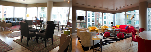
Left: Before / Right: After, design by Kimball Starr, photo by Eric Rorer
I met with the owners of a two-bedroom condo located steps from the San Francisco waterfront. The clients are a retired couple moving from the suburbs to the city for a more urban and active nightlife, wanting a space that reflects their modern aesthetic with the vibrancy of colors from their vacation home in Antigua, Guatemala.
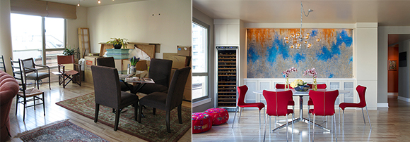
Left: Before / Right: After, design by Kimball Starr, photo by Eric Rorer
A major aspect of their project is the need for beautiful and effective storage, to assist with downsizing. In the After image on the right, I addressed this by creating Mondrian-inspired custom cabinetry to display their gorgeous collectibles and books in the open-plan living room, house their multimedia electronics, and conceal everyday items such as kitchen crockery and office supplies. The storage coordinates beautifully with B&B Italia dining chairs covered in red wool, and the modern classic Eero Saarinen marble dining table.
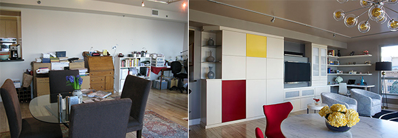
Left: Before / Right: After, design by Kimball Starr, photo by Eric Rorer
The adjacent dining area highlights an art piece created from textured paint on plaster, inspired by the weathering, layering, and patina of a building’s exterior in the Central American climate. Colors and fabrics used throughout the space were thoughtfully selected to remind the couple of their Guatemalan experiences. A cheeky zipper up each dining chair back adds a tailored detail, and copper glass globes cluster in a chandelier that finishes off the dining space. What a difference!
Sunnyside Arts & Crafts Stunner
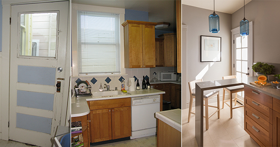
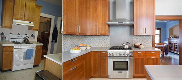
Left & Center: Before / Right: After, design by Kimball Starr, photo by David Duncan Livingston
Before, the flow of this kitchen didn’t work, with minimal natural light, and no place to sit with friends or family while cooking. Knocking down the wall next to the door opened up the space, and allows for the new 10-pane door to flood in lots of natural light. Adding a petite peninsula kept the space open and airy for counter seating, and hand-blown blue glass pendants overhead enliven the space with moody lighting after the sun goes down.
Left: Before / Right: After, design by Kimball Starr, photo by David Duncan Livingston
The original kitchen was a monument to the
late 80s/early 90s, with plastic-fronted appliances, boring cabinets,
mismatched countertops, plus those diamond-shaped wall accents, behind the
stove and sink. Yuck!
Sometimes too modern a kitchen can feel out of place within a traditional home. This 1930s home had wood wainscoting throughout, with original wood floors that we preserved. Pairing modern light-gray quartz countertops with distressed pewter hardware, cherry cabinetry, and gorgeous limestone floors strikes a balance between modern and traditional. The kitchen exudes warmth and soul, and fits in with the home’s original aesthetic, while still providing some modern materials.
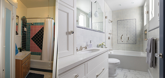
Left: Before / Right: After, design by Kimball Starr, photo by David Duncan Livingston
Before, the outdated diamond tiling continued in the bathroom. After, the old tiling is banished, replaced with statuary marble floors, and handmade Pratt & Larson glazed ceramic wall tiles, plus a decorative inset to keep with the traditional arts and crafts architecture of home. A deep tub, Waterworks shower fixtures, and modern glass pendants in front of the custom-shaped mirrors keep the space from being too traditional and fussy, while the light colors feel airy and timeless. The light, ethereal tones and soft watery blues in the tile make it a perfect space to cleanse both your mind and body.
If you want to take your spaces from dated to divine, contact Kimball Starr for a consultation today!
As the nights grow longer, autumn turns leaves and pumpkins lovely shades of orange and gold, and we look forward to Halloween. Here are some of my favorite creative yard and entry designs for a spooky All Hallows Eve!
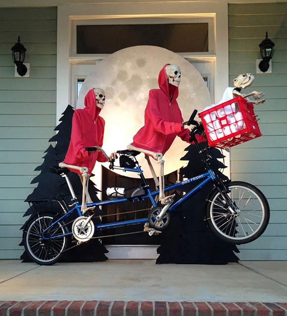
E.T. Bike Fly
Image courtesy Baxter’s Skeleton Decorations
Appealing to 80s kids as well as today’s, E.T. can still scare us just a little! A single bicycle and skeleton would do also, with a stuffed E.T. toy in the basket.
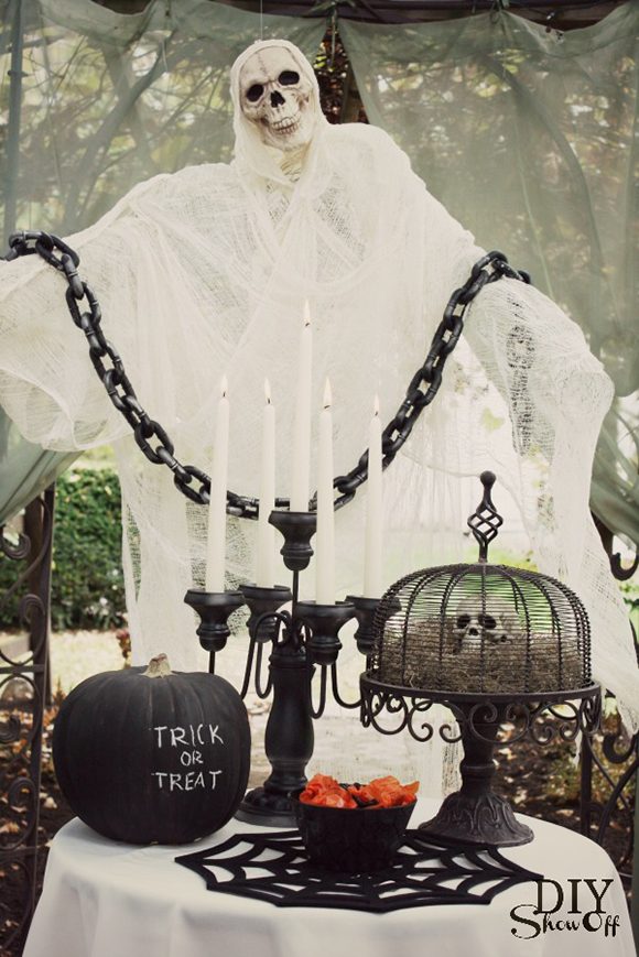
Ghostly Snack
Image courtesy diyshowoff.com
Stop by for a bite! Whether the kids want a meal or just a snack, this ghoulish spectre offers a table full of dark delights. For a bigger display, use a full-size dining table in your yard, and set places for your in-laws!
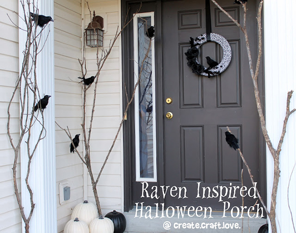
Raven Porch
Image courtesy createcraftlove.com
If traditional Halloween colors of orange and black don’t appeal, why not try something like this spooky raven-inspired front porch design? Black ravens are balanced with a ghostly white pumpkin arrangement and natural branches for an effective seasonal feeling.
Crime Scene
Image courtesy PrudentPennyPincher.com
Simple to create, a clever crime scene will scare your neighbors, and might dig up some real dirt.
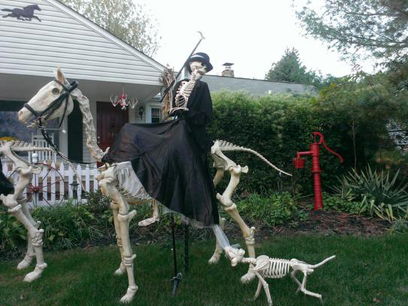
Haunted Foxhunt
Image courtesy kidfriendlythingstodo.com
This homeowner didn’t stop with just a single dog, horse and skeletal rider in their yard – they created a whole haunted foxhunt, with 3 skeleton horses and multiple dogs! Last year, they added flickering post lamps and ghoulish green ground lights to show the way. I wonder how they’ll improve it for 2019, now in their third year? There’s a 3-minute YouTube video by homeowner Borbala Equestrian from last year.
A Christmas Skeleton Story
Image courtesy Baxter’s Skeleton Decorations
This one takes real commitment to the craft
– finding a Red Ryder BB gun AND a silver zeppelin, while also decorating a
full Christmas tree for the enjoyment of fans will win a major award, seen here
back left table.
I hope you enjoyed this tour of fun yard decor and entry designs. Have a safe Halloween holiday season!
If you want help decorating your yard or entrance, get in touch with designer Kimball Starr – she can bring your ideas to life!
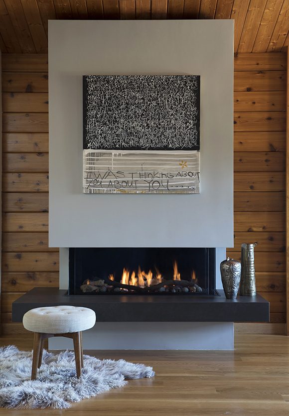
Sometimes, ordinary just won’t do.
Sometimes you need a custom-designed solution to make a space superior.
For example, for a client who loves modern and cozy — design aspects that don’t always go together — I custom-created the fireplace and surround above to contrast with the warm, knotty cedar wood wall construction, and personalized with art and pottery. The stool and rug are perfect for getting the fire started on a chilly night.
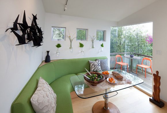
Small Spaces, Custom Solutions
Design by Kimball Starr / Photo by Eric Rorer
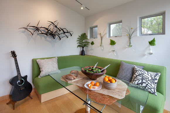
One big challenge in a very small home of just 596 feet was not only the size, but some really odd angles! None of the corners of the house are actually 90 degrees, because it was originally designed around the shape of a crystal.
The entry area corner wall was a 110-degree angle, much to my surprise, so I eased the awkwardness by giving it a pleasing curve, and filled in the space behind it with a wood ledge for display. Underneath the entire length of the seating is an open base where the homeowner can store his hobby items and accessories, such as his keyboard, small guitar, and extra pillows and blankets. Form and function!
Design by Kimball Starr / Photo by Eric Rorer
An ingenious solution for a tiny space is the dual purpose of this glass table: It’s adjustable! It transforms from coffee table to dining table height. I also designed the shape as a rectangle with rounded edges, so nobody gets jabbed moving around the table.
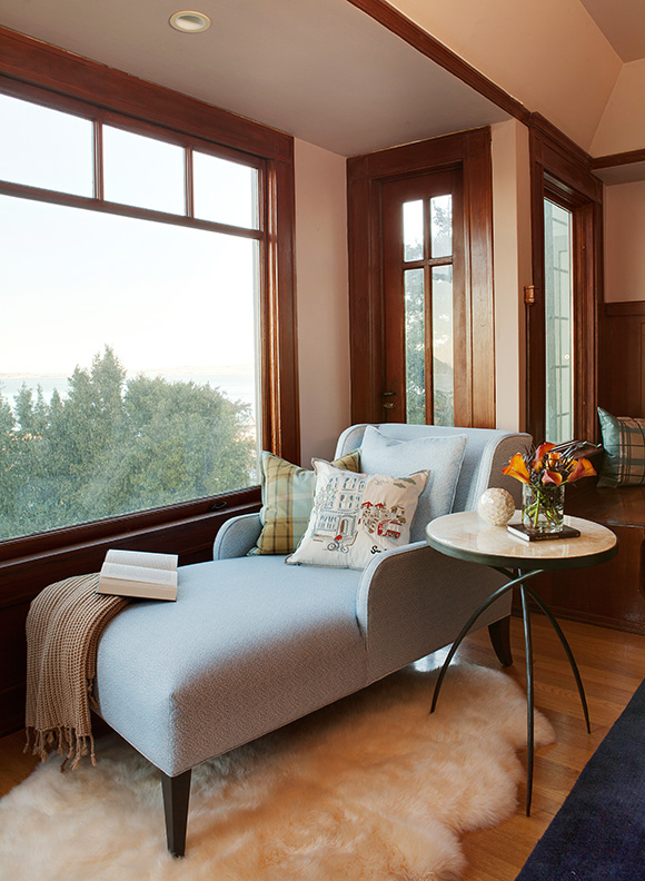
Bespoke Furniture, Classic Interiors
Design by Kimball Starr / Photo by Marija Vidal
Here is what I like to call a gentleman’s modern classic living room. The homeowner loved his view of Alcatraz and the San Francisco bay out this window, so we needed a sophisticated solution for lounging in front of this bay window. A chaise lounge was the answer, so I designed this custom chaise lounge with arms on both sides— a bit cozier, especially when adding a fur rug, comfy pillows, and blanket. Now it’s the perfect place to read on a foggy (or sunny!) San Francisco day.
If you have a design challenge in need of the perfect custom solution, contact Kimball Starr for a consultation today!
Design by Kimball Starr / Photo by David Duncan Livingston
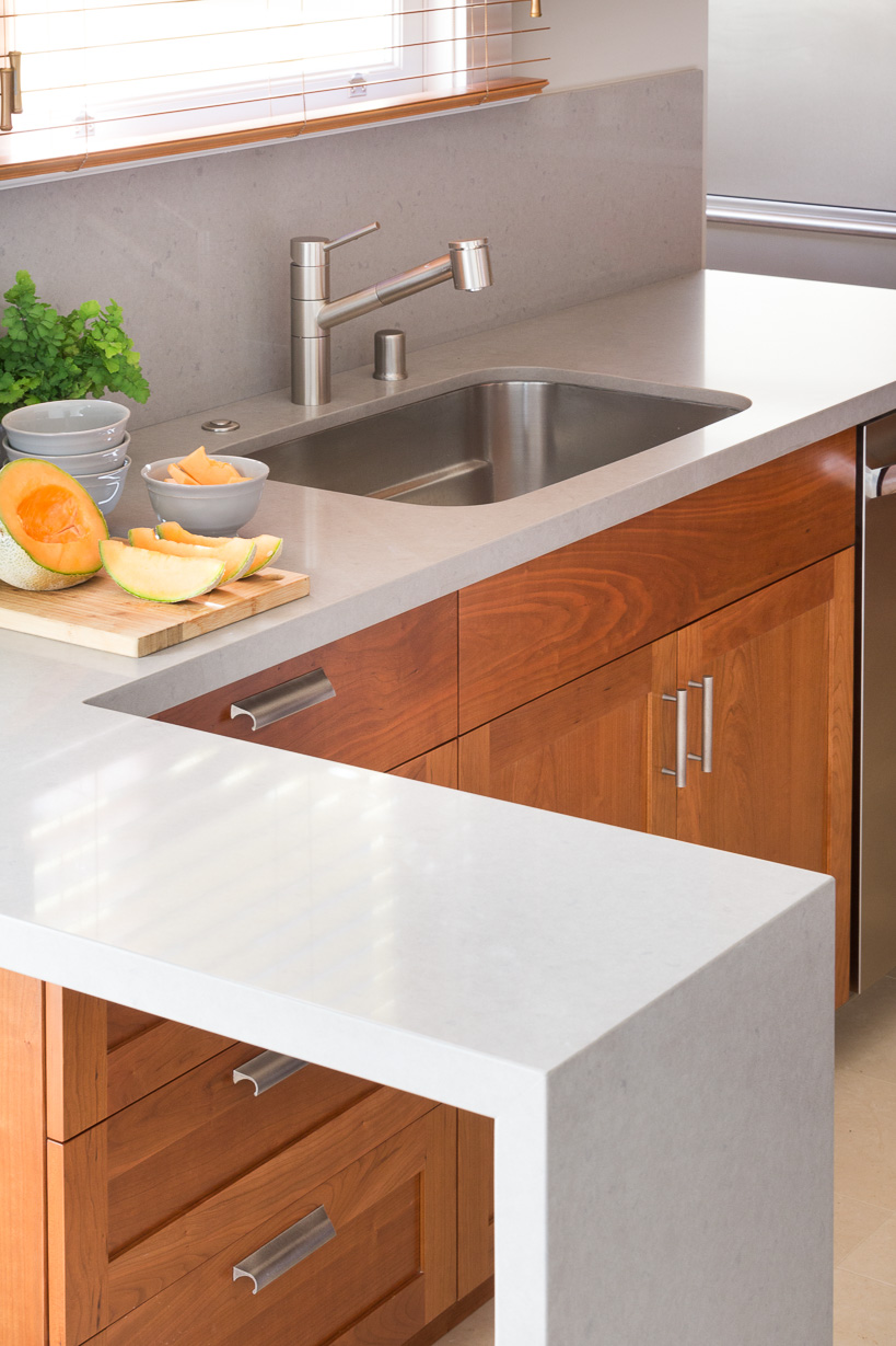
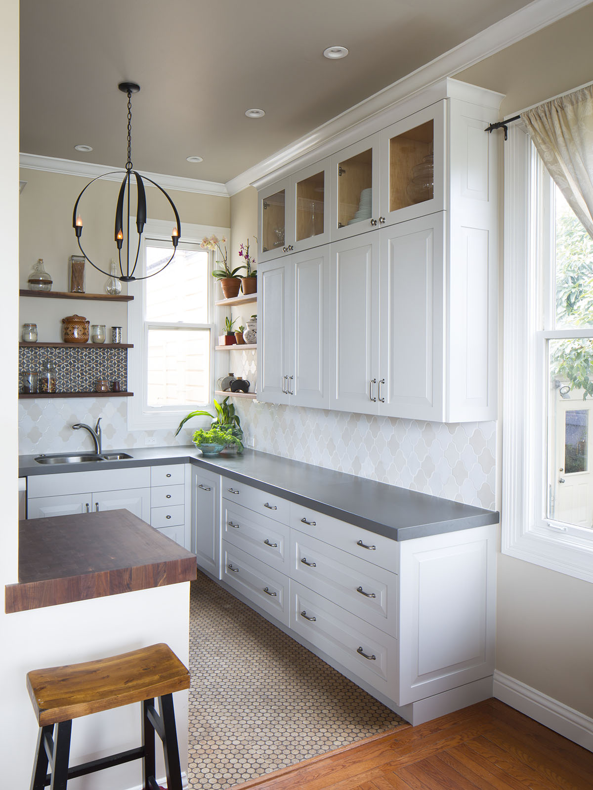
Have you heard of living in place? Also known as aging in place, it’s the concept that people want to remain in their homes as long as possible, as we age and our health and lifestyle needs change. For example, in the kitchen above, a simple faucet with a pull-out nozzle will make washing up easy for people with arthritis. Here are a few more tips for setting up your forever home.
Photo courtesy Rachel Shingleton of Pencil Shavings Studio
Choose Gorgeous, Right-size Furniture
A couple where the husband is 5’10” and the wife is 5’ may have some challenges in making their home comfortable for them both, without health issues in the mix. Even if you aren’t so different in size, it’s important to have furniture that’s the right scale and fit for you. Adjustable tables and chairs can be a help in this, as can designing a bathroom or kitchen with multiple counter heights.
Also, specifying or customizing furniture to fit is a great solution. We found a smaller-scale recliner for my 85 y.o. mother who is only 5’. She had been struggling with a full-size recliner for years. Now she loves reading and relaxing in her right-size chair!
Photo courtesy Ljupco at Dreamstime.com
Create Accessible Flows
If you or your family member need to use a cane, walker, wheelchair or other ambulatory aid, it’s especially important to open up the circulation of your rooms. Ensure there’s at least a 3 to 3.5-foot pathway leading to doors and around furniture. Remove any trip hazards like loose rugs, and try to find rugs that have a low profile and rubber backing for places you still need them. Eliminate stairs and add ramps, or choose a one-level home, if you decide to relocate.
Photo courtesy Houzz.com
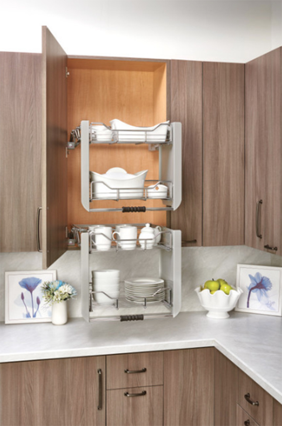
Bring It Down to Your Level
Think about how difficult it can be to get something down from a high shelf, especially if it’s heavy or bulky. Now imagine doing that while having bursitis, arthritis, or any number of painful conditions. Consider relocating heavy items to lower shelves, or installing a special pull-down shelf like this one, allowing easy, safe access to upper shelves.
Design by Kimball Starr / Photo by Eric Rorer
Brighten Spaces with Lighting
As we grow older, our eyes change, and we
need more light to see well. I recommend installing recessed lighting that’s
centered over your task areas throughout your spaces for a bright, evenly lit
tone. Next, add table lamps for adjustable accent and task lighting.
One place you really need to see well is the kitchen. Recessed lights create a great foundation; then add under-cabinet lighting to illuminate your countertop workspace, making prep and cooking a delight. For soft, ambient light when task lights aren’t in use, finish off with a stylish pendant light or chandelier.
Design by Kimball Starr / Photo by Eric Rorer
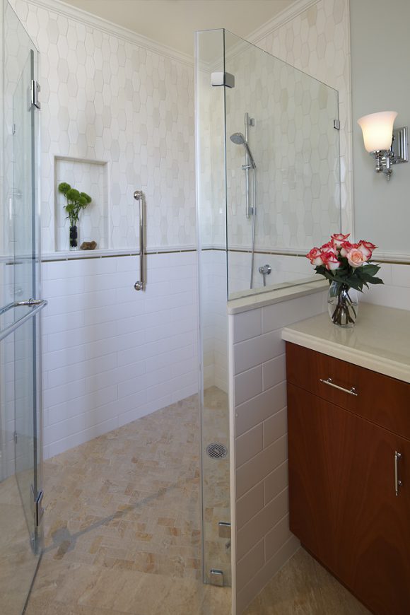
Beautify Bathroom Safety
Grab bars don’t have to be
clinical-looking. There are a wide range of ADA- approved grab bars that are
both beautiful and safe. You can use them as additional towel rails to conceal
their purpose.
Ideally, you want a curbless, step-in shower, like this one I designed for a couple in St Francis Woods, San Francisco. Curbless showers are highly desirable even for those who don’t medically require them, creating a beautiful, flowing look for your bathroom. Selecting a gorgeous, handmade ceramic tile like the one above will also elevate your space.
These are just a few ways to make your home a place you can remain for as long as you wish, with independence and freedom, into your golden years.
For more ideas on how to create YOUR forever home, contact Kimball Starr for a consultation today!
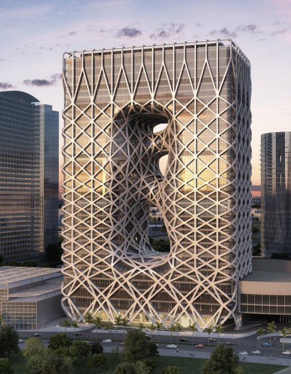
Image Macau hotel by Zaha Hadid courtesy CommercialInteriorDesign.com
When the weather turns warm, I love to look outside for inspiration in my work. Artists who utilize natural forms always catch my eye.
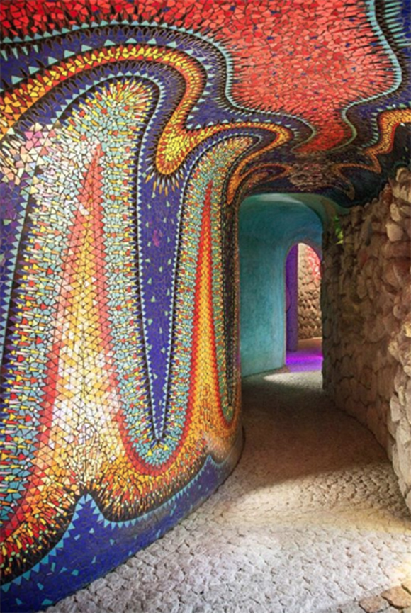
Biomorphic forms are the most perfect forms and shapes drawn from nature. They are balanced physically and mathematically, created by nature, so they will naturally be the forms most pleasing to the eye and senses. Architects, designers and artists gain inspiration from these shapes and colors, to make their work more attractive. One such artist is @javiersenosiaina on Instagram. Just look at these beautiful shapes!
Image Nido De Quetzalcoatl courtesy @javiersenosiaina
I imagine the artist carefully placing each tile as he builds up the pattern, while the sun moves across the sky and changes the reflections and shadows.
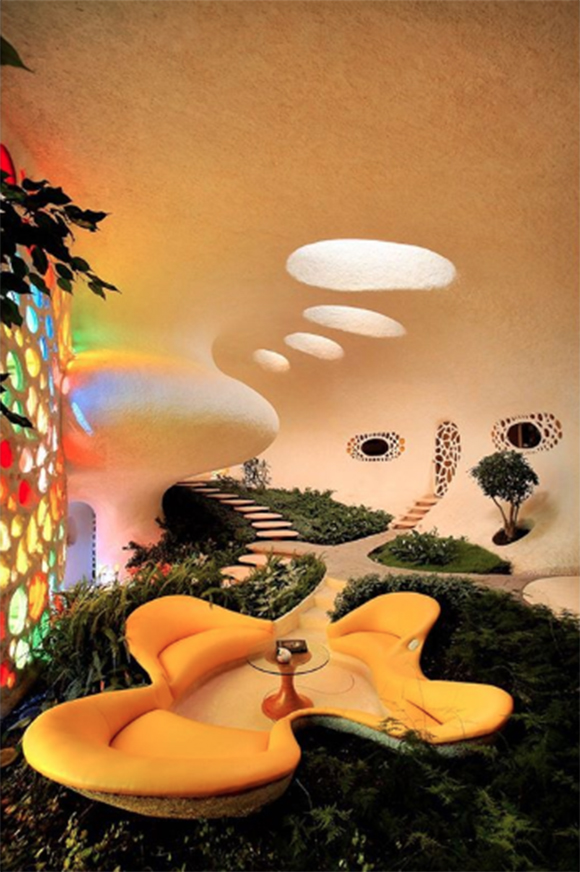
Here I’m reminded of the Nautilus in Dr. Doolittle, appropriate since it’s modeled on a real-life nautilus shell, which displays its internal chambers arranged in an approximately logarithmic spiral, related to the Fibonacci sequence.
Image Casa Orgánica-Ducha courtesy @javiersenosiaina
This view makes me think of serendipity – finding something unexpected along a journey.
Image Wangjing Soho courtesy Cristiano Bianchi at Dezeen
Another artist who’s famous for her curvaceous shapes is Zaha Hadid. While we sadly lost her in 2016, her amazing work remains to inspire us, like the Wangjing Soho towers in Beijing, curved to look like giant pebbles.
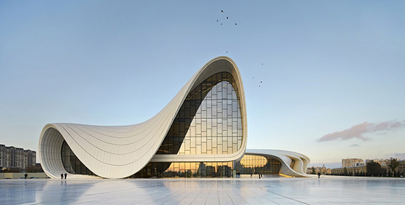
Image Heydar Aliyev Center Baku courtesy Hufton Crow at Wired.com
Her work for the Heydar Aliyev Center in Baku won the London Design Museum’s Design of the Year award in 2014, embodying Hadid’s signature, voluptuous design.
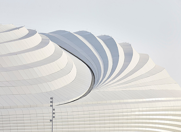
Image Al Wakrah Stadium courtesy Dezeen
The Al Wakrah stadium’s shape is an abstraction of a line of up-turned dhows – traditional boats that can be seen in Al Wakrah’s port in Qatar. The internal structure of the roof was also designed by Hadid to reflect the form of the boats, which is also reminiscent of sand dunes, formed by the wind. I can’t think of a more beautiful profile for a building.
In high-end residential projects, quality fabrics and furnishings, attention to detail, and partnering with artisan workrooms are what elevates a luxury interior from an average run-of-the-mill interior. Read on to see how we took an outdated, run-down space, and turned it into a timeless, high-end traditional living room.
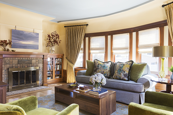
AFTER: Design by Kimball Starr / Photo by Eric Rorer
In this project, the homeowner is nearing retirement, and wanted a quality luxury interior that complemented the traditional architecture in his “forever” home.
Creating a beautiful foundation for the room starts with the rug. This hand-knotted, hand-dyed Tibetan wool rug from Tufenkian places an heirloom-quality rug center stage.
It’s worth investing in a handmade rug, as the weaving quality and superior hand-dyed subtleties are unattainable in a machine-made rug. I also encourage clients to purchase original artwork you love, or that reminds you of a special time or destination. Here, the artwork coordinates with the rug. Compare the difference between this and the “before” image.
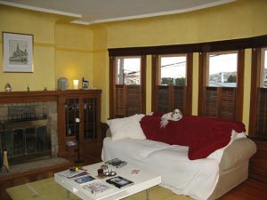
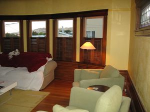
BEFORE
In love with the comfort of the oversize sofa, the homeowner didn’t want to give it up. So we had an expert upholsterer make a slipcover that is such an exact fit, you’d think it was upholstered, while still allowing for ease of cleaning.
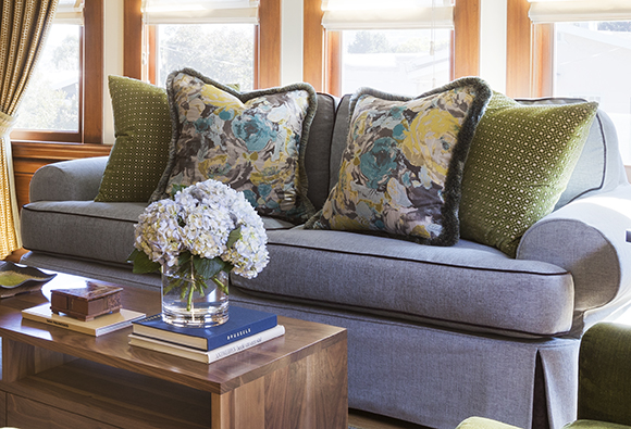
AFTER: Design by Kimball Starr / Photo by Eric Rorer
Velvets and silks are luxurious fabrics chosen for the handmade accent sofa pillows, filled with sink-in goose down for an incredibly soft feel.
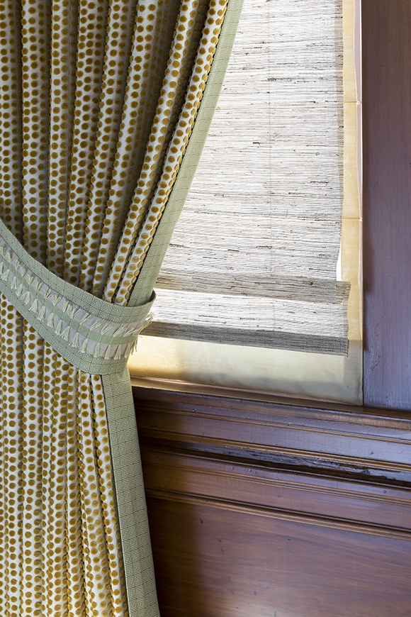
AFTER: Design by Kimball Starr / Photo by Eric Rorer
Opulence and luxury are also expressed through layers of custom window treatments, starting with the practical, woven grass shades that cover the windows in two layers. An operable lining provides privacy behind the grass shades, or a single layer brings in lovely filtered light through the natural grass.
For the decorative portion, the stationary draperies soften the bay windows with a playful polka-dot cut velvet on one side, and an outdoor fabric that is fade-resistant on the backside. When viewed from outside, the sage green lining complements the exterior house color. Linings of your draperies don’t have to be white! We finished off the draperies with a custom designed tieback, accented with raffia to complement the grass shades.
BEFORE
You can see the previous wood shutters visually cut off the windows, made the room too dark, and were impractical to use on a daily basis.
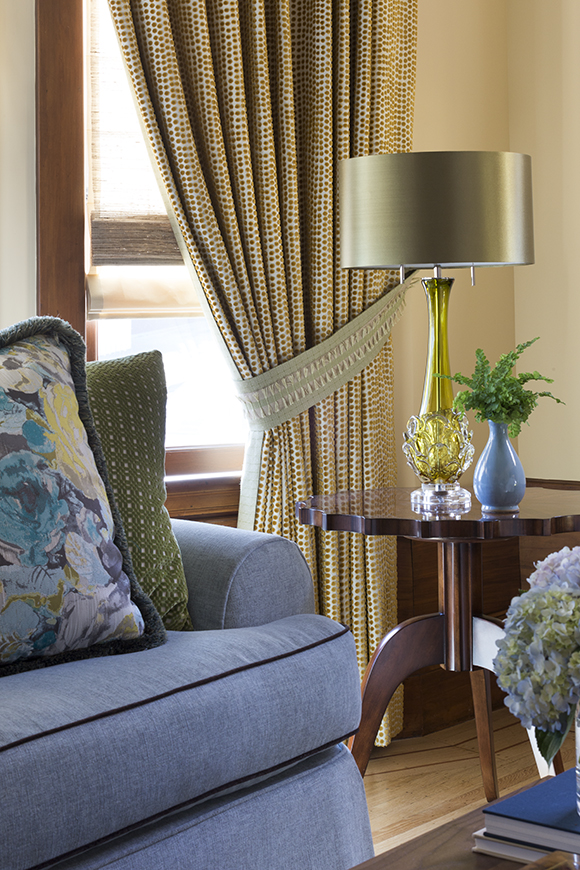
AFTER: Design by Kimball Starr / Photo by Eric Rorer
After, quality accessories such as the Italian blown glass lamp topped with a green silk shade and scalloped-edge cherry side table are bespoke, timeless design pieces.
When it comes to luxury, details matter! Taking time to get it right is absolutely worth the attention, an investment you’ll enjoy for years to come.
Do YOU have a luxury interior design project that requires special care? Kimball Starr will ensure a perfect finish – contact her today for a consultation!