In the spring and summer, my mind naturally turns towards the outdoors, and fair-weather pursuits. What a wonderful time to relax in an outdoor garden or garden-inspired room!
Photo courtesy Filoli.org
One such magical place is Filoli Gardens in Northern California. If you’re lucky enough to live close enough for a visit, you should definitely plan a day outing to enjoy the stunning curated views.
Photo courtesy Filoli.org
The Georgian-style terraces around the main house highlight sweeping views of the Santa Cruz Mountains, in contrast to the formal English Renaissance-style-garden to the south, featuring lush flower beds, yew-lined avenues, and a sunken garden, shown above.
Photo courtesy Filoli.org
Seasonal spring plantings include daffodils, tulips, and hyacinths, contrasted with blue violas, while the summer display presents zinnias, roses and salvias. This view is of the famous walled garden, with little vignettes to be enjoyed throughout the seasons.
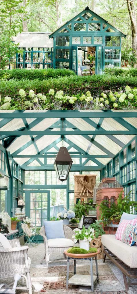
Photo courtesy apieceofrainbow.com
If you can’t come to Northern California, celebrate your local environment by creating a garden room of your own. A wicker indoor seating area, surrounded by glass walls and protected views of your garden, yard, or perhaps a walkway towards a beautiful view outside your windows makes a perfect place to pause and reflect. Then no matter the weather, you can enjoy the space.
Photo courtesy HGTV.com by Robert Felker
Kimball Starr designs homes that pair with beautiful gardens throughout the San Francisco Bay Area and Lake Tahoe. Contact her today for a socially-distanced in-person or remote consultation!
In a post-COVID world, how can we create spaces that naturally help us fight infections, and keep our spaces clean? Read on for my top tips!
Design by Kimball Starr / Photo by Eric Rorer
Start with the basic design elements of the space, by choosing surfaces that are easier to clean. Pick flat panel cupboards that don’t collect dust, avoid shiplap that needs regular cleaning, and use larger size tiles for fewer grout lines.
Design by Kimball Starr / Photo by Eric Rorer
Use naturally anti-microbial surfaces for kitchen countertops and bathroom surfaces, such as stainless steel, and copper. Doorknobs are another place that copper is excellent at stopping the spread of germs.
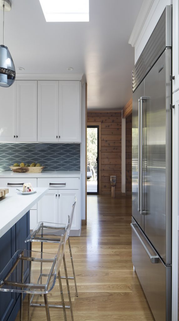
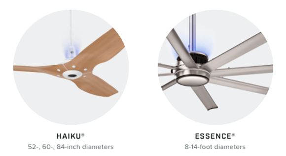
Images courtesy Big Ass Fans
New technology beats your old air filter, when it comes to having cleaner air in our homes. Big Ass Fans offers UV-C lighting as endorsed by the CDC integrated into two of their ceiling fans. UV light has been proven to fight infection for over 70 years, so take advantage of this in your home or office, and you’ll have a healthier, happier life for many years to come.
Design by Kimball Starr / Photo by Eric Rorer
Kimball Starr designs healthy homes throughout the San Francisco Bay Area and Lake Tahoe. Contact her today for a socially-distanced in-person or remote consultation!
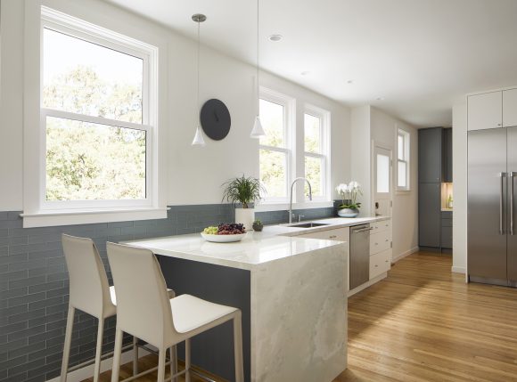
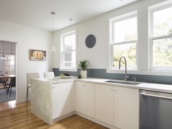
AFTER: Design by Kimball Starr / Photo by Eric Rorer
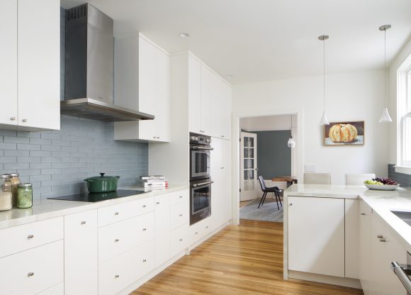
Today I’m excited to share a recent before & after kitchen project! This one is really dramatic so I think you’ll enjoy seeing the changes, from a dark, cramped, dreary kitchen to a lovely light space.
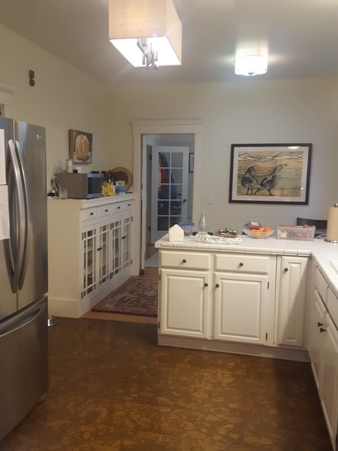
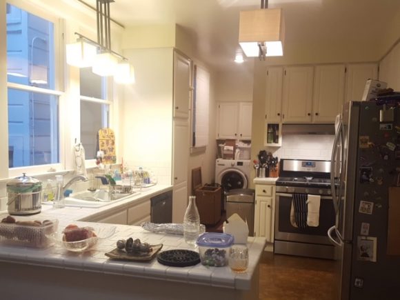
BEFORE
As you can see in the Before image above compared to the top After photo, we made some big changes to the floor plan and layout. The fridge was in an awkward location, with no nearby counter space to put down food items because of the doorway peeking out behind the old fridge location. We closed that doorway and relocated the fridge to provide better access and flow – a HUGE change!
AFTER: Design by Kimball Starr / Photo by Eric Rorer
Providing a 48” fridge and freezer column allows plenty of storage space, and now it’s closer to the opposite counter in front of the windows. A short L-shaped counter provides seating and storage, while allowing free movement through the kitchen.
BEFORE
You can see how cramped everything looked previously. The island jutted out and stopped traffic flow. The cabinetry blocked sunlight from the windows. There was nowhere to set a pot down next to the cooktop. In a laundry nook just beyond the kitchen, the side-by-side washer and dryer were taking up a lot of real estate.
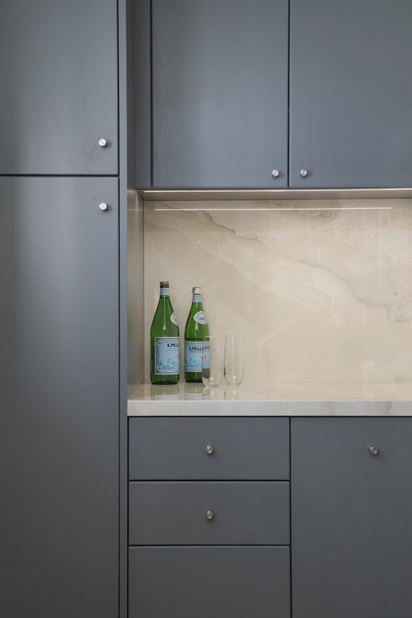
AFTER: Design by Kimball Starr / Photo by Eric Rorer
We stacked the washer and dryer to double our floor space, a simple yet incredibly effective solution. Here you can see where the washer and dryer used to be, now there’s beautiful gray-green cabinetry that matches the subway tile in the kitchen, and counter space where you can set a basket for laundry needs or doggie supplies, plus additional pantry storage.
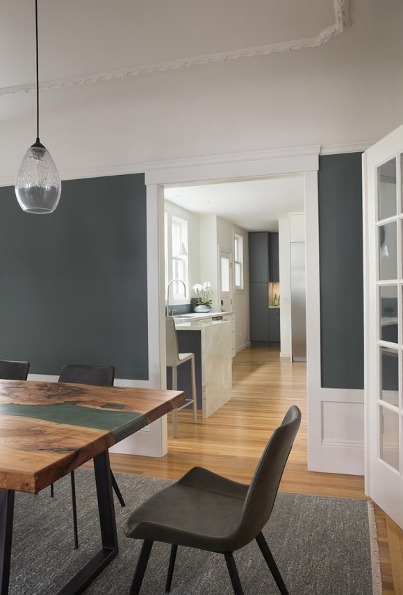
AFTER: Design by Kimball Starr / Photo by Eric Rorer
By changing finishes, the space went from dark and dreary to light and airy colors that open up the space. We created balance with the cabinetry and color dimension with the tiling.
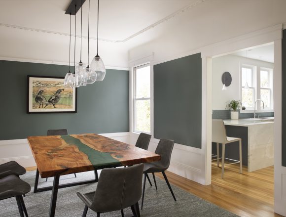
BEFORE
Previously the dining room was being used as a home office, which isn’t ideal for a family.
AFTER: Design by Kimball Starr / Photo by Eric Rorer
The husband had a slab of cypress from a fallen tree sitting in the garage, but didn’t know how to use it. We relocated the home office, put legs onto the slab and turned it into a beautiful dining table. Now the entire space tones and looks completely pulled together with their gorgeous new kitchen and laundry. I’m so pleased with how it turned out, and so are the clients!
AFTER: Design by Kimball Starr / Photo by Eric Rorer
Kimball Starr designs luxury homes throughout the San Francisco Bay Area and Lake Tahoe. Contact her today for a socially-distanced in-person or remote consultation on how YOUR home can be transformed!
Wouldn’t it be lovely to live beside the water at Lake Tahoe? Here are some properties to inspire. You can have the home of your dreams!
Photo courtesy TahoeRealty.com
With a private dock and contemporary interiors, this West Shore property sits among the trees and emerald waters.
Photo courtesy TahoeRealty.com
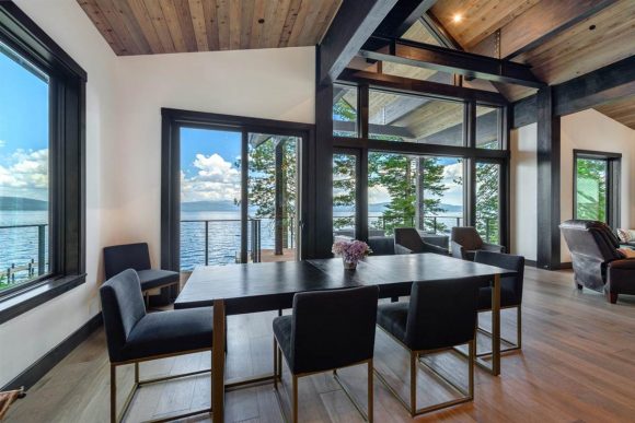
A sleek dining area draws your eye outward over the lake.
Photo courtesy TahoeRealty.com
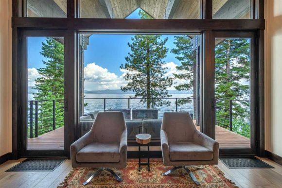
Living room swivel chairs allow you to enjoy the views in any direction.
Photo courtesy TahoeRealty.com
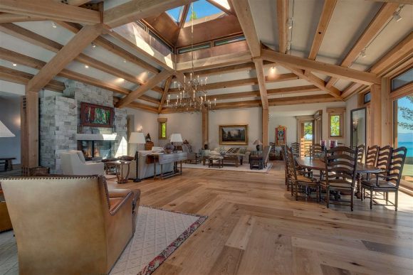
This home boasts warm hardwood and a skylight paired with views from the Tahoe West Shore.
Photo courtesy TahoeRealty.com
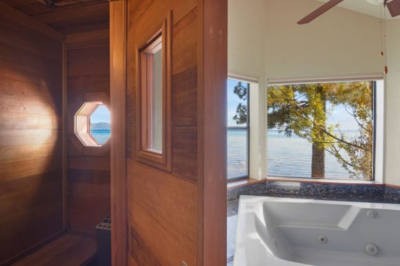
Choose either a sauna or soaking tub at this home, situated along the stunning North Shore.
Photo courtesy TahoeRealty.com
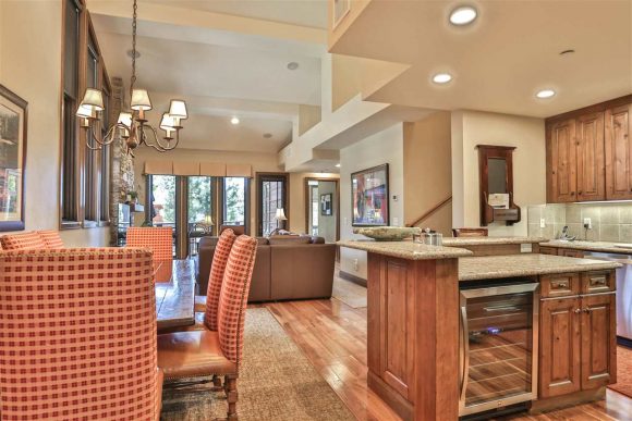
This contemporary country kitchen will be a favorite with guests.
Photo courtesy TahoeRealty.com
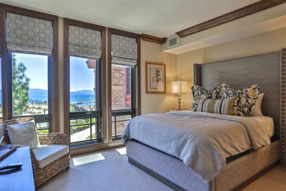
Imagine waking up to that lake view out your floor-to-ceiling windows, dressed with simple yet elegant blinds.
Photo courtesy TahoeRealty.com
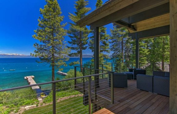
And of course, you can’t live in Tahoe without a deck, for entertaining, dining, and just taking in nature.
Kimball Starr designs luxury homes throughout the San Francisco Bay Area and Lake Tahoe. Contact her today for a socially-distanced in-person or remote consultation.
For the 50th anniversary of Earth Day this year on April 22, let’s look at a few easy green design inspirations and actions you can do at home.
Plant a Tree
Photo courtesy Pinterest user MMore
“The best time to plant a tree is 50 years ago. The next-best time is today.” – old saying
The day before Earth Day this year is National Arbor Day, April 21, also known as Plant a Tree Day. How do you know which kind of tree is best for your area, and won’t contribute to pollen issues? Use this handy guide.
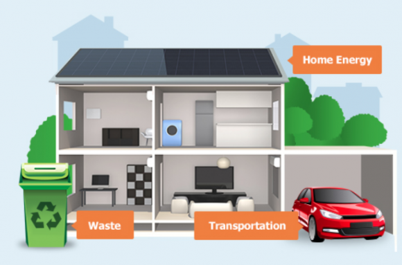
Reduce Your Energy Use
Image courtesy EPA.com
Find out what your household carbon footprint is in 3 areas: Energy use, transportation, and waste, then learn how to reduce them with this handy calculator.
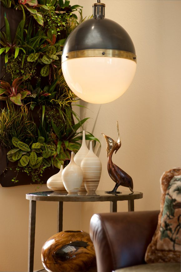
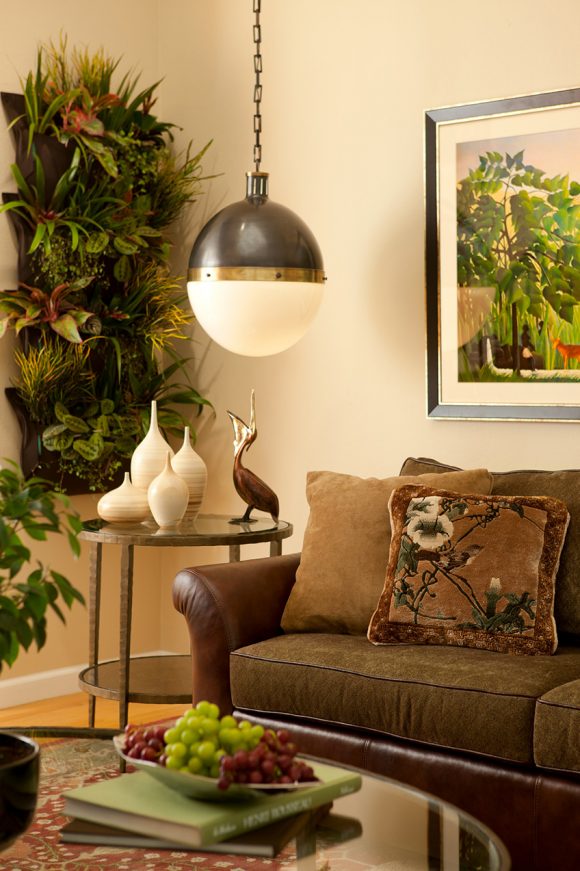
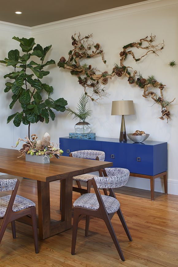
Design Interiors with Plants
Design by Kimball Starr / Photo by Eric Rorer
Our last post is perfect for this! Just click over to Designing with Plants and get all the tips you need.
Kimball Starr Interior Design creates healthy homes throughout the San Francisco Bay Area and Lake Tahoe. Contact her today for a socially-distanced in-person or remote consultation.
A plant is the world’s oldest housewarming gift (other than a bottle of wine), because nothing makes your home feel fresh and lived-in like live plants. Bonus that they naturally clean your indoor air, too!
Here’s a brief look at which plants to include when designing your home, with tips to get the most out of specific situations.
Best for Beginners
Design by Kimball Starr / Photo by Eric Rorer
Snake Plant (Sansevierias)
Snake Plants are some of the toughest plants around. Indoors or on your balcony, these spiked lovelies can deal with nearly anything.
Care tips: They’ll grow faster in strong natural light and slower in low light, so decide where to place them. Buy darker-leafed varieties for low light. No direct sunlight like a west or south window – they burn! Always ensure the soil is nearly completely dry before thoroughly watering again, though these will do well in a bathroom, too. Snake plants are mildly toxic to cats and dogs.
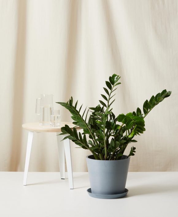
North-Facing
Photo courtesy Bloomscape
ZZ Plant (Zamioculcas zamiifolia)
Roots called rhizomes help this plant stay hydrated, while its variegated leaves go from bright green to a dark emerald.
Care tips: Low light and not much water, so it’s low-maintenance. Water when the soil is dry, or every two to three weeks. Poisonous if eaten, so keep away from kids and pets.
South-Facing
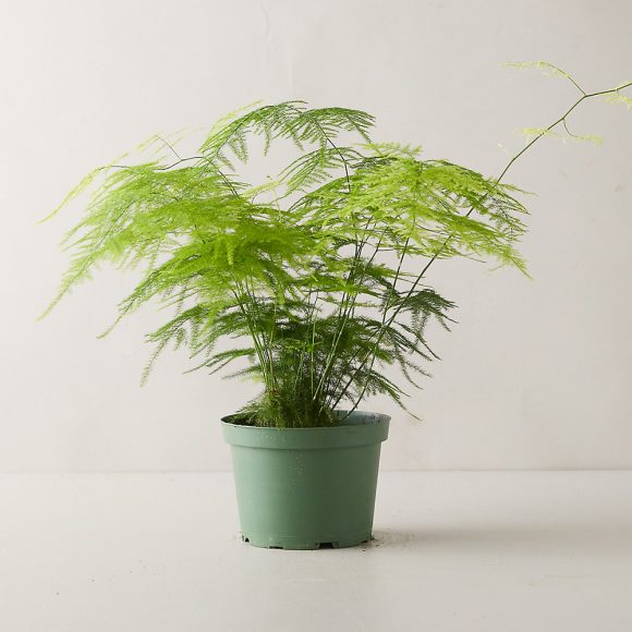
Photo courtesy Terrain
Asparagus Fern (Asparagus setaceus)
Stunningly delicate, the Asparagus Fern does better as a houseplant than an outdoor plant since it’s considered an invasive species.
Care tips: Keep in a sunny spot and let it dry out between waterings. Keep away from cats and dogs – it’s toxic to them.
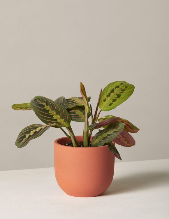
Photo courtesy The Sill
Maranta (Marantaceae)
Known as a prayer plant because the Maranta’s leaves will raise and lower with the sun throughout the day. Gorgeous variegated leaves include shades of green and bright pink.
Care tips: Medium to bright but indirect sunlight. Water weekly or every other week, when you see its leaves look droopy. Pet-safe houseplant.
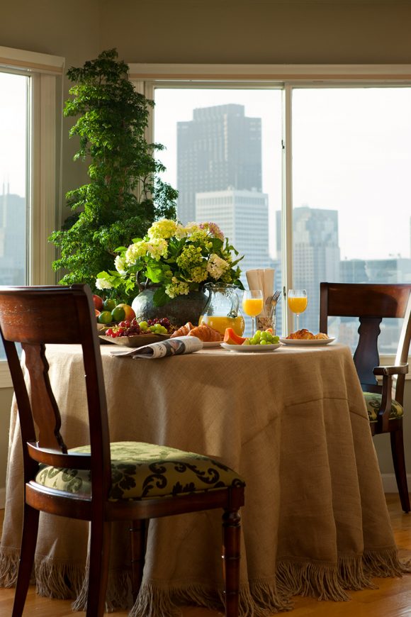
Best Indoor Tree
Design by Kimball Starr / Photo by Eric Rorer
Ficus Altissima (Variegata)
For those who love the look of a leafy indoor tree like the fiddle leaf fig, try a ficus altissima with large velvety yellow and green leaves. “This plant makes a statement without the more complex care instructions that come with the Fiddle!” explains Joyce Mast, a horticultural expert at Bloomscape.
Care tips: Place this hardy plant in bright, indirect light, then let it grow. Indoors, this statement plant can gain six to eight feet in height (outdoors, up to 40 feet!) Toxic to dogs, so take care.
Design by Kimball Starr / Photo by Eric Rorer
Kimball Starr Interior Design creates healthy homes throughout the San Francisco Bay Area and Lake Tahoe. Contact her today for a socially-distanced in-person or remote consultation.