What’s the one thing you can put into a home that increases its financial value, frees up hours of time weekly, and makes your life easier, better, and happier? A mudroom! Here are some inspirational ideas.
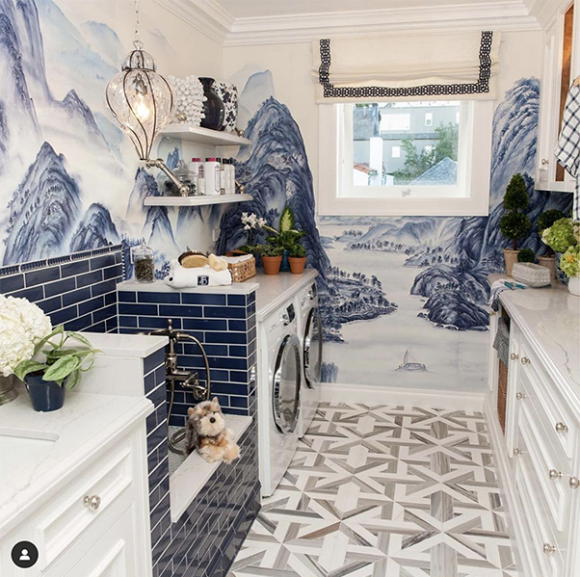
Photo courtesy SF Decorator Showcase participant Dina Bandman Interiors
A mudroom with a pet-washing station next to the washer and dryer is a grand idea. This one was a winner at the San Francisco Decorator Showcase house.
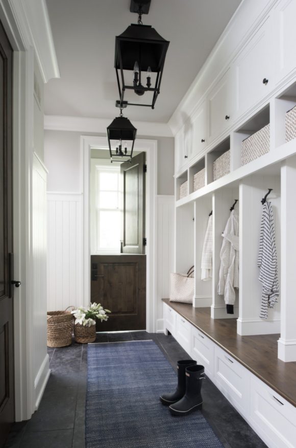
Photo courtesy Houzz user Hadley Court
This traditional mudroom entry with barn half-door allows for greetings while pulling boots off.
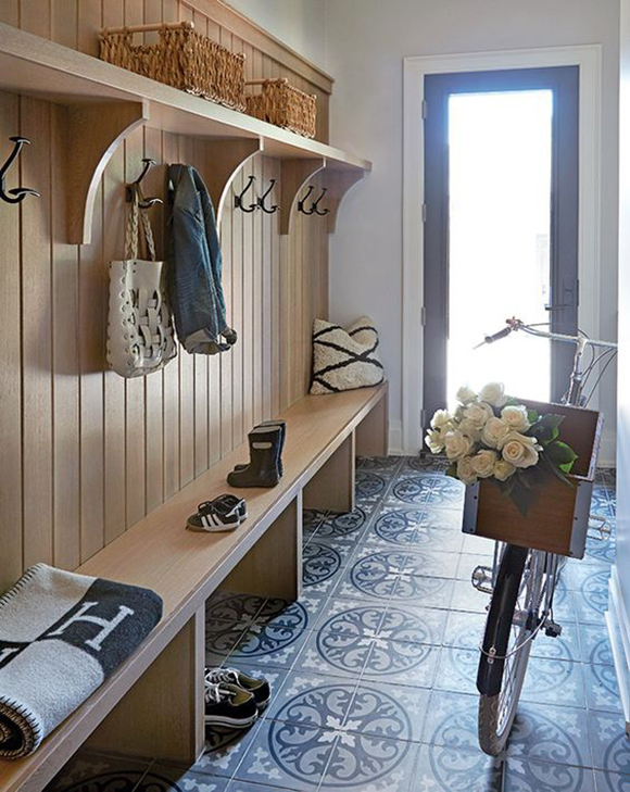
Photo courtesy shelterness.com
Fancy tiling distracts from the dirt brought in on adorable tiny wellies in this mudroom.
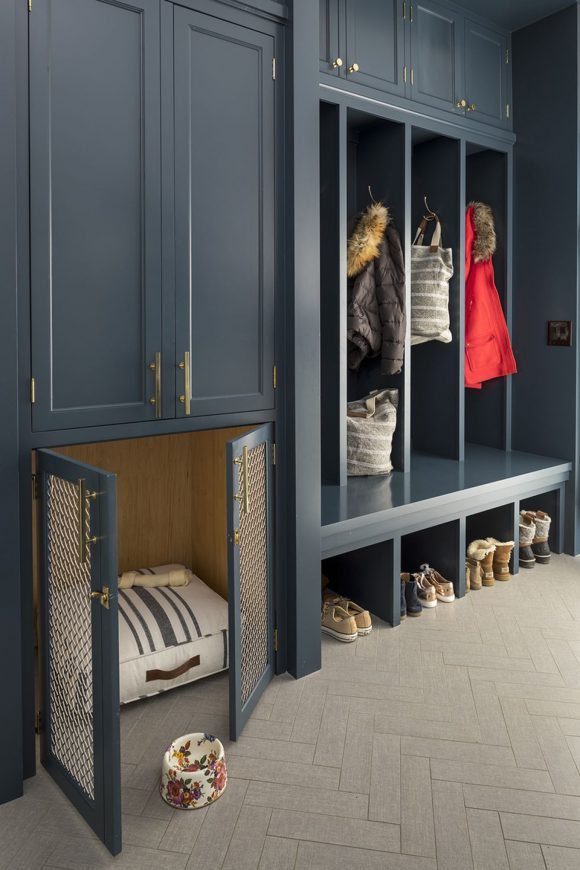
Photo courtesy Murphy & Co.
Love this look! Custom dog crate integrated into a mudroom space, with classic herringbone flooring and dark, dramatic cabinets.
Kimball Starr designs luxury mudrooms for homes throughout the San Francisco Bay Area and Lake Tahoe. Contact her today for a remote or socially-distant in-person consultation.
My favorite part of completing an interior design project is arranging the artwork. A room isn’t considered finished until it has art, but what is the best way to display it? Read on for my top tips!
First, if you’re not familiar with Minted.com, you should be. They have the biggest collection of custom online art, canvases, art printing, posters and cards, canvas bags, printed gifts and handicrafts, so you can find just the right piece to finish off your home or office design. I use them all the time when I need to create a custom piece unique to my client. And here’s how I like to display them:
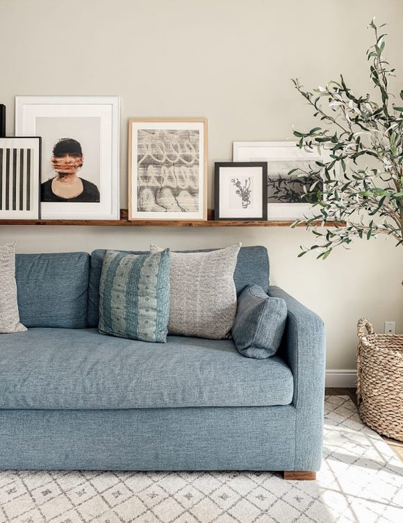
Photo courtesy chrislovesjulia.com
Ledges are great for a casual look. Put artwork against the wall and change it up as often as you like without having to remove nails or hooks.
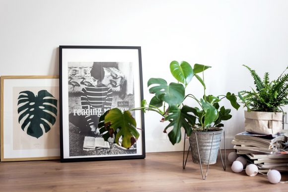
Photo courtesy Sandra Roe via Apartment Therapy
Lean prints against the wall, either from the floor, a shelf, or a picture rail. Another great way to display art, and easy to update.
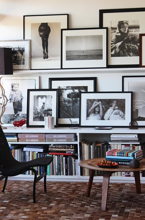
Photo courtesy CarlaAstan.com
Stacking frames of different sizes together creates groupings and combinations that tell a story.
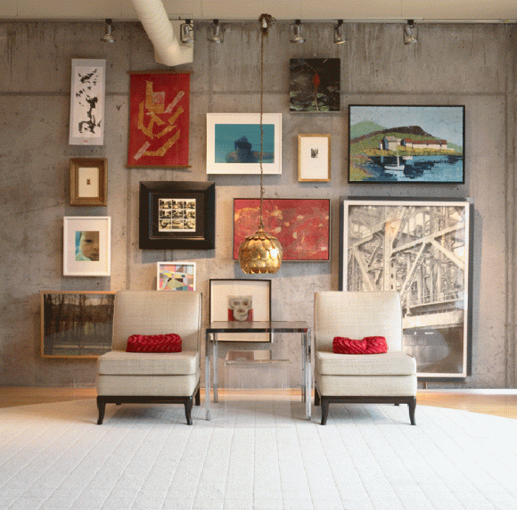
Photo courtesy Rabatin Family via arakawagrip.com
Hanging systems like rods or wire and clips are fun and creative. You don’t have to commit to a single location. Change and update them as desired, and you don’t have to repair the wall afterward.
Design by Kimball Starr / Photo by David Duncan Livingston
Unify multiple frames with size or color. Using all black frames, or all the same size frames, or making all your photos black and white are good ways to unify them. Here we’ve hung pictures from a picture rail using grosgrain ribbon, befitting the client’s Craftsman home.
Kimball Starr designs for luxury homes throughout the San Francisco Bay Area and Lake Tahoe. Contact her today for a remote or socially-distant in-person consultation.
According to the annual Houzz Trends Report, people have been relying on their homes to provide new avenues of activity and entertainment since the beginning of the pandemic and it shows in emerging search trends for art studios (up nearly 10x), home bars and wine cellars (up nearly 4x) and home theaters, home gyms and home offices (up 3x, 2.5x and 2x, respectively).
Let’s take a look at some wine cellars and home theaters today, spaces I enjoy creating.
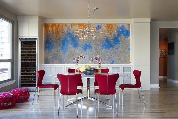
BEFOREAFTER Design by Kimball Starr / Photo by Eric Rorer
Above is a before-and-after wine storage solution we created in a San Francisco condo’s open plan dining area. The owners wanted something contemporary and sleek, while still welcoming and convenient.
We sunk the wine storage into the wall for a clean look, with slide-out racks. Beside it, a built-in credenza makes it easy to serve a flight of wines for tasting, with hors d’oeuvres. Above that, custom artwork ties in colors from their beloved vacation destination of Guatemala, so our retired couple can enjoy a glass of wine and share happy memories for many years to come.
Photo courtesy Millesime Wine Racks
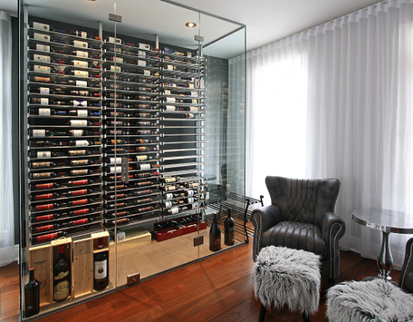
Here’s another way to create wine storage with a small footprint: A climate-controlled environment within a room.
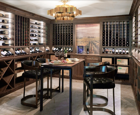
Photo courtesy Kitchen Design Partners Chicago
This grand tasting room and storage space has an elegant feeling, where you can really spend time enjoying your wine.
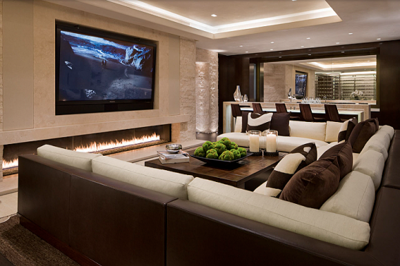
Photo courtesy Charles Cunniffe Architects, Aspen
A contemporary living and entertaining room can be created with coordinated furnishings that tie the spaces together, such as this corner sofa and seating at the bar.
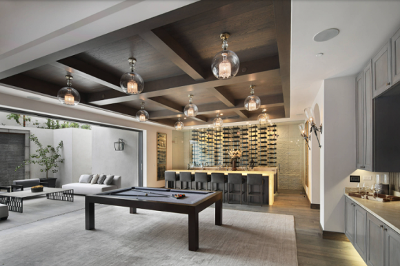
Design by Surreal Systems LLC / Photo by Jeri Koegel
What a beautiful coffered ceiling over the game space, coordinated with the living room and wine bar in this open-plan entertainment room in Orange County.
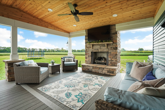
Photo courtesy Outdoor-FX Inc.
This transitional porch with a pergola and outdoor living room has everything you need to relax and entertain outside, with stunning views.
You can have the wine cellar or entertainment space of your dreams! Kimball Starr designs for homes throughout the San Francisco Bay Area and Lake Tahoe. Contact her today for a remote or socially-distant in-person consultation.
What does is look like when a color in the real world and a color in the digital space come together?
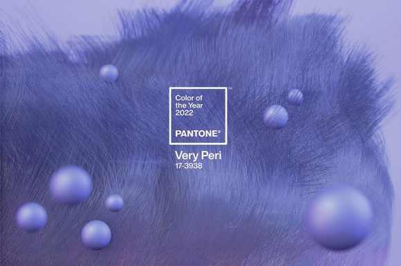
Image courtesy Pantone
Pantone’s Color of the Year 2022 is Very Peri, a combination of red and blue that might appear familiar to Microsoft users.
Photo courtesy NYPost
Matching to this completely made-up brand-new color is going to be interesting. You read that right, a brand-new color: The first time in global color authority Pantone’s history they’ve done such a thing.
Photo courtesy Anthropologie
Dubbed Very Peri (Pantone 17-3938), the dynamic periwinkle blue boasts a warm violet-red undertone and signals novelty in these continuing unprecedented times.
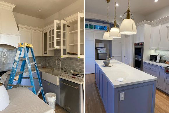
In-process project photos and design by Kimball Starr
“As we emerge from an intense period of isolation, our notions and standards are changing, and our physical and digital lives have merged in new ways,” the company shared in their press release. “Very Peri illustrates the fusion of modern life and how color trends in the digital world are being manifested in the physical world and vice versa.”
Photo courtesy Better Homes and Gardens
Periwinkle blue (or violet, if you prefer), is a color that takes its name from the periwinkle plant’s flowers, or myrtle. This particular blue has a violet-red undertone, which conveys “a spritely, joyous attitude and dynamic presence that encourages courageous creativity and imaginative expression,” said color guru Leatrice Eiseman, executive director of the Pantone Color Institute.
We’re looking forward to seeing all the ways that people utilize this color in their world. I look forward to finishing my periwinkle blue kitchen cabinetry project once the hardware arrives!
Custom color is Kimball‘s specialty! She designs colorful homes throughout the San Francisco Bay Area and Lake Tahoe. Contact her today for a remote or socially-distant in-person consultation.
In the New Year, if pandemic conditions allow, we’ll be hosting some friends and family again, and that means providing seating for everyone! Here’s a look at a before & after project featuring chairs and tables.
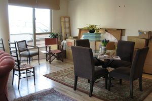
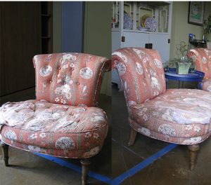
BEFORE photo by Kimball Starr
This San Francisco loft was mostly empty when we started. The client wanted a look inspired by a Moroccan bazaar, with lots of color, texture, and patterns. A pair of slipper chairs would be a great seating option, but they needed a complete overhaul.
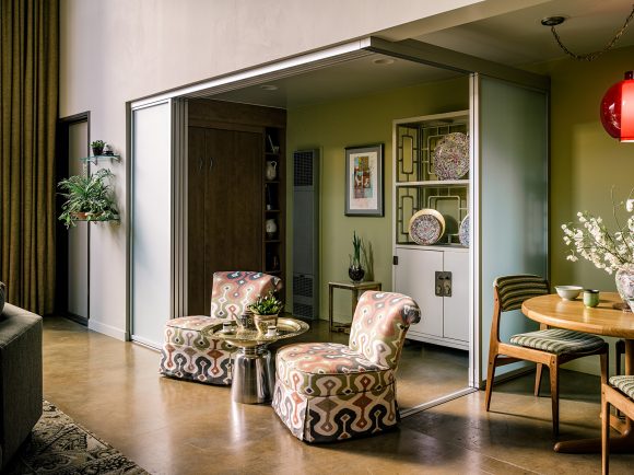
AFTER Design by Kimball Starr / photo by Paul Dyer
I re-upholstered the chairs with a beautiful pattern and added a metal side table for a great place to relax and read with a cup of tea or enjoy a conversation with a friend.
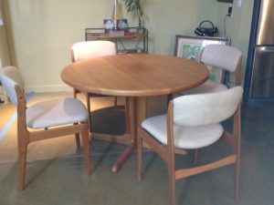
BEFORE Photo by Kimball Starr
A matched set of mid-century modern dining table and chairs was the look the client wanted, but the original upholstery was boring and drab – unthinkable!
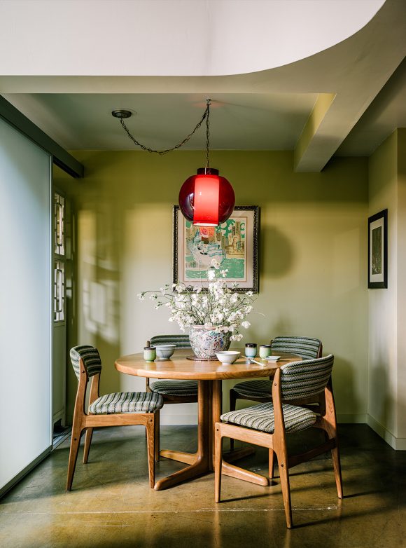
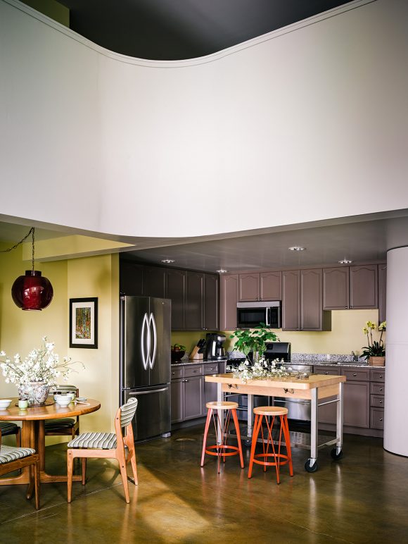
AFTER Design by Kimball Starr / photo by Joe Fletcher
Reupholstering the chairs in a funky striped material made them fit in better with their new surroundings, and a bit of furniture polish brought the table and chairs back to as-new condition. Now the brightly-colored pendant light shines down onto a vase full of fresh flowers, ready to welcome guests to a drink or meal at the table.
AFTER Design by Kimball Starr / photo by Joe Fletcher
Now the dining area fits in with the loft’s adjacent kitchen space, and is beautiful to look at as well, putting the fun back in functional.
Kimball Starr brings furniture back to life in homes throughout the San Francisco Bay Area and Lake Tahoe. Contact her today for a socially-distanced in-person or remote consultation!