Color Your Home for Mood Health
Have you ever been in a room with a color you either loved or disliked? How did it affect your mood?
Science tells us that colors of interior spaces change our moods through color psychology, triggered by biological and psychological responses linked to nature, culture, and personal memories. We use color’s emotional impact to set moods and create specific atmospheres, especially in our homes, offices, and other interior environments.
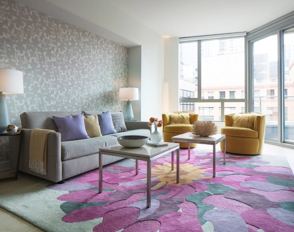
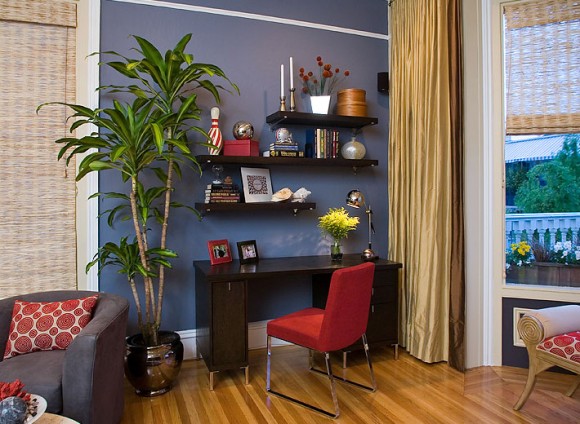
Warm colors such as reds and yellows boost energy and excitement, while cool colors like blues and greens promote calm, affecting our heart rate, stress, and ability to focus.
These effects — achieved by how hues, saturation, and lighting interact with our perception — create atmospheres of tranquility, vibrancy, or drama, influencing our mental and physical well-being.
How Colors Influence Moods
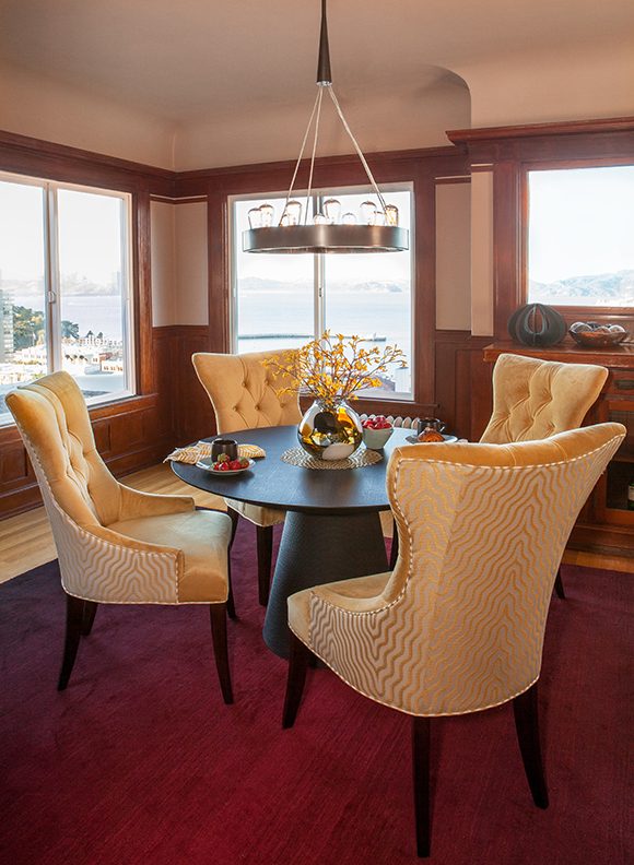
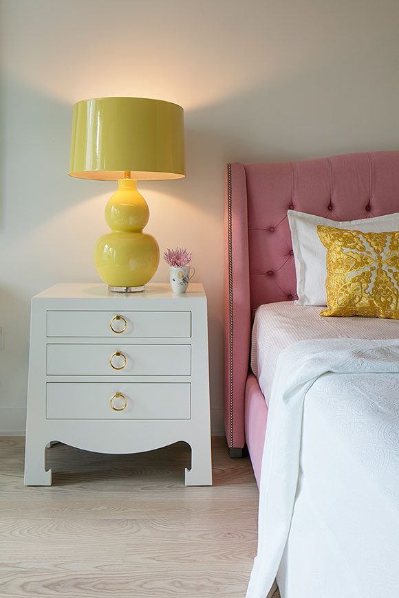
Warm Colors – Reds, Oranges, Yellows
- Effect: Stimulate energy, passion, appetite, creativity, and conversation
- Examples: Red for urgency or love, orange for enthusiasm, yellow for cheerfulness
- Interior use: Good in social spaces like kitchens, dining and living rooms
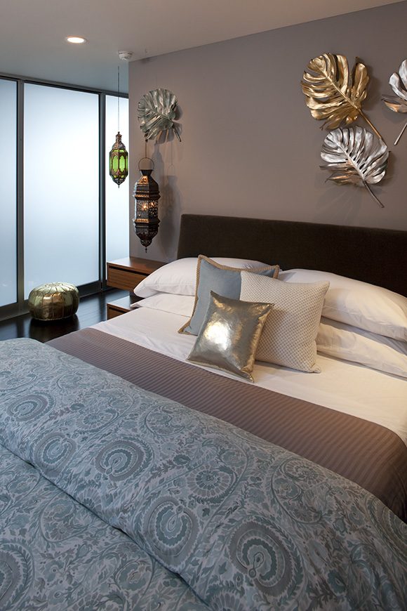
Cool Colors – Blues, Greens, Purples
- Effect: Induce calmness, tranquility, focus, and relaxation
- Examples: Blue for peace and trustworthiness, green for growth or freshness
- Interior use: Ideal for bedrooms, offices, bathrooms, or meditation areas
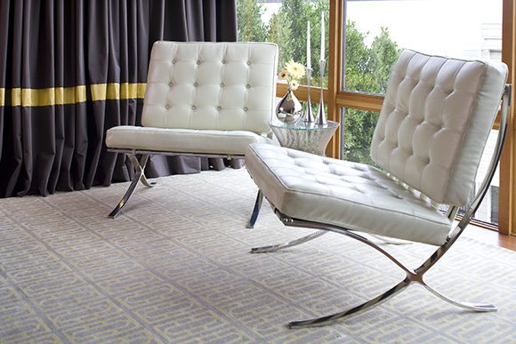
Neutrals and Dark Hues – Browns, Grays, Black
- Effect: Create feelings of drama, intimacy, coziness, or stability, depending on saturation
- Examples: Brown for reliability, charcoal or navy for warmth
- Interior use: Can add sophistication or make large rooms feel more intimate
Why It Happens
Biological and Neurological Response
Colors aren’t only seen; they’re felt. They trigger physical reactions like changes in heart rate, blood pressure, and hormone levels.
Evolutionary and Cultural Associations
We link colors to natural elements such as blue sky and green forests or cultural symbols, such as red for luck or passion. This creates instinctive responses in us.
Personal Memories
Past positive or negative experiences with a color can heavily influence our emotional reaction to it. Think about being inside a room with a color you dislike strongly, and how that would make you feel.
Design Factors
Saturation and Light
Deep, saturated colors add depth, while pastels create serenity. Interior lighting dramatically changes how colors are perceived! This is why it’s so important to get the right type and amount of light for the use of your space.
Balance
Overusing warm colors can cause agitation, while too many cool tones can feel cold. Strategic mixing is key for balance, and understanding how to combine complementary colors.
If you need help executing any of these concepts, get in touch! I’m known for being good with color, harmony, and balance.
Kimball Starr designs gorgeously colorful homes throughout the San Francisco Bay Area and Lake Tahoe. Contact her today for a consultation.


