Oct 21, 2015 | Posted in How To & Decorating Tips |


For those who live in California, you probably know that we are currently in the grips of the worst drought in recent history. The graphic below shows how much water major California cities are currently using.
So what can we do to help reduce water usage? In a series of blogs focusing on how interior design can contribute to conserve water, we’ll give you some great tips and introduce you to products that will make conserving water simple and beautiful. Today’s edition: Low-flow fixtures!

graphic courtesy MotherJones.com
One of the simplest retrofits you can perform yourself is to add an aerator to your sink faucets in the kitchen and bathroom. Aerators cost little and can be found at your local hardware store. “They’re rated for different flows, and a flow rate of 0.5 to 1 gallons per minute should be sufficient for a bathroom sink,” says Chrissy Trask, author of It’s Easy Being Green: A Handbook for Earth-Friendly Living.
You could also install a shut-off button or pull-chain on your current showerhead, making it simple to temporarily stop the water flow while shampooing, without losing water temperature.

Left: Faucet aerator graphic courtesy greenandsave.com / Right: Shower water stop graphic courtesy ec.gc.ca
If you haven’t yet installed a low-flow shower head because you remember the barely-dripping showers from the 1990s, there are now beautiful options with powerful water pressure! When it comes to showerheads, it pays to be picky. “Don’t just shop around for the cheapest model you can find,” Trask warns. “You want a showerhead that provides enough pressure to rinse the shampoo out of your hair, and that means spending a little more for the aerated type.”

Left: American Standard FloWise Transitional 3-function water-saving shower head / Right: Yakult Rain Showerhead
The American Standard FlowWise 3-function showerhead features exclusive turbine technology that delivers an invigorating shower using 20% or 40% less water, which can save a family up to 8,000 gallons of water a year. Choose from a turbine, full or combination spray. Matches contemporary, transitional or modern bathroom designs.
The Yakult Rain Handheld Showerhead comes in a 100% brass or chrome finish with a 5-year warranty – the same quality used in hotels. The 8-inch model features a 2.0 gallon-per-minute flow rate, saving 20% water usage compared to a standard model, plus the handheld option is perfect for bathing children and washing pets with ease while blending with modern bathroom designs.
In our next drought conscious blog posts, see tips on how interior design choices can conserve water with Washing Machines and Sinks & Toilets. Meanwhile, if you’re ready to remodel that kitchen or bath, contact us to redesign your space with beauty and eco-conscious fixtures. We make water conservation beautiful!
Kimball Starr Interior Design is a San Francisco design firm that offers interior remodels and decorating services for homes throughout the SF Bay Area. Our designs are focused on creating modern and eco-conscious interiors for relaxed California living.
Labels: residential design, sustainable design, tips, water use reduction
Oct 07, 2015 | Posted in Before & After |
The bathroom is one of the most-used rooms in the home, so it can really be a pain-point if the design isn’t correct. Luckily there are ways to renovate a bathroom to bring it up to a more usable standard. For example, take this San Francisco bathroom remodel in St. Francis Woods by Kimball Starr – it started out as 2 separate rooms, one with just a water closet and another room with the sink, tub and shower stall. This isn’t a space efficient layout where space is limited and no sink in the same room as the toilet is also not ideal.
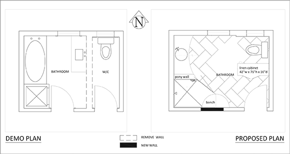
BEFORE on left and AFTER on right / Floor plans by Kimball Starr
Enter Kimball Starr, who saw potential for reworking this less than optimal floor plan. In order to maximize the available space and create a layout that flows better in the bathroom, if you’ll pardon the pun, we removed the separating wall along with the tub, and closed off one of the doorways.
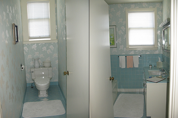
BEFORE: water closet and bathroom / Photos by Kimball Starr
-
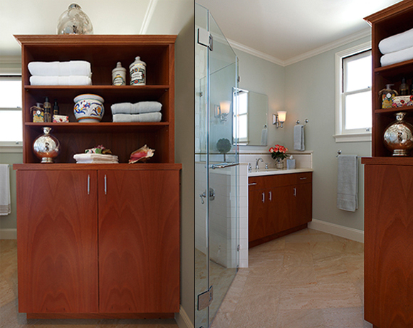
AFTER: Custom-designed bath cabinetry and San Francisco bathroom design by Kimball Starr Interior Design / Photos by Eric Rorer
By removing the separating wall and closing off the second doorway, the spaces were finally unified. A custom-made cabinetry piece was created as a visual block in front of the toilet as you enter the bathroom, so it’s not the first thing you see, and provides abundant storage for towels, cleaning supplies, and toiletries. The flooring is porcelain tiles made to look like stone, with excellent durability, and laid at a 45 degree angle to visually elongate the space.
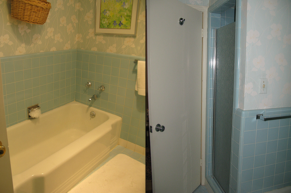
BEFORE: bathroom tub and shower / Photos by Kimball Starr
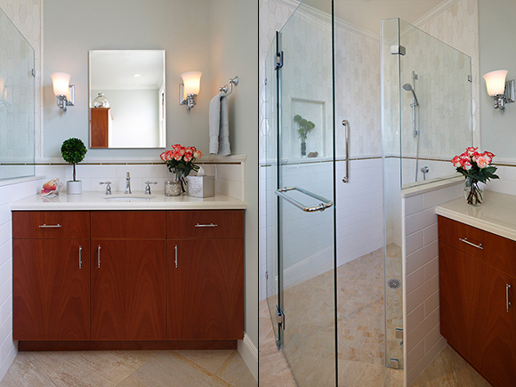
AFTER: San Francisco bathroom design by Kimball Starr Interior Design / Photos by Eric Rorer
A custom-designed mahogany vanity was sized to utilize every inch of space in the area where the tub existed, increasing functionality and storage, and providing a serene place to beautify and clean hands and face.
Beautiful handmade elongated geometric ceramic tiles by Pratt & Larson cover the upper part of the shower in varying shades of cream, bone and ivory, combined with simple classic subway tiles on the lower shower walls. To finish off the shower, the flooring is the same as the bathroom but cut into small squares to prevent a slippery floor. The curbless shower entry gives a seamless look, and coupled with the grab bar provides appropriate design elements for aging in place.
Now this bathroom is a beautiful, tranquil space that echoes the rest of the home! If you have a challenging bathroom space that needs to be reconfigured, and you don’t know how to approach the work, call in the San Francisco bathroom design expert, Kimball Starr Interior Design!
Kimball Starr Interior Design is a professional bathroom design firm for all shapes and sizes of baths. The award-winning San Francisco interior design firm provides full bath design from concept to completion including finish & fixture selections, construction documents, and contractor recommendations.
Labels: bathroom, before and after, custom furniture, porcelain tile
Sep 15, 2015 | Posted in How To & Decorating Tips |
All California residents should be aware that we are currently experiencing the worst drought since 1985-1991. The graphic below shows how serious this situation is as of just a few weeks ago.

California Drought Monitor as of July 30, 2015 courtesy droughtmonitor.unl.edu
So what can we do to help reduce water usage? In our series of blogs focusing on how interior design can contribute, here are great tips and products that will make conserving water simple and beautiful. Today’s edition: Washing machines.
PG&E provides top tips for getting the most out of your washing machine while using the fewest resources:
- Use the washing machine for full loads only to save water and energy.
- Washing dark clothes in cold water saves water and energy, and helps your clothes retain their color.
- Monitor your bill and water meter to determine unusually high use and possible leaks.
- Install a water-efficient clothes washer. Save: 16 gallons/load and $150 with this rebate program.
If you need a new washer, front-loading washing machines typically clean better than high-efficiency top-loaders, use less water and their high spin speed extracts more water so dryer time is cut. Most front-loaders can handle about 17 to 28-pound loads.
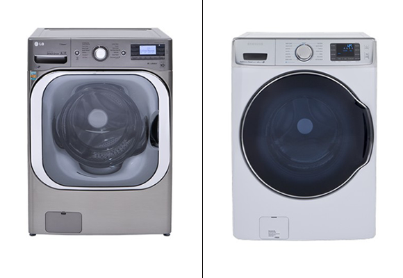
Left: The LG WM8500HVA / Right: The Samsung WF56H9110CW. Both photos courtesy ConsumerReports.com
The Energy-Star rated LG WM8500HVA front loading washing machine features the new Allergiene cycle that reduces and removes 95 percent of dust mites and pet dander from a load. It’s 41″ x 29″ x 33″, stackable, and has an end-of-cycle alert.
The Samsung WFH6H911CW front loading washing machine is 43″ x 30″ x 33″, stackable, and is Energy-Star Rated. Both of these machines look nice and won’t break the bank, while using 40% less water than machines of 10-15 years ago.
If you don’t want to look at these machines, there are ways to conceal them without banishing them to the basement. We have creative approaches to hiding appliances while keeping them handy, such as this San Francisco loft kitchen featuring a wheeled door that resembles an architectural column.
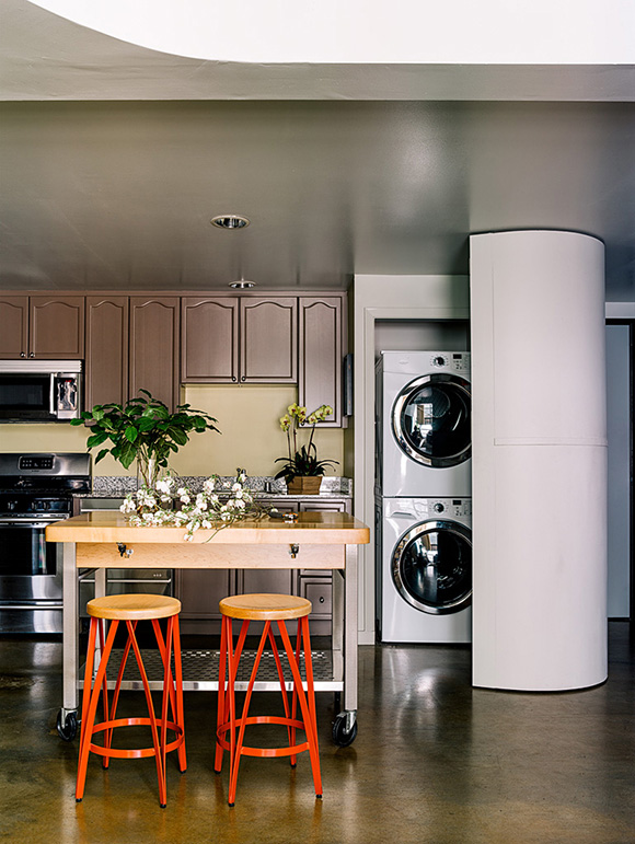
San Francisco loft interior by Kimball Starr Interior Design / Photo by Eric Rorer
See our other tips on how interior design choices can conserve water with Low-flow fixtures and Sinks & Toilets. If you need help identifying ways to conserve water with your next kitchen or bathroom remodel, or ways to beautify those water-conserving features, contact Kimball Starr Interior Design for a consultation today!
Kimball Starr Interior Design is a San Francisco design firm that offers interior remodels and decorating services for homes throughout the SF Bay Area. Our designs are focused on creating modern and ecologically conscious interiors for relaxed California living.
Labels: drought, residential design, sustainable design
Aug 11, 2015 | Posted in How To & Decorating Tips |
by Guest Blogger, Jennifer Davidson, Allied ASID, LEED AP
You should know about “green design” – the idea that we can design and build in a way that is more in tune with nature; healthier, and more sustainable. While it still is not possible to completely avoid industrially-produced products that are made with chemicals, it is possible to make smarter choices, both as a designer and as a consumer. Here’s how to source a healthier, greener couch or sofa for your home or office.
First, if you haven’t read my earlier post about healthy interiors, you should. It will help you make more informed decisions on a multitude of factors. Once you’re ready to think about healthier furniture, let’s begin with some history.

Graphic courtesy “New York Times”
The state of the industry
A 1975 California standard led to the use of harmful and potentially harmful flame retardant chemicals in furniture and baby products across North America. Greensciencepolicy.org tested the foam of 101 American couches bought between 1984-2010 and found that 85% of the couches contained toxic or inadequately tested flame retardant chemicals in the foam. These chemicals are linked to numerous health and environmental problems.
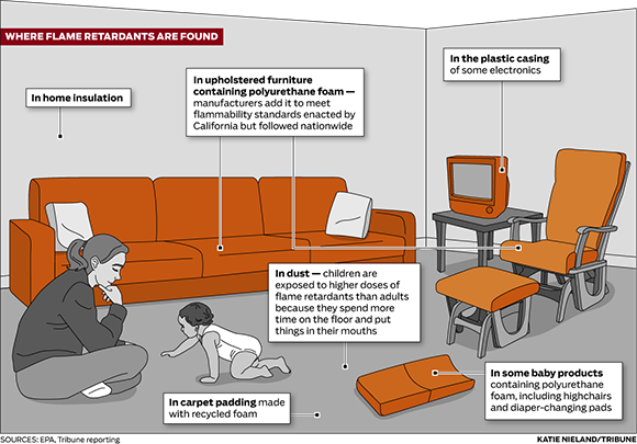
Graphic courtesy EPA & Tribune Reporting
Flame retardants found in couches
- TDCPP (chlorinated Tris), listed as a carcinogen by California in 2011
- PentaBDE, (pentabrominated diphenyl ether) globally banned due to toxicity and environmental persistence
- Firemaster 550, associated with obesity and anxiety in one animal study

Photo courtesy 2k3db at scientificamerican.com
Furniture manufacturers are making the switch to foam without flame retardants
In 2013 and 2014 the furniture industry reacted to the Prop. 65 listing of TDCPP and California’s revision of flammability standard TB 117. The industry began removing the chemical from furniture products.
A few of the bigger stores started phasing in healthier foam last July. Look for the “TB117-2013″ tag and confirm with a sales representative that the foam doesn’t contain flame retardants, which are not banned from furniture yet, but no longer required.

graphic courtesy greensciencepolicy.org
Soy-based vs. polyester foam
In an upholstered piece of furniture, the cushions need a filler of some kind. Before plastics, our grandparents and their parents used horsehair, feathers, wool or cotton batting, but with the rise of plastics, everything changed. Polyurethane foam was introduced as a cushion component in furniture in 1957 and quickly replaced other products because it was very inexpensive. Polyfoam cushions cost $2 vs. natural latex at $7 or $8.
Polyurethane foam is a by-product of the same process used to make petroleum from crude oil. The US Environmental Protection Agency (EPA) considers polyurethane foam fabrication facilities potential major sources of hazardous air pollutants including methylene chloride, toluene diisocyanate (TDI), and hydrogen cyanide.
O Ecotextiles tells us that an average queen-sized polyurethane foam mattress covered in polyester fabric loses HALF its weight over ten years of use. Where does the weight go? Polyurethane oxidizes, and it creates “fluff” (dust) which is released into the air and eventually settles in and around your home, and you breathe it in. Some of the chemicals include formaldehyde, styrene, toluene di-isocyanate (TDI), and antimony. Polyfoam breaks down rapidly, resulting in lumpy cushions, and has poor porosity, which traps moisture and results in mold, plus it is extremely flammable. Therefore flame-retardant chemicals are added to its production when used in mattresses and upholstered furniture.
Compare this with a bio-based foam made from soybeans. Companies claim that using soy in polyurethane foam production results in fewer greenhouse gas emissions, requires less energy, and could significantly reduce reliance on petroleum, but it actually contains very little soy. It’s more accurate to call it “polyurethane-based foam with a touch of soy”. Soy foam is not biodegradable either. What’s a consumer to do?

Photo courtesy churchillandsmith.com
Natural latex
There is a viable (and yes, more expensive product choice): Natural latex (rubber). The word “latex” can be confusing for consumers, because it has been used to describe both natural and synthetic products. This product can be 100% natural (natural latex) or 100% man-made (derived from petrochemicals) – or it can be a combination of the two. Keep in mind that rubber and latex are the same thing.
Natural latex is breathable, biodegradeable, sustainably harvested, healthier, meaning totally nontoxic, mold/mildew proof, and it lasts longer than polyfoam – some reports say up to 20 times longer. I bet you know which one you should buy, based on this information.

Graphic courtesy Royal Winter Fair Wool
Other healthier construction choices
Now that we’ve considered the foam itself in detail, let’s also briefly examine some elements of a couch and determine which will be the better choices to look for when selecting a “green” sofa.
Foam wrap – look for organic wool batting whenever possible. Wool is a breathable fiber that regulates itself to individual body temperature and really is warm in winter, cool in summer. It is naturally water-resistant, repelling moisture vapor through its fibers and making it resistant to rot, mold and mildew. It is also a rapidly-renewable material that takes little resources to produce.
Frame construction – Choose FSC-certified wood frames and water-based finishes. Avoid nails, choose screws instead for a stronger, more durable hold. If the manufacturer employs corner blocking with glue, ensure that it is water-based glue.
Fabrics – Many manufacturers such as Kravet and Pollack feature green fabric lines that meet strict performance standards, use recycled or sustainable fibers, and have been processed in facilities where wastewater is properly treated. You can also look for Cradle-to-Cradle certified products under Materials for Designers/Textiles to find 10 companies that manufacture textiles which meet C2C Certified standards, and can help you gain LEED points, if you are focused on Leadership in Energy & Environmental Design.

Photo courtesy GreenSciencePolicy.org
Return your old foam & keep your sofa – but healthier
The Green Science Policy Institute offers a program called the Safer Sofa Foam Exchange. Take your existing foam inserts which contain flame retardants purchased between 1978-2013 and exchange them for new, healthier foam for about $50 per cushion. The Green Science Policy Institute will use your old foam for testing and research to determine the safest way to dispose of these chemicals, many of which have long half-lives, remaining in the environment for many years. Participating locations include Foam Order in San Francisco, Kay Chesterfield Company in Oakland, The Foam Store of Marin (reach them through the Foam Order site), and Foam and Cushion in Concord. This way you can keep the same sofa that you’ve loved for years, but make sure you’re healthy to keep using it for years longer.
So now that you are armed with an understanding of what your options are, how to make the best choices for you, and how to find healthier furniture choices, I hope you will consider making your next purchase a more sustainable one.
___________________________
 JENNIFER DAVIDSON is a LEED Accredited Professional and holds an M.F.A. in Interior Architecture and Design from the Academy of Art University. She is the Social Media Chair for ASID California North Chapter and consults with interior design professionals on their small business needs. Contact her via makesocialmediaeasy.squarespace.com
Labels: green design, sustainable design
Jul 24, 2015 | Posted in Starr Spotlight |
No, we’re not trying to make space by shouting fire – we’re announcing the theme of our craft-item-inspired room vignette at the American Craft Council show in San Francisco July 31st to August 2nd!
With more than 230 of the top contemporary jewelry, clothing, furniture and home décor artists from across the country, ACC is the largest juried craft show west of the Rockies. For the past few years, ACC has featured a series of interior design vignettes called Make Room: Modern Design Meets Craft, created around and inspired by a craft item. This year’s theme is the 4 elements of Water, Air, Earth and Fire – Kimball’s theme!
Here’s a sneak peak at Kimball’s process:

FIRE
Designer: Kimball Starr, Allied ASID
Design firm: Kimball Starr Interior Design
Inspirations: Victor DiNovi, Mark L. Hendrickson, and Clark Renfort
Design style: I draw inspiration from colors, textures, and forms found in nature, as well as from gritty urban landscapes. I combine these elements to create exciting urban spaces while maintaining a touchstone to nature, for custom-crafted interiors that fit each homeowner’s lifestyle and sensibility.
Vision: From the destruction that fire wreaks comes renewal and rebirth in nature. This room is a conceptual design of an outdoor “room” in a lava field that illustrates how that transformation can bring forth beauty. I chose these organically shaped pieces so they appear as if they’ve grown up out of the lava bed, like beacons of beauty that rise up after fire.
Come see Kimball’s designs for yourself – along with the 3 other designer vignettes and thousands of hand-crafted pieces, all under one roof!
San Francisco American Craft Council Show
Festival Pavilion, Fort Mason Center
July 31 – August 2, 2015
Click here for tickets, show info, and artist listings.
Kimball Starr Interior Design is an award-winning San Francisco interior design firm providing home decorating services. Always inspired, Kimball is constantly expressing her elemental drive to design. Put that drive to work for you by contacting Kimball for a consultation today!
Labels: art, creative interior design, modern design
Jul 16, 2015 | Posted in How To & Decorating Tips, Inspirations |
Your bedroom is a haven from the rest of the world – a place you feel safe and comfortable. It’s also your most intimate environment, so it should be filled with happy memories and show what makes you, you. If you enjoy traveling, or are inspired by different cultures around the world, you can make your bedroom into a reminder of those travels without leaving the comforts of home. Here are a few international bedroom design ideas that express the personalities and travelogues of their owners.
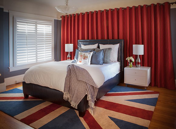
Kimball Starr Interior Design / photo by Marija Vidal
The patriotic British flag rug brands this bedroom with masculine colors: bold red, blue, and white. The London Red fabric draperies soften the space while defining the feature wall and the metal studded blue leather bed frame is masculine yet sensual. Notice how the bed looks inviting? Make your bed linens soft and appealing so you won’t want to leave your bed!
Heavy woven wool shams play to the country’s crisp cool air reminding you of foggy days, thick sweaters, and snuggling by a roaring fire. Pairing those with crisp white linens, wool herringbone throw blanket, and French Blue pinstriped pillows are reminiscent of a proper British tailored suit. Finish off the bed with an accent pillow embroidered with a quintessential double-decker bus, and a bench could also be added at the foot of the bed, covered in fabric that mimics place name signage such as Haversham Corner or Tottenham Court for a genuine British feel.
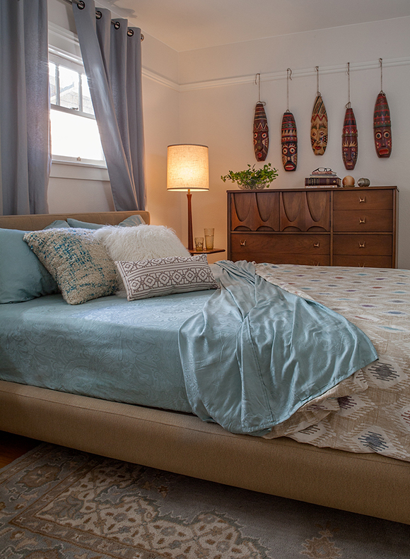
Kimball Starr Interior Design / photo by Mirija Vidal
The softer blues, creams and whites of this vintage bungalow bedroom can be either feminine or masculine to celebrate a global style with a relaxed feel. These soft watery blues and creams complement the vintage Broyhill Brasilia dresser, the bedside lamp and the authentic Brazilian carved masks. Various textures of pillows and ethnic patterned bedspread create a warm landing for your eyes and body.
An antique patterned rug makes a comfortable way to get up in the morning, protecting your feet from cold floors. Brazil is the home of Carnival, so an authentic addition might be a feather arrangement reminiscent of the fabulous headdresses worn at Carnival, or add your own fun masks or carved art you find on your very next global beach travels!
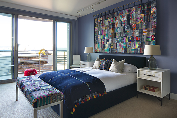
Kimball Starr Interior Design / photo by Eric Rorer
Artisan textiles are the focal point of this contemporary bedroom, which are based on the Guatemalan tapestry brought back from the owner’s travels. We hung it right over the headboard as a statement piece, and then upholstered the bench in a similar hand-sewn fabric. The throw blanket was also an Antigua find in the Guatemalan markets, and we had colorful tassels added as a playful fringe. The bedding is finished off with a decorative pillow to visually tie together all the handmade textiles.
Upholstering the bed in an inky blue velvet provides a balance of sensuality and calm to the multiple patterns. Wood tiled drawer fronts on the nightstands paired with glass jug bases for lamps complete the handcrafted style, but balance nicely with a modern aesthetic. An excellent additional choice might be woven baskets, used by locals to carry items to and from market.
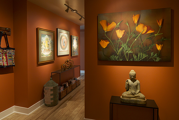
Kimball Starr Interior Design / photo by Eric Rorer
While this last photo isn’t a bedroom, it’s an entryway that leads to a bedroom. Entryways are a great way to set the mood of the home, and here we used the client’s art collected from international travels to highlight the Tibetan influence along with a few sculptural pieces. The warm orange wall color glows from lighting that highlights curated artwork. A wonderful cultural addition could be prayer flags hung along the hall ceiling, or Tibetan singing bowls on the table. This entryway makes you feel welcome, wouldn’t you agree?
Now that you have some inspiration, incorporate your own international flavor into your home to express your personality, or contact us and we’ll show you how!
Kimball Starr Interior Design is an award-winning San Francisco interior design firm providing home decorating services. Always ready for the next trip, Kimball is constantly on the lookout for travel design inspiration and new ideas around the globe!
Labels: bedroom