When you look through my interior design portfolio, one thing that new clients often mention attracted them is my use of color combinations. I’m confident in using color boldly to transform interior spaces, and I can help you gain color confidence, too! Here’s a peek into my process.
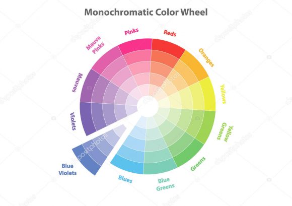
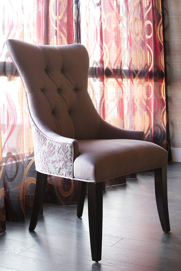
Monochromatic Color Scheme
Image courtesy DepositPhotos.com
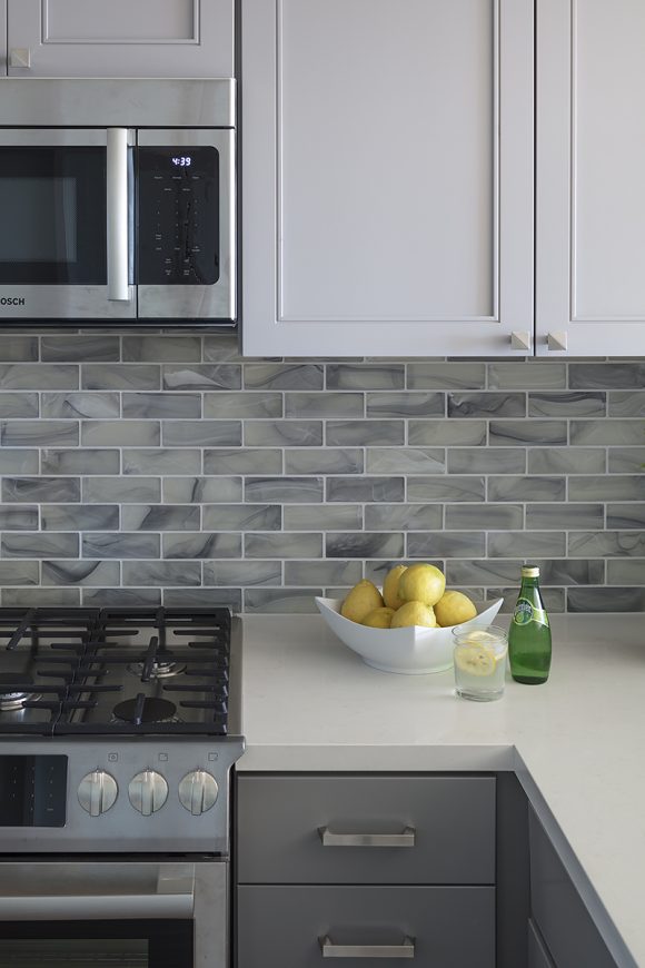
One of the simplest ways to be assured your colors will go together is by using variations of the same color, just in different values or tints, called a monochrome. Monochromatic designs often use neutrals such as grey or tan, but could just as easily be made with blue.
The key to this type of color combination is to create a balance by using several variations of your main color, then just a pop of a contrasting color to give it life, such as shades of light and dark grays accented with a touch of lime green.
Design by Kimball Starr / Photo by Eric Rorer
In the kitchen above, designed for a San Francisco bachelor who wanted something timeless and chic, variations of grey upper and lower cabinetry with silver drawer pulls, stainless steel appliances, and sleek subway tiles work together to provide a soothing backdrop, so the fruit and green glass bottle on the counter really stand out, as would any fresh food you’re preparing and serving.
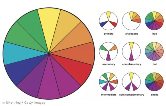
Complementary Colors
Graphic courtesy Craftsy.com
Another easy combination is complementary colors. Primary colors, which are yellow, red, and blue, are the building blocks for creating all other colors. Specific paint mixture combinations of two primary colors will create the secondary colors of either green, orange, or purple. A complementary color scheme is defined as a primary color matched with its secondary color shown directly across from it on the color wheel.
Design by Kimball Starr / Photo by Eric Rorer
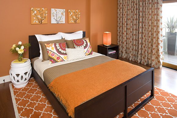
Pairing a primary with its complementary color creates a harmonious balance. For example, red and green, which we use often for Christmas and holiday traditions. Yellow and purple is bright and energetic, seen in sports teams and also as a trending interior design combination. Blue and orange is so popular in graphic design and color correction for film and television that there are whole YouTube essays about this combination, and why we’re attracted to it.
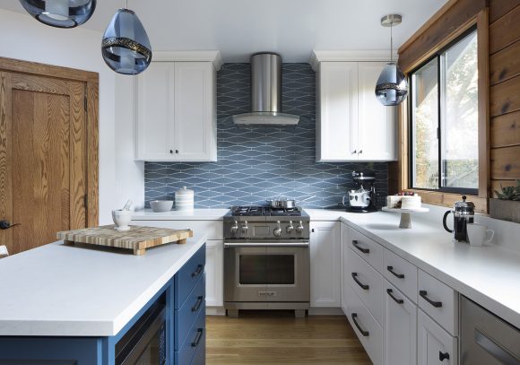
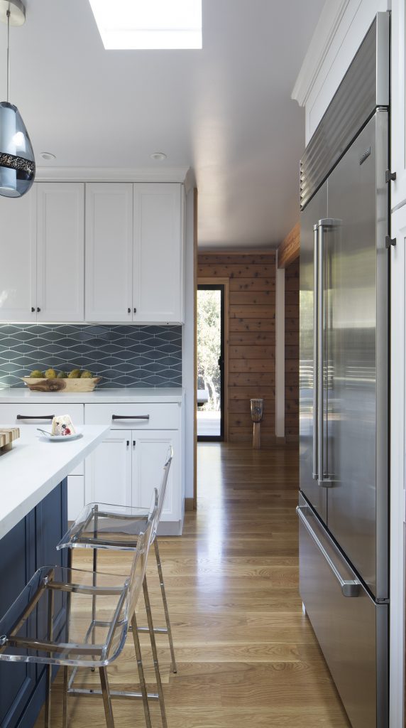
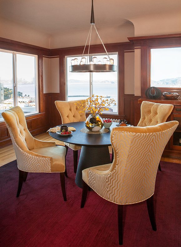
Design by Kimball Starr / Photo by Paul Dyer
My Bay Area farmhouse kitchen design above is a good example of blue and orange, where the orangey color of the wood stands in a for a true orange. It’s important to work with the dominant color and features in your home, to enhance the beauty instead of fighting it. This home has a very cabin-y feel with all the exposed knotty wood, but the blue color complements the wood comfortably, making it feel both homey and modern.
Split Complementary
Graphic courtesy NNehring via Getty Images
A more advanced combination is that of split complementary, where you select two colors that are one color apart from each other on the wheel, and then one directly across from those.
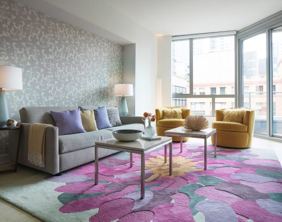
In my design below, lilac and fuchsia with a splash of yellow liven up foggy San Francisco days. Don’t forget that color has a strong effect on mood, so pick something you love to fill your home with joy.
Design by Kimball Starr / photo by Eric Rorer
If you want to use color boldly, work with Kimball Starr Interior Design! She creates beautiful homes in the San Francisco Bay Area and Lake Tahoe. Contact her today for an in-person or remote consultation.
On January 1 we shared a beautiful newly-designed kitchen with custom cabinetry. Now let’s look closer at some of the fine details that make it functional and gorgeous.
Design by Kimball Starr / Photo by Homeowner
In our redesigned kitchen, we moved the refrigerator to a different wall and used a Sub-Zero paneled fridge for a cleaner look.
Design by Kimball Starr / Photo by Homeowner
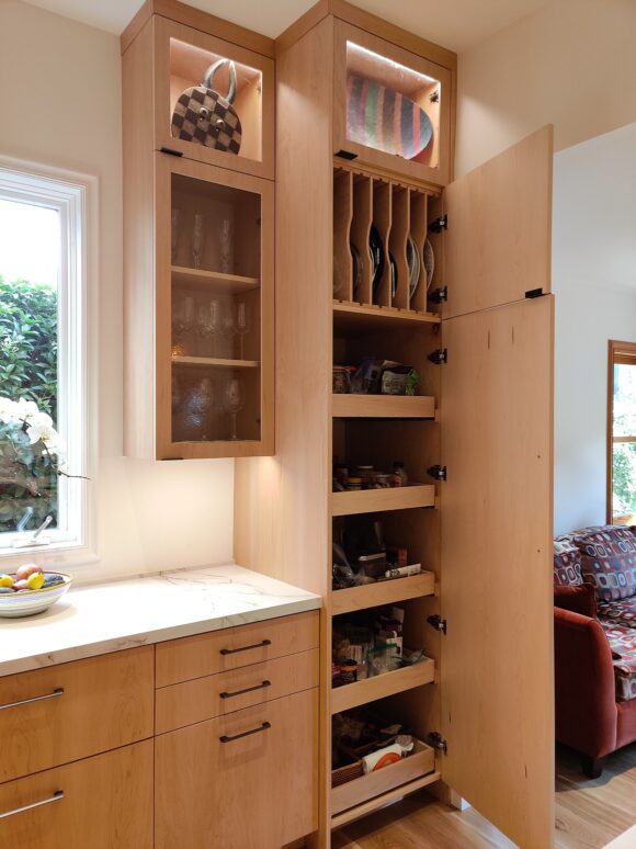
Adding lighted glass top cabinets allows beautiful collectibles and infrequently-used kitchen items to be featured.
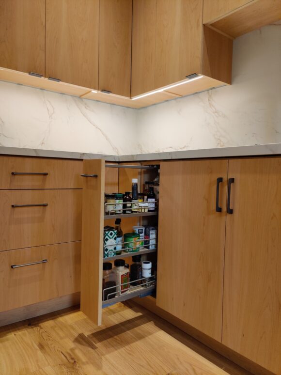
Extending the cabinets to the ceiling is a modern look homeowners crave, along with a beautiful slide-out storage pantry.
Design by Kimball Starr / Photo by Homeowner
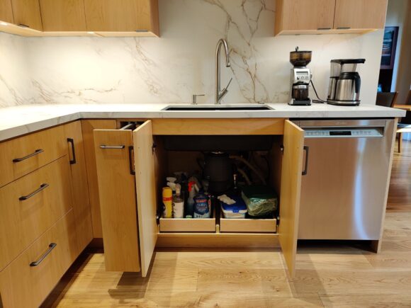
Underneath the sink now holds pull-out drawers, making access to supplies a breeze.
Design by Kimball Starr / Photo by Homeowner
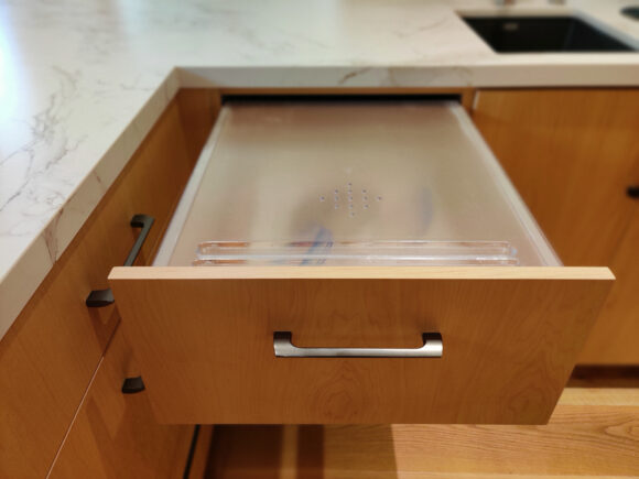
A custom bread storage drawer with built-in cutting surface keeps bread, pastries, and other baked goods fresh and delicious.
Design by Kimball Starr / Photo by Homeowner
Use every space with this pull-out spice rack near the range.
You can also see the custom under-cabinet lighting and the row of power strips against the wall. Never move counter items to reach a plug again!
Design by Kimball Starr / Photo by Homeowner
What would normally be a dead end under an L-shaped counter is fully utilized by creating a cabinet near the stools. Great for items that are used infrequently but need to be at eye level, like vases and special glassware.
Design by Kimball Starr / Photo by Homeowner
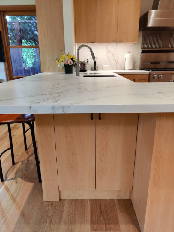
Final detail: This kitchen features two sinks! The bar counter now holds a smaller sink for cocktails, food and drinks prep.
Want a custom kitchen of your own? Kimball Starr designs kitchens throughout the San Francisco Bay Area and Lake Tahoe. Contact her today for a remote or in-person consultation!
In a post-COVID world, how can we create spaces that naturally help us fight infections, and keep our spaces clean? Read on for my best tips!
Design by Kimball Starr / Photo by Eric Rorer
Start with the basic design elements of the space by choosing surfaces that are easier to clean. Pick flat panel cupboards that don’t collect dust, avoid shiplap that needs regular cleaning, and use larger size tiles for fewer grout lines.
Design by Kimball Starr / Photo by Eric Rorer
Use naturally anti-microbial surfaces for kitchen countertops and bathroom surfaces, such as stainless steel, and copper. Doorknobs are another place that copper is excellent at stopping the spread of germs.
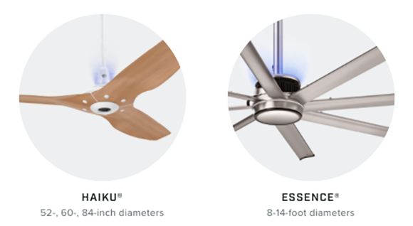
Images courtesy Big Ass Fans
New technology beats your old air filter, when it comes to having cleaner air in our homes. Big Ass Fans offers UV-C lighting as endorsed by the CDC integrated into two of their ceiling fans. UV light has been proven to fight infection for over 70 years, so take advantage of this in your home or office, and you’ll have a healthier, happier life for many years to come.
Design by Kimball Starr / Photo by Eric Rorer
Kimball Starr designs healthy homes throughout the San Francisco Bay Area and Lake Tahoe. Contact her today for a consultation!
Have you ever been in a room with a color you either loved or disliked? How did it affect your mood?
Science tells us that colors of interior spaces change our moods through color psychology, triggered by biological and psychological responses linked to nature, culture, and personal memories. We use color’s emotional impact to set moods and create specific atmospheres, especially in our homes, offices, and other interior environments.
Warm colors such as reds and yellows boost energy and excitement, while cool colors like blues and greens promote calm, affecting our heart rate, stress, and ability to focus.
These effects — achieved by how hues, saturation, and lighting interact with our perception — create atmospheres of tranquility, vibrancy, or drama, influencing our mental and physical well-being.
How Colors Influence Moods
Design by Kimball Starr / Photo by Marija Vidal
Warm Colors – Reds, Oranges, Yellows
Effect: Stimulate energy, passion, appetite, creativity, and conversation
Examples: Red for urgency or love, orange for enthusiasm, yellow for cheerfulness
Interior use: Good in social spaces like kitchens, dining and living rooms
Design by Kimball Starr / Photo by Eric Rorer
Cool Colors – Blues, Greens, Purples
Effect: Induce calmness, tranquility, focus, and relaxation
Examples: Blue for peace and trustworthiness, green for growth or freshness
Interior use: Ideal for bedrooms, offices, bathrooms, or meditation areas
Design by Kimball Starr / Photo by Eric Rorer
Neutrals and Dark Hues – Browns, Grays, Black
Effect: Create feelings of drama, intimacy, coziness, or stability, depending on saturation
Examples: Brown for reliability, charcoal or navy for warmth
Interior use: Can add sophistication or make large rooms feel more intimate
Why It Happens
Design by Kimball Starr / Photo by Eric Rorer
Biological and Neurological Response
Colors aren’t only seen; they’re felt. They trigger physical reactions like changes in heart rate, blood pressure, and hormone levels.
Evolutionary and Cultural Associations
We link colors to natural elements such as blue sky and green forests or cultural symbols, such as red for luck or passion. This creates instinctive responses in us.
Personal Memories
Past positive or negative experiences with a color can heavily influence our emotional reaction to it. Think about being inside a room with a color you dislike strongly, and how that would make you feel.
Design Factors
Design by Kimball Starr / Photo by Eric Rorer
Saturation and Light
Deep, saturated colors add depth, while pastels create serenity. Interior lighting dramatically changes how colors are perceived! This is why it’s so important to get the right type and amount of light for the use of your space.
Balance
Overusing warm colors can cause agitation, while too many cool tones can feel cold. Strategic mixing is key for balance, and understanding how to combine complementary colors.
If you need help executing any of these concepts, get in touch! I’m known for being good with color, harmony, and balance.
Kimball Starr designs gorgeously colorful homes throughout the San Francisco Bay Area and Lake Tahoe. Contact her today for a consultation.
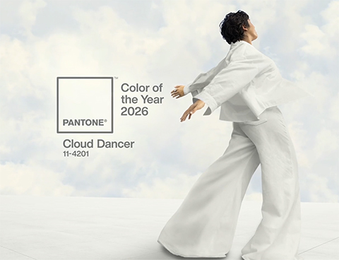
Every year designers anticipate the Color of the Year announcement from Pantone, so I’m excited to share this year’s event!
Image courtesy Pantone.com
From the Pantone website:
A Whisper of Tranquility and Peace in a Noisy World
“Introducing Pantone Color of the Year 2026, PANTONE 11-4201 Cloud Dancer, a lofty white that serves as a symbol of calming influence in a society rediscovering the value of quiet reflection. A billowy white imbued with serenity, PANTONE 11-4201 Cloud Dancer encourages true relaxation and focus, allowing the mind to wander and creativity to breathe, making room for innovation.”
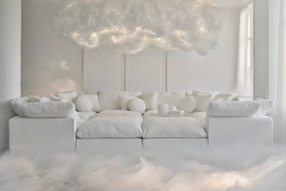
Pantone and Joybird have partnered to present a heavenly collection of furniture with serenity you can feel, plus several additional coordinating colors.
“Cultivating calm and relaxation, the exclusive Joybird x Pantone collaboration fulfills our longing for harmony at home with invitingly tactile fabrics that evoke serenity and inspire quiet reflection.”
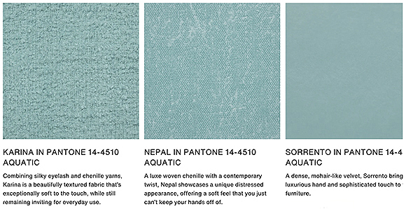
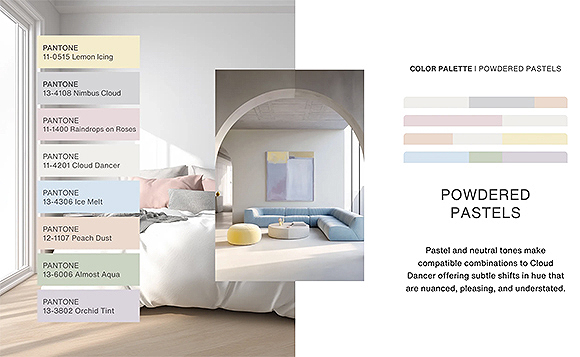
Color palette and photos courtesy Pantone.com
Color Palette: Powdered Pastels
Cloud Dancer and powdered pastels reminds me of the 1980s, when pastels were everywhere. This is a more adult style, while retaining a sense of whimsy and fun.
I can’t wait to use these with some of my clients in 2026 – could it be YOU?
Kimball Starr designs gorgeous homes throughout the San Francisco Bay Area and Lake Tahoe. Contact her today for a consultation.
Are you out of storage space, lack counter or work surfaces, or it’s too far between your stove, fridge, and sink so you feel like you’re always running? I can help!
Enjoy these inspirational images of a San Francisco kitchen we finished in 2025 so you can stop dreaming and start making a change.
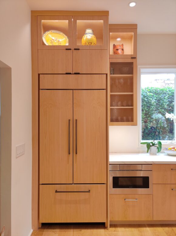
Design by Kimball Starr / Photo by Cabinet Maker
Natural oak upper cabinets go all the way to the ceiling for a modern look with less dusting above.
A beautiful stainless steel hood makes cooking easy and reduces cleanup. The counter is created with the same sintered stone as the backsplash for an elegant look that’s simple to clean.
Design by Kimball Starr / Photo by Cabinet Maker
An integrated fridge matches the rest of the cabinetry. No more cleaning fingerprints off the fridge door!
The microwave is under the counter, avoiding spills from overhead lifting.
Lighted display cases are enclosed by glass, keeping your family items safe and clean.
Design by Kimball Starr / Photo by Cabinet Maker
The sink, cabinets, and dishwasher are within reach, making loading and unloading dishes a breeze.
Detail on the finishes is what makes this kitchen really sing!
Design by Kimball Starr / Photo by Cabinet Maker
Kimball Starr designs gorgeous, well-thought-out homes throughout the San Francisco Bay Area and Lake Tahoe. Contact her today for a consultation.