I just love a new year, getting a chance to have a fresh start, and time to renew yourself and your environment to prepare for the year ahead. If you’re dreaming of a refreshed and renovated home, read on for a beautiful before-and-after!
Design by Kimball Starr / Photo by Paul Dyer
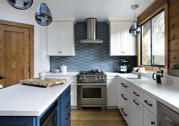
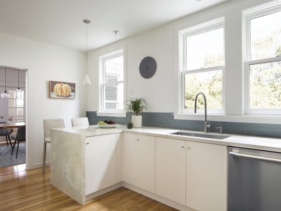
Above is how my client’s kitchen looks now, after I shifted a wall and added a door and an island.
Left: BEFORE / Right: AFTER Design by Kimball Starr / Photo by Paul Dyer
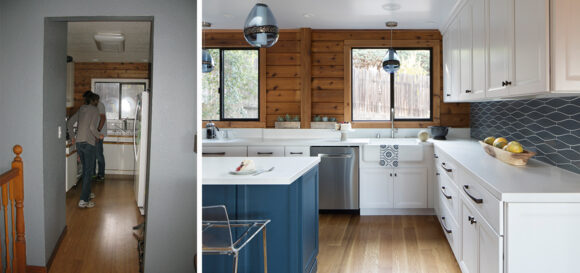
You can see how limiting the sheetrock walls were. After removing the walls, now the kitchen is open and welcoming.
Left: BEFORE / Right: AFTER Design by Kimball Starr / Photo by Paul Dyer
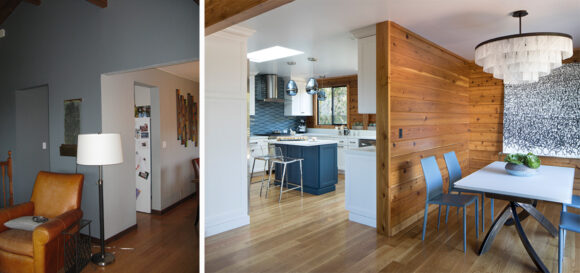
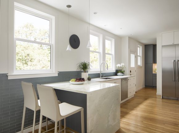
We changed the container of the space to improve flow and make it more usable. The sheetrock corner went away, we added a beam overhead, and clad the dining room wall to match the rest of the space.
Left: BEFORE / Right: AFTER Design by Kimball Starr / Photo by Paul Dyer
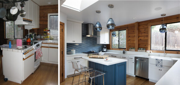
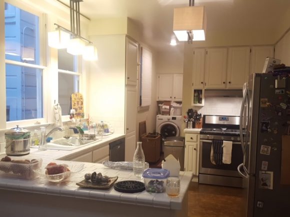
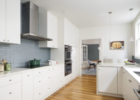
On the left is how the kitchen previously looked in my client’s San Francisco home. Cramped, dark, and no place to put things down while cooking. On the right, my solution to create a light and airy kitchen with style!
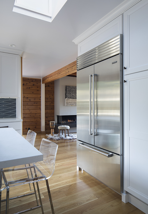
AFTER Design by Kimball Starr / Photo by Paul Dyer
Looking through the kitchen towards the living room and dining room, you can see how interconnected everything is now in my clients’ bright and contemporary home.
Kimball Starr designs beautiful, refreshed homes throughout the San Francisco Bay Area and Lake Tahoe. Contact her today for a socially-distanced in-person or remote consultation!
The entryway, also called the foyer, is one of the hardest-working spaces in your home, especially during the holiday season. Here are some inspirational ideas from around the web and my top tips for your consideration.
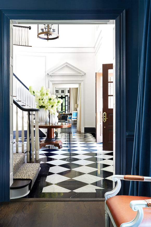
Photo courtesy Mali Azima
Black and white flooring never goes out of style. This floor shows off the length of the room. Love it!
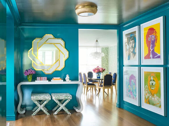
Photo courtesy Annie Schlecte
Don’t be afraid to go bold with color! Make a statement and envelop your visitor with rich tones. Consider painting the walls, ceiling, and trim in the same vibrant hue.
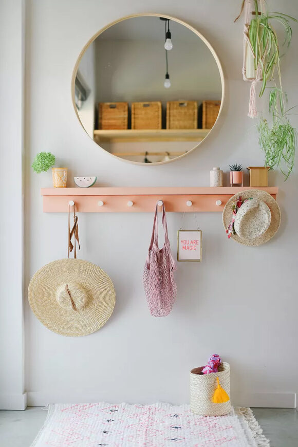
Photo courtesy Maria-Carla Atencio
In a small area, use as little décor as possible and make it useful storage.
Photo courtesy Edward Gohlich
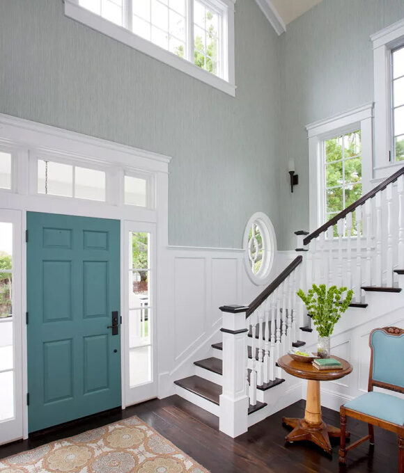
Communicate your theme. This coastal-feeling entry makes a subtle splash with water-inspired colors like seafoam, plenty of windows, and a high ceiling to accommodate the stairs, a classic architectural feature. What a great way to welcome people into your home.
Kimball Starr designs for stunning homes throughout the San Francisco Bay Area and Lake Tahoe. Contact her today for a remote or socially-distant in-person consultation.
Want an update on the standard white-on-white kitchen? Read on for how I delivered a GORGEOUS space with a touch of modern color.
Design by Kimball Starr / Photo by Paul Dyer
My client wanted a kitchen that had more workable space and was beautiful to see and use. We added a beautiful moss-green subway tile to the walls and backsplash, swapped the fridge and cook surface, and let the natural light shine through the windows by removing the tall pantry.
BEFORE
Here you can tell how it was before — cramped, dark, and lacking storage.
Design by Kimball Starr / Photo by Paul Dyer
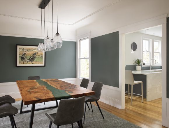
Repeating the green subway tiles on the opposite wall brings a lovely sense of rhythm and harmony to the kitchen. The view into the dining room at the far end reveals our gorgeous grey-green paint color on the walls.
Design by Kimball Starr / Photo by Paul Dyer
Now you can see how our beautiful green color really makes the space sing. My client had the slab of cypress wood stored in their garage but didn’t know how to use it. I turned it into their dining table; the color ties in perfectly.
Design by Kimball Starr / Photo by Paul Dyer
Repeating the grey-green on the cabinetry in the laundry area creates a space unified by gorgeous color throughout, with a beautiful veined white marble backsplash that matches the kitchen counters to complete the look.
Kimball Starr designs for gorgeous homes throughout the San Francisco Bay Area and Lake Tahoe. Contact her today for a remote or socially-distant in-person consultation.
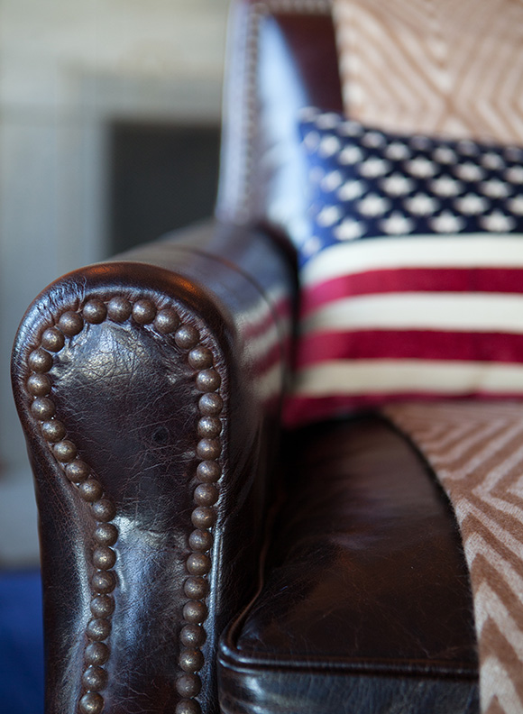
I just love leather furniture: The texture, the feeling, the look of something aged by use, loved by a family. Here we look back at some of my favorite projects that include leather furniture, in time for the holidays!
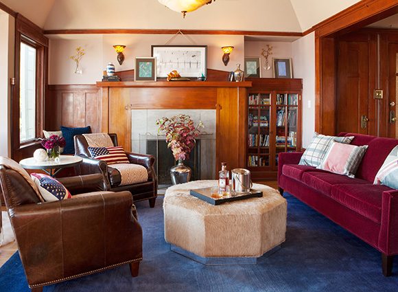
Design by Kimball Starr / Photo by Marija Vidal
Love the cracks in this well-worn armchair.
Design by Kimball Starr / Photo by Marija Vidal
Leather chairs pair nicely with a hair-on-hide ottoman, here used as a coffee table.
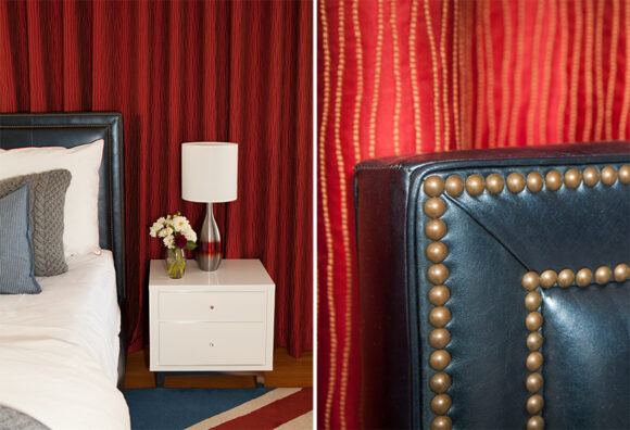
Design by Kimball Starr / Photo by Marija Vidal
The look of the bed’s leather headboard with nail-head details in this same gentleman’s modern classic condo makes my heart sing.
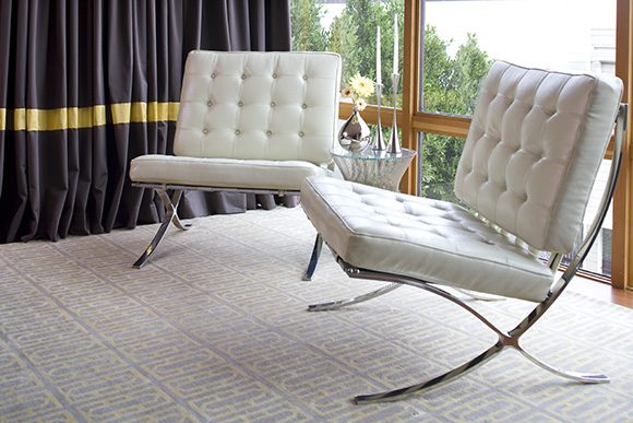
Design by Kimball Starr / Photo by Eric Rorer
Barcelona leather chairs are timeless.
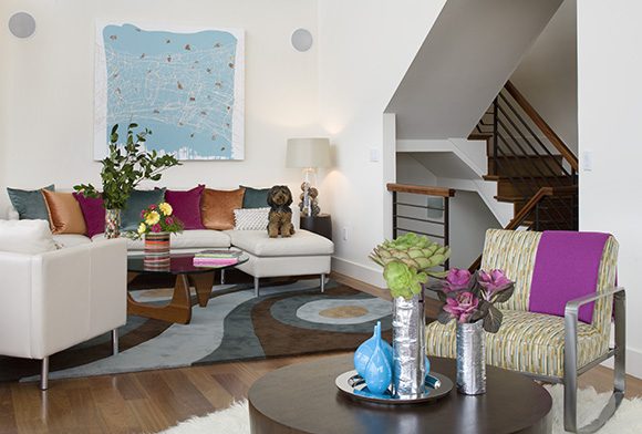
Design by Kimball Starr / Photo by Eric Rorer
Even the family dog loves the leather sectional sofa in this hillside retreat.
Kimball Starr designs custom leather furniture for homes throughout the San Francisco Bay Area and Lake Tahoe. Contact her today for a remote or socially-distant in-person consultation.
One of the common issues we have in a modern world is entertainment equipment and collections – your wifi router, streaming devices, books, magazines, and Blu-rays take space to store and can look cluttered. I have an elegant solution: Custom cabinetry!
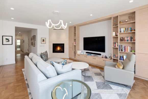
Design by Kimball Starr / Photo by Steph Dewey
Look how many cabinets and drawers we can fit in this light, bright, contemporary family living room by creating a custom wall of storage.
Design by Kimball Starr / Photo by Steph Dewey
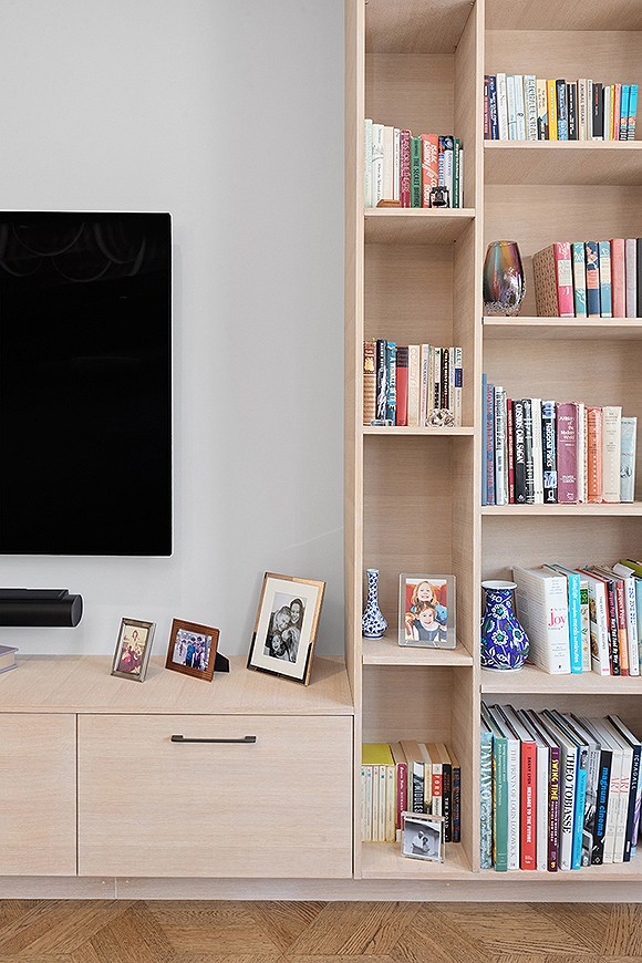
Books, photos, and collectibles are easily accessible and displayed with open storage.
Design by Kimball Starr / Photo by Steph Dewey
Closed storage keeps the messier things like wifi equipment, magazines and personal papers out of sight.
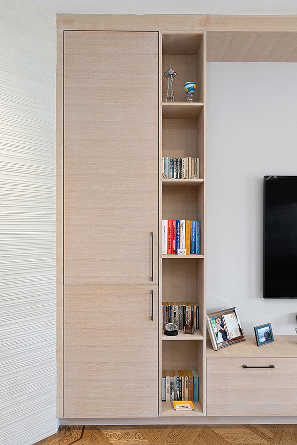
The row of cabinets underneath the television are specially designed to open out of the way, so nothing prevents you from looking in to see the contents without having to bend over. Thoughtful design like this makes such a difference to how you enjoy the space.
Design by Kimball Starr / Photo by Steph Dewey
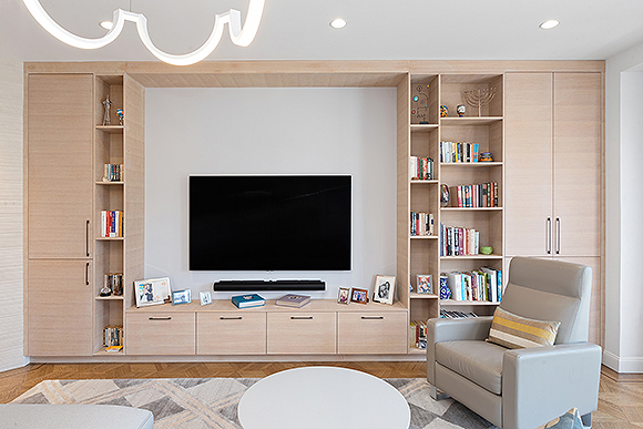
What’s on display is the beauty of this light oak wood cabinetry, which is trending right now. I can create something like this for you, too!
Kimball Starr designs custom storage for homes throughout the San Francisco Bay Area and Lake Tahoe. Contact her today for a remote or socially-distant in-person consultation.
Have you ever been in a powder room that really made you say, Wow? Was it a single detail that bowled you over, or the coordination of multiple materials in such a small space? Let’s look at some of my work on powder rooms to learn more.
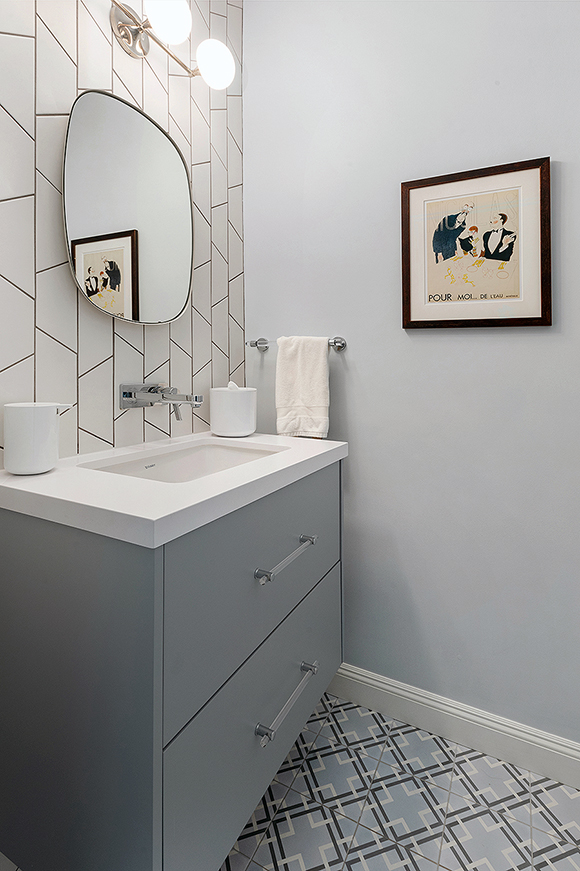
Design by Kimball Starr / Photo by Steph Dewey
A mix of patterns and shapes adds energy to this small-but-mighty powder room in a transitional home. From the vertical backsplash wall tiling with a wall-mounted single spigot to the geometrically-patterned flooring, joined by grey-blue cabinetry with clear acrylic handles, this little room is smartly appointed, if I do say so myself!
Design by Kimball Starr / Photo by David Duncan Livingston
The many colors, patterns, and textures in my Sunnyside client’s powder room are unified by the color scheme of blues and blue-greys. Notice the marble continued on the ceiling inset in a different scale from the marble floor tile, repeating but not copying each other. Repetition is one of the hallmarks of good design.
Design by Kimball Starr / Photo by Eric Rorer
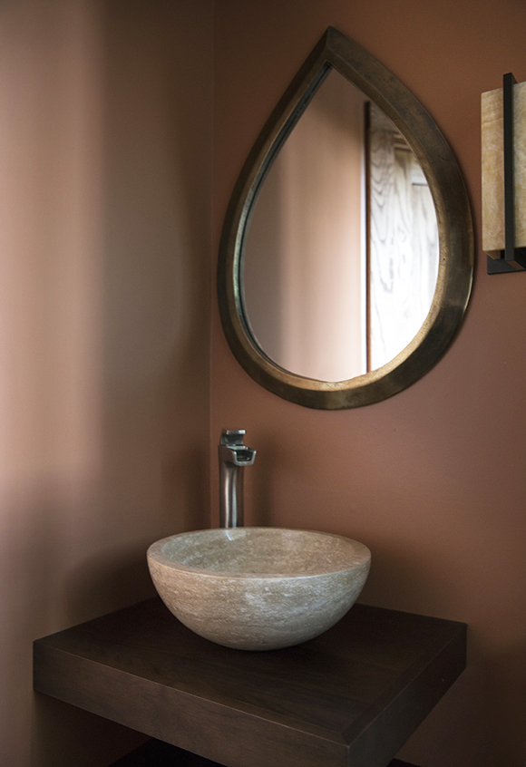
This is a detail view with bold impact. The above-counter stone basin is the star here, with a single waterfall spigot, while the teardrop mirror is a simple, usable, and stylish addition.
Design by Kimball Starr / Photo by Eric Rorer
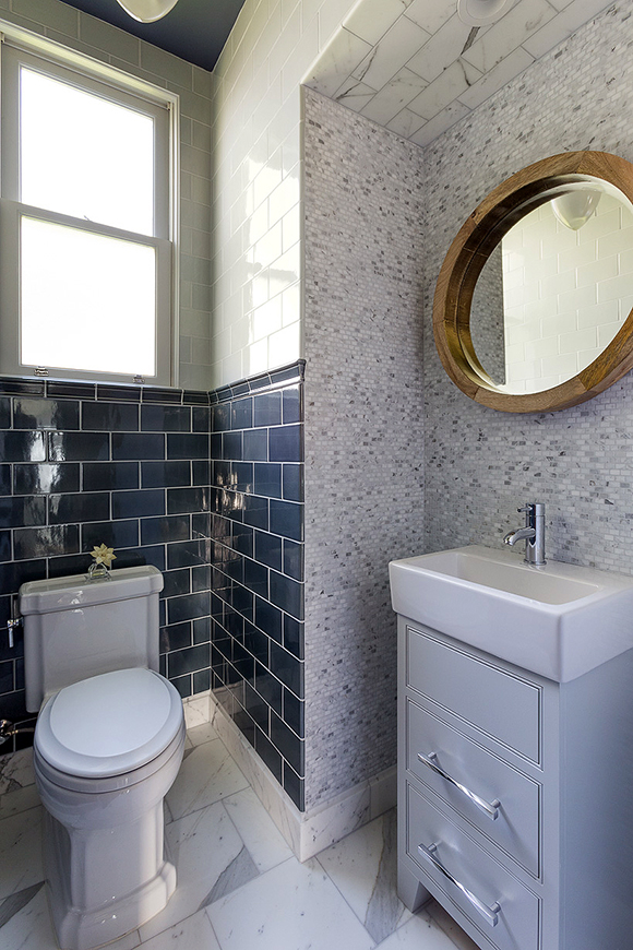
This one isn’t solely a powder room, but we’re looking at just a portion of the space. Here the wall mount toilet is a space savings, leaving more open floor. Wood-look plank floor tiles keep the space easy to clean. Using a small amount of veining in the marble wall tiling maintains interest while not overwhelming the space.
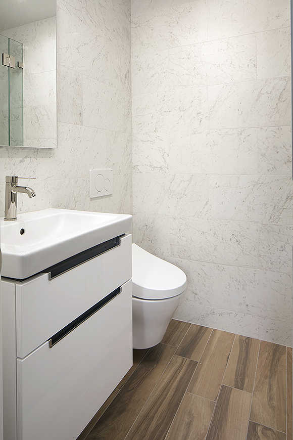
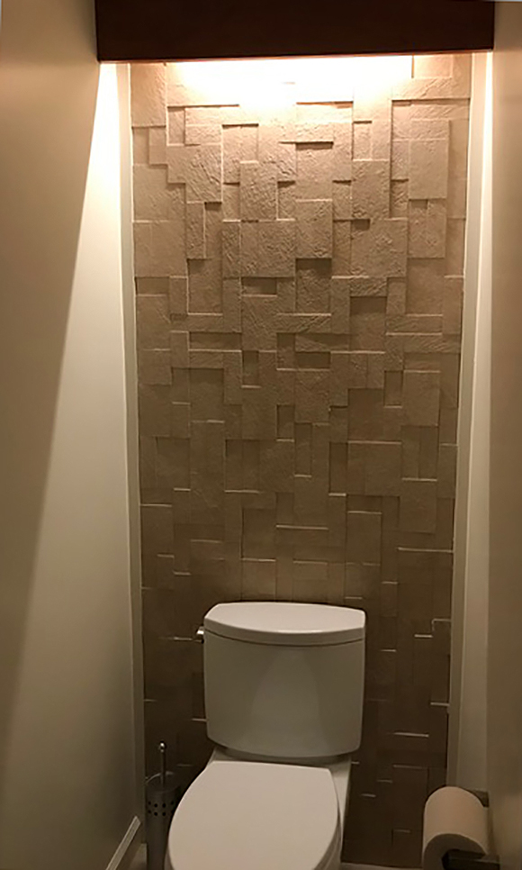
Design and photo by Kimball Starr
Here we made a toilet niche interesting with textural stone. While not technically a full powder room, this stand-alone toilet room has the same project goal of providing interest with the textural stone tiles while maintaining usability in a very small space. Do you think we achieved that goal?
Kimball Starr designs for trendy and classic homes throughout the San Francisco Bay Area and Lake Tahoe. Contact her today for a remote or socially-distant in-person consultation.